Visualization — pandas 0.24.0rc1 documentation (original) (raw)
We use the standard convention for referencing the matplotlib API:
In [1]: import matplotlib.pyplot as plt
In [2]: plt.close('all')
We provide the basics in pandas to easily create decent looking plots. See the ecosystem section for visualization libraries that go beyond the basics documented here.
Note
All calls to np.random are seeded with 123456.
Basic Plotting: plot
We will demonstrate the basics, see the cookbook for some advanced strategies.
The plot method on Series and DataFrame is just a simple wrapper aroundplt.plot():
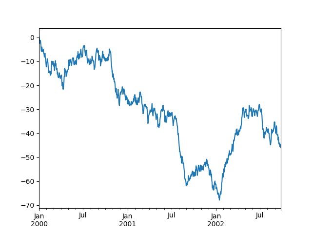
In [3]: ts = pd.Series(np.random.randn(1000), ...: index=pd.date_range('1/1/2000', periods=1000)) ...:
In [4]: ts = ts.cumsum()
In [5]: ts.plot() Out[5]: <matplotlib.axes._subplots.AxesSubplot at 0x7faf410d9f60>
If the index consists of dates, it calls gcf().autofmt_xdate()to try to format the x-axis nicely as per above.
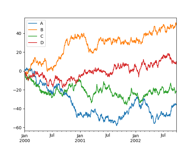
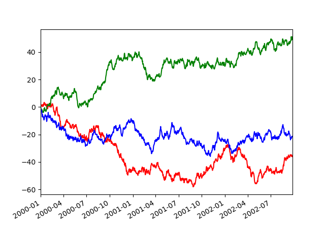
On DataFrame, plot() is a convenience to plot all of the columns with labels:
In [6]: df = pd.DataFrame(np.random.randn(1000, 4), ...: index=ts.index, columns=list('ABCD')) ...:
In [7]: df = df.cumsum()
In [8]: plt.figure();
In [9]: df.plot();
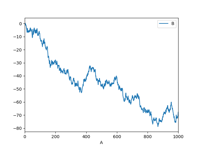
You can plot one column versus another using the x and y keywords inplot():
In [10]: df3 = pd.DataFrame(np.random.randn(1000, 2), columns=['B', 'C']).cumsum()
In [11]: df3['A'] = pd.Series(list(range(len(df))))
In [12]: df3.plot(x='A', y='B') Out[12]: <matplotlib.axes._subplots.AxesSubplot at 0x7faf43c99b00>
Note
For more formatting and styling options, seeformatting below.
Other Plots
Plotting methods allow for a handful of plot styles other than the default line plot. These methods can be provided as the kindkeyword argument to plot(), and include:
- ‘bar’ or ‘barh’ for bar plots
- ‘hist’ for histogram
- ‘box’ for boxplot
- ‘kde’ or ‘density’ for density plots
- ‘area’ for area plots
- ‘scatter’ for scatter plots
- ‘hexbin’ for hexagonal bin plots
- ‘pie’ for pie plots
For example, a bar plot can be created the following way:
In [13]: plt.figure();
In [14]: df.iloc[5].plot(kind='bar');
You can also create these other plots using the methods DataFrame.plot.<kind> instead of providing the kind keyword argument. This makes it easier to discover plot methods and the specific arguments they use:
In [15]: df = pd.DataFrame()
In [16]: df.plot. # noqa: E225, E999 df.plot.area df.plot.barh df.plot.density df.plot.hist df.plot.line df.plot.scatter df.plot.bar df.plot.box df.plot.hexbin df.plot.kde df.plot.pie
In addition to these kind s, there are the DataFrame.hist(), and DataFrame.boxplot() methods, which use a separate interface.
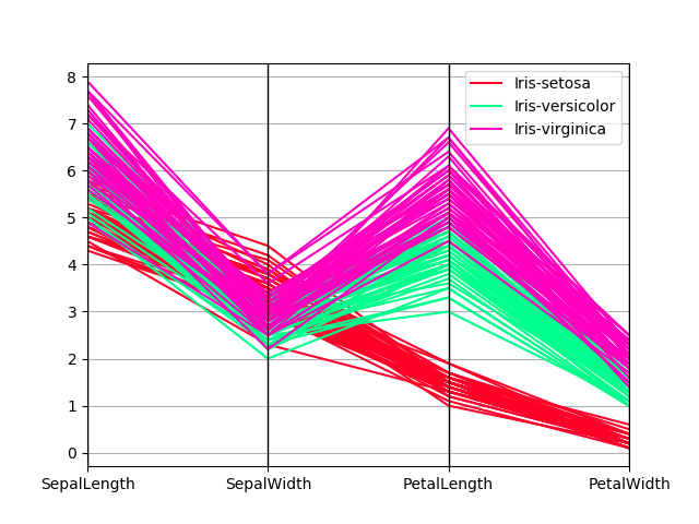
Finally, there are several plotting functions in pandas.plottingthat take a Series or DataFrame as an argument. These include:
- Scatter Matrix
- Andrews Curves
- Parallel Coordinates
- Lag Plot
- Autocorrelation Plot
- Bootstrap Plot
- RadViz
Plots may also be adorned with errorbarsor tables.
Bar plots
For labeled, non-time series data, you may wish to produce a bar plot:
In [17]: plt.figure();
In [18]: df.iloc[5].plot.bar() Out[18]: <matplotlib.axes._subplots.AxesSubplot at 0x7faf418d7cf8>
In [19]: plt.axhline(0, color='k');
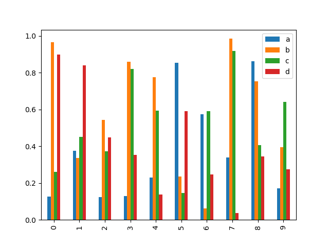
Calling a DataFrame’s plot.bar() method produces a multiple bar plot:
In [20]: df2 = pd.DataFrame(np.random.rand(10, 4), columns=['a', 'b', 'c', 'd'])
In [21]: df2.plot.bar();
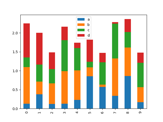
To produce a stacked bar plot, pass stacked=True:
In [22]: df2.plot.bar(stacked=True);
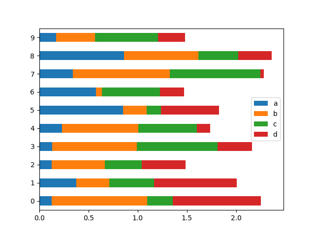
To get horizontal bar plots, use the barh method:
In [23]: df2.plot.barh(stacked=True);
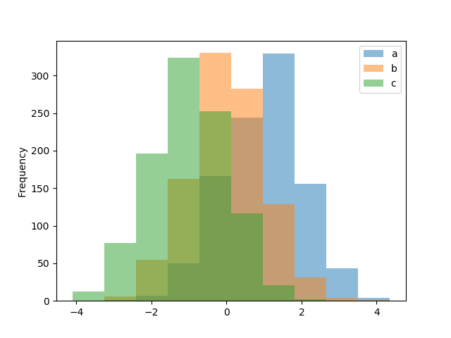
Histograms
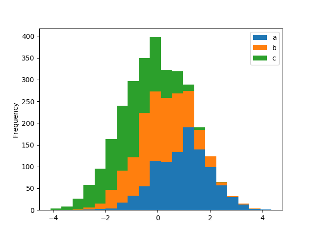
Histograms can be drawn by using the DataFrame.plot.hist() and Series.plot.hist() methods.
In [24]: df4 = pd.DataFrame({'a': np.random.randn(1000) + 1, 'b': np.random.randn(1000), ....: 'c': np.random.randn(1000) - 1}, columns=['a', 'b', 'c']) ....:
In [25]: plt.figure();
In [26]: df4.plot.hist(alpha=0.5) Out[26]: <matplotlib.axes._subplots.AxesSubplot at 0x7faf4128f3c8>
A histogram can be stacked using stacked=True. Bin size can be changed using the bins keyword.
In [27]: plt.figure();
In [28]: df4.plot.hist(stacked=True, bins=20) Out[28]: <matplotlib.axes._subplots.AxesSubplot at 0x7faf402d55f8>
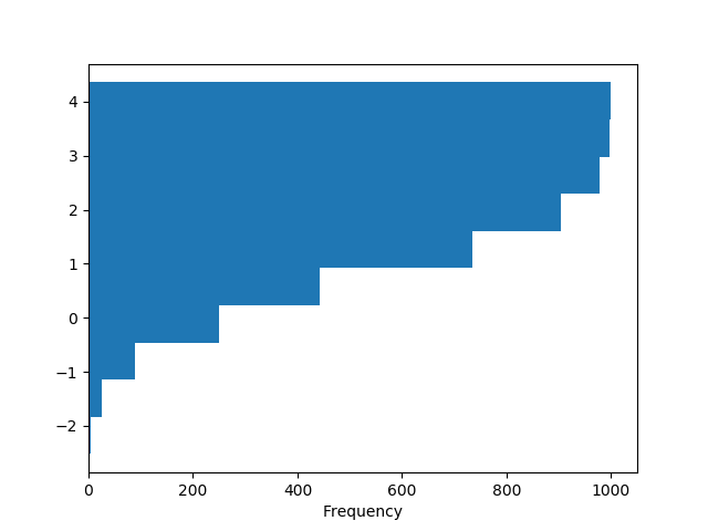
You can pass other keywords supported by matplotlib hist. For example, horizontal and cumulative histograms can be drawn byorientation='horizontal' and cumulative=True.
In [29]: plt.figure();
In [30]: df4['a'].plot.hist(orientation='horizontal', cumulative=True) Out[30]: <matplotlib.axes._subplots.AxesSubplot at 0x7faf415f2470>
See the hist method and thematplotlib hist documentation for more.
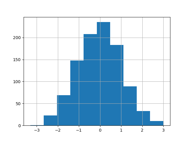
The existing interface DataFrame.hist to plot histogram still can be used.
In [31]: plt.figure();
In [32]: df['A'].diff().hist() Out[32]: <matplotlib.axes._subplots.AxesSubplot at 0x7faf40dc2ba8>
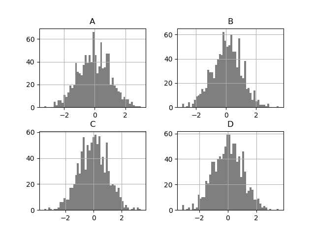
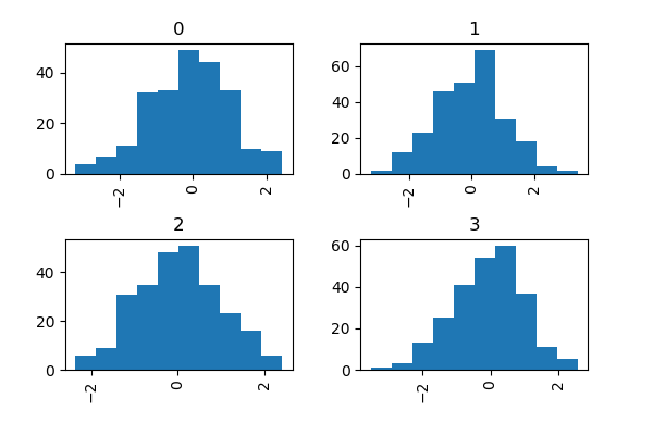
DataFrame.hist() plots the histograms of the columns on multiple subplots:
In [33]: plt.figure() Out[33]: <Figure size 640x480 with 0 Axes>
In [34]: df.diff().hist(color='k', alpha=0.5, bins=50) Out[34]: array([[<matplotlib.axes._subplots.AxesSubplot object at 0x7faf41647240>, <matplotlib.axes._subplots.AxesSubplot object at 0x7faf414fbba8>], [<matplotlib.axes._subplots.AxesSubplot object at 0x7faf40543438>, <matplotlib.axes._subplots.AxesSubplot object at 0x7faf4056d978>]], dtype=object)
The by keyword can be specified to plot grouped histograms:
In [35]: data = pd.Series(np.random.randn(1000))
In [36]: data.hist(by=np.random.randint(0, 4, 1000), figsize=(6, 4)) Out[36]: array([[<matplotlib.axes._subplots.AxesSubplot object at 0x7faf40f99f28>, <matplotlib.axes._subplots.AxesSubplot object at 0x7faf4198b1d0>], [<matplotlib.axes._subplots.AxesSubplot object at 0x7faf418b9438>, <matplotlib.axes._subplots.AxesSubplot object at 0x7faf418a16a0>]], dtype=object)
Box Plots
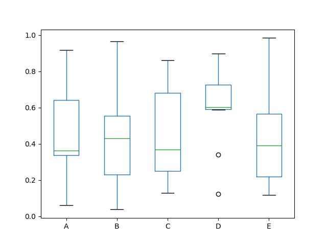
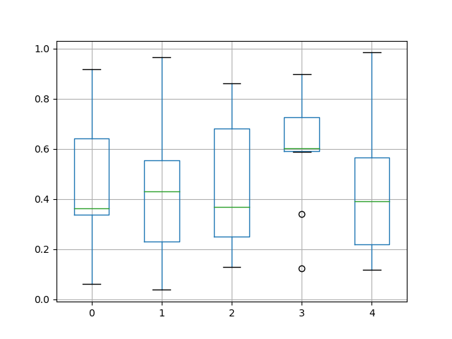
Boxplot can be drawn calling Series.plot.box() and DataFrame.plot.box(), or DataFrame.boxplot() to visualize the distribution of values within each column.
For instance, here is a boxplot representing five trials of 10 observations of a uniform random variable on [0,1).
In [37]: df = pd.DataFrame(np.random.rand(10, 5), columns=['A', 'B', 'C', 'D', 'E'])
In [38]: df.plot.box() Out[38]: <matplotlib.axes._subplots.AxesSubplot at 0x7faf3b852a90>
Boxplot can be colorized by passing color keyword. You can pass a dictwhose keys are boxes, whiskers, medians and caps. If some keys are missing in the dict, default colors are used for the corresponding artists. Also, boxplot has sym keyword to specify fliers style.
When you pass other type of arguments via color keyword, it will be directly passed to matplotlib for all the boxes, whiskers, medians and capscolorization.
The colors are applied to every boxes to be drawn. If you want more complicated colorization, you can get each drawn artists by passingreturn_type.
In [39]: color = {'boxes': 'DarkGreen', 'whiskers': 'DarkOrange', ....: 'medians': 'DarkBlue', 'caps': 'Gray'} ....:
In [40]: df.plot.box(color=color, sym='r+') Out[40]: <matplotlib.axes._subplots.AxesSubplot at 0x7faf4168cc88>
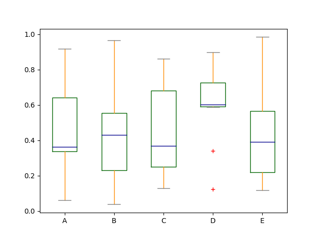
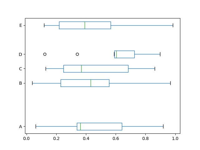
Also, you can pass other keywords supported by matplotlib boxplot. For example, horizontal and custom-positioned boxplot can be drawn byvert=False and positions keywords.
In [41]: df.plot.box(vert=False, positions=[1, 4, 5, 6, 8]) Out[41]: <matplotlib.axes._subplots.AxesSubplot at 0x7faf40239438>
See the boxplot method and thematplotlib boxplot documentation for more.
The existing interface DataFrame.boxplot to plot boxplot still can be used.
In [42]: df = pd.DataFrame(np.random.rand(10, 5))
In [43]: plt.figure();
In [44]: bp = df.boxplot()
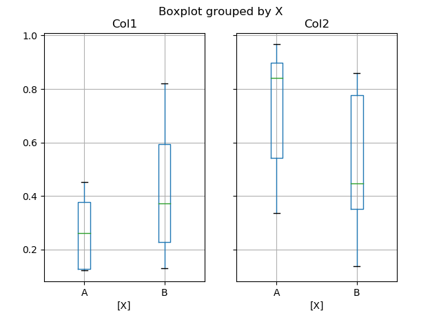
You can create a stratified boxplot using the by keyword argument to create groupings. For instance,
In [45]: df = pd.DataFrame(np.random.rand(10, 2), columns=['Col1', 'Col2'])
In [46]: df['X'] = pd.Series(['A', 'A', 'A', 'A', 'A', 'B', 'B', 'B', 'B', 'B'])
In [47]: plt.figure();
In [48]: bp = df.boxplot(by='X')
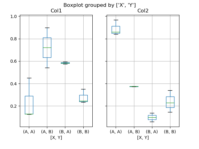
You can also pass a subset of columns to plot, as well as group by multiple columns:
In [49]: df = pd.DataFrame(np.random.rand(10, 3), columns=['Col1', 'Col2', 'Col3'])
In [50]: df['X'] = pd.Series(['A', 'A', 'A', 'A', 'A', 'B', 'B', 'B', 'B', 'B'])
In [51]: df['Y'] = pd.Series(['A', 'B', 'A', 'B', 'A', 'B', 'A', 'B', 'A', 'B'])
In [52]: plt.figure();
In [53]: bp = df.boxplot(column=['Col1', 'Col2'], by=['X', 'Y'])
Warning
The default changed from 'dict' to 'axes' in version 0.19.0.
In boxplot, the return type can be controlled by the return_type, keyword. The valid choices are {"axes", "dict", "both", None}. Faceting, created by DataFrame.boxplot with the bykeyword, will affect the output type as well:
| return_type= | Faceted | Output type |
|---|---|---|
| None | No | axes |
| None | Yes | 2-D ndarray of axes |
| 'axes' | No | axes |
| 'axes' | Yes | Series of axes |
| 'dict' | No | dict of artists |
| 'dict' | Yes | Series of dicts of artists |
| 'both' | No | namedtuple |
| 'both' | Yes | Series of namedtuples |
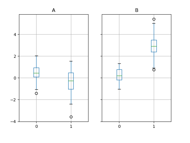
Groupby.boxplot always returns a Series of return_type.
In [54]: np.random.seed(1234)
In [55]: df_box = pd.DataFrame(np.random.randn(50, 2))
In [56]: df_box['g'] = np.random.choice(['A', 'B'], size=50)
In [57]: df_box.loc[df_box['g'] == 'B', 1] += 3
In [58]: bp = df_box.boxplot(by='g')
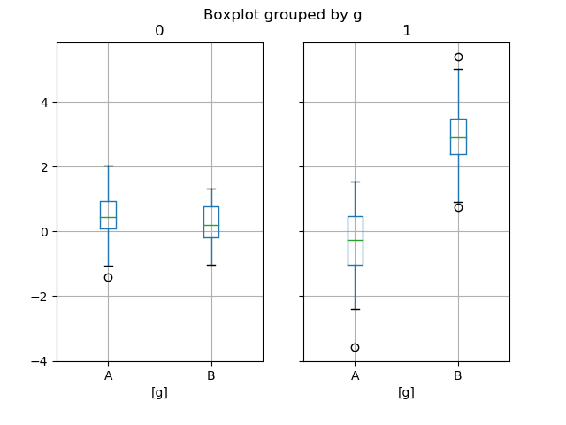
The subplots above are split by the numeric columns first, then the value of the g column. Below the subplots are first split by the value of g, then by the numeric columns.
In [59]: bp = df_box.groupby('g').boxplot()
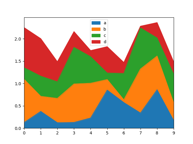
Area Plot
You can create area plots with Series.plot.area() and DataFrame.plot.area(). Area plots are stacked by default. To produce stacked area plot, each column must be either all positive or all negative values.
When input data contains NaN, it will be automatically filled by 0. If you want to drop or fill by different values, use dataframe.dropna() or dataframe.fillna() before calling plot.
In [60]: df = pd.DataFrame(np.random.rand(10, 4), columns=['a', 'b', 'c', 'd'])
In [61]: df.plot.area();
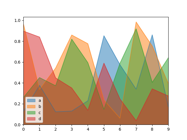
To produce an unstacked plot, pass stacked=False. Alpha value is set to 0.5 unless otherwise specified:
In [62]: df.plot.area(stacked=False);
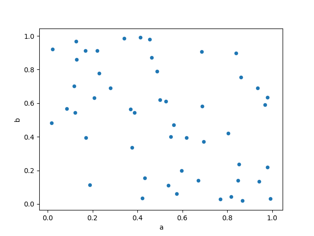
Scatter Plot
Scatter plot can be drawn by using the DataFrame.plot.scatter() method. Scatter plot requires numeric columns for the x and y axes. These can be specified by the x and y keywords.
In [63]: df = pd.DataFrame(np.random.rand(50, 4), columns=['a', 'b', 'c', 'd'])
In [64]: df.plot.scatter(x='a', y='b');
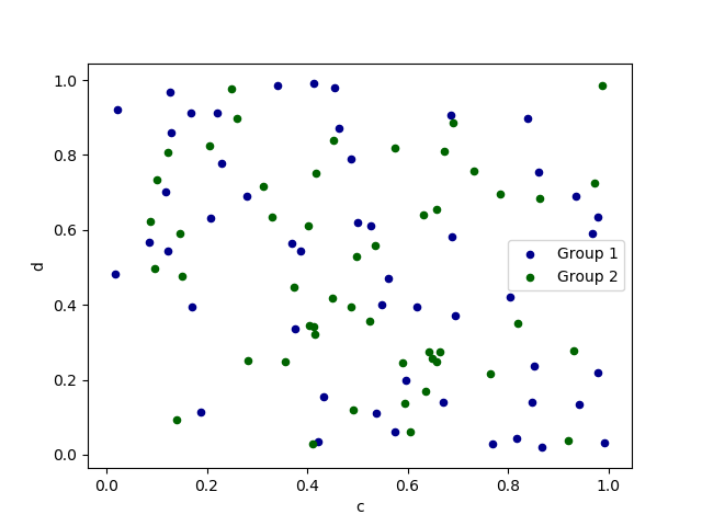
To plot multiple column groups in a single axes, repeat plot method specifying target ax. It is recommended to specify color and label keywords to distinguish each groups.
In [65]: ax = df.plot.scatter(x='a', y='b', color='DarkBlue', label='Group 1');
In [66]: df.plot.scatter(x='c', y='d', color='DarkGreen', label='Group 2', ax=ax);
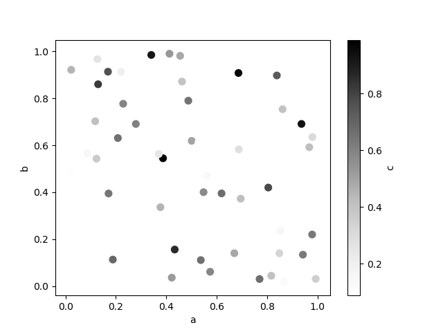
The keyword c may be given as the name of a column to provide colors for each point:
In [67]: df.plot.scatter(x='a', y='b', c='c', s=50);
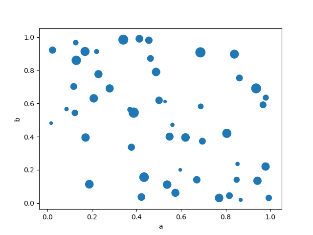
You can pass other keywords supported by matplotlibscatter. The example below shows a bubble chart using a column of the DataFrame as the bubble size.
In [68]: df.plot.scatter(x='a', y='b', s=df['c'] * 200);
See the scatter method and thematplotlib scatter documentation for more.
Hexagonal Bin Plot
You can create hexagonal bin plots with DataFrame.plot.hexbin(). Hexbin plots can be a useful alternative to scatter plots if your data are too dense to plot each point individually.
In [69]: df = pd.DataFrame(np.random.randn(1000, 2), columns=['a', 'b'])
In [70]: df['b'] = df['b'] + np.arange(1000)
In [71]: df.plot.hexbin(x='a', y='b', gridsize=25) Out[71]: <matplotlib.axes._subplots.AxesSubplot at 0x7faf3980e8d0>
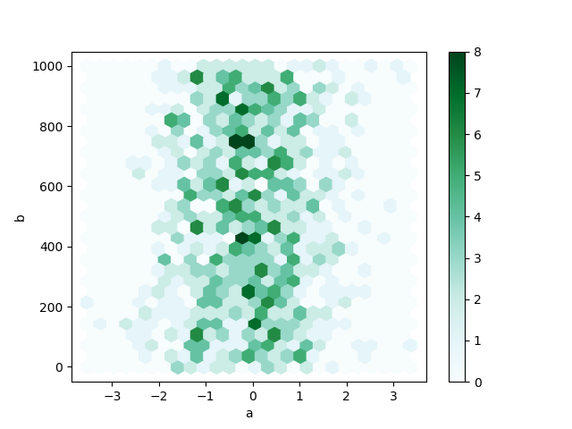
A useful keyword argument is gridsize; it controls the number of hexagons in the x-direction, and defaults to 100. A larger gridsize means more, smaller bins.
By default, a histogram of the counts around each (x, y) point is computed. You can specify alternative aggregations by passing values to the C andreduce_C_function arguments. C specifies the value at each (x, y) point and reduce_C_function is a function of one argument that reduces all the values in a bin to a single number (e.g. mean, max, sum, std). In this example the positions are given by columns a and b, while the value is given by column z. The bins are aggregated with NumPy’s max function.
In [72]: df = pd.DataFrame(np.random.randn(1000, 2), columns=['a', 'b'])
In [73]: df['b'] = df['b'] = df['b'] + np.arange(1000)
In [74]: df['z'] = np.random.uniform(0, 3, 1000)
In [75]: df.plot.hexbin(x='a', y='b', C='z', reduce_C_function=np.max, gridsize=25) Out[75]: <matplotlib.axes._subplots.AxesSubplot at 0x7faf397b1860>
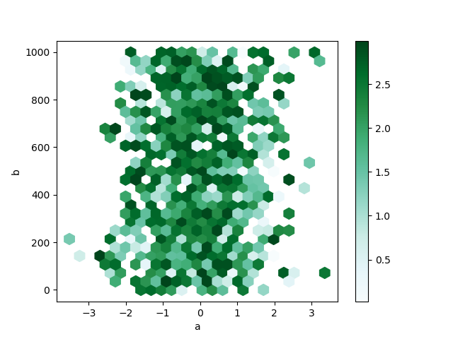
See the hexbin method and thematplotlib hexbin documentation for more.
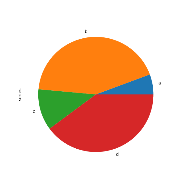
Pie plot
You can create a pie plot with DataFrame.plot.pie() or Series.plot.pie(). If your data includes any NaN, they will be automatically filled with 0. A ValueError will be raised if there are any negative values in your data.
In [76]: series = pd.Series(3 * np.random.rand(4), ....: index=['a', 'b', 'c', 'd'], name='series') ....:
In [77]: series.plot.pie(figsize=(6, 6)) Out[77]: <matplotlib.axes._subplots.AxesSubplot at 0x7faf396d3240>
For pie plots it’s best to use square figures, i.e. a figure aspect ratio 1. You can create the figure with equal width and height, or force the aspect ratio to be equal after plotting by calling ax.set_aspect('equal') on the returnedaxes object.
Note that pie plot with DataFrame requires that you either specify a target column by the y argument or subplots=True. When y is specified, pie plot of selected column will be drawn. If subplots=True is specified, pie plots for each column are drawn as subplots. A legend will be drawn in each pie plots by default; specify legend=False to hide it.
In [78]: df = pd.DataFrame(3 * np.random.rand(4, 2), ....: index=['a', 'b', 'c', 'd'], columns=['x', 'y']) ....:
In [79]: df.plot.pie(subplots=True, figsize=(8, 4)) Out[79]: array([<matplotlib.axes._subplots.AxesSubplot object at 0x7faf3969ca90>, <matplotlib.axes._subplots.AxesSubplot object at 0x7faf39661240>], dtype=object)
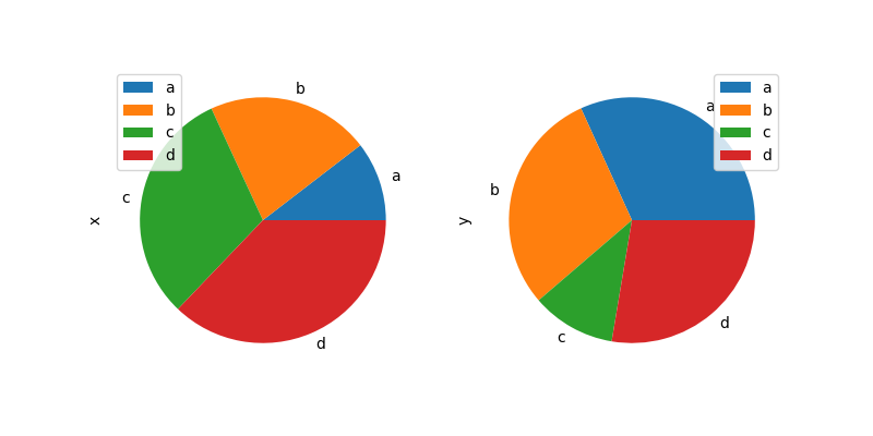
You can use the labels and colors keywords to specify the labels and colors of each wedge.
Warning
Most pandas plots use the label and color arguments (note the lack of “s” on those). To be consistent with matplotlib.pyplot.pie() you must use labels and colors.
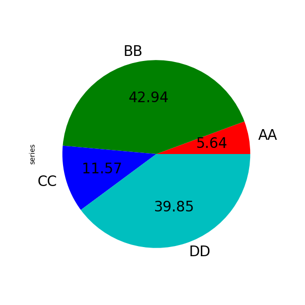
If you want to hide wedge labels, specify labels=None. If fontsize is specified, the value will be applied to wedge labels. Also, other keywords supported by matplotlib.pyplot.pie() can be used.
In [80]: series.plot.pie(labels=['AA', 'BB', 'CC', 'DD'], colors=['r', 'g', 'b', 'c'], ....: autopct='%.2f', fontsize=20, figsize=(6, 6)) ....: Out[80]: <matplotlib.axes._subplots.AxesSubplot at 0x7faf395d7c50>
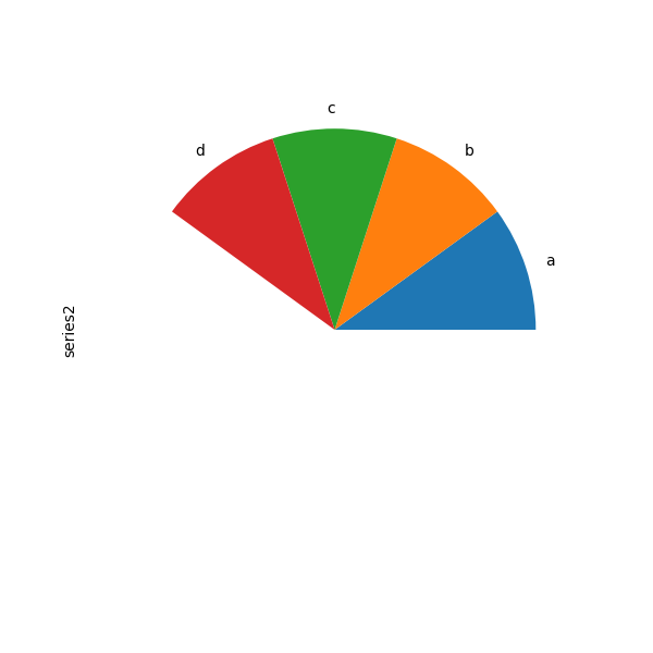
If you pass values whose sum total is less than 1.0, matplotlib draws a semicircle.
In [81]: series = pd.Series([0.1] * 4, index=['a', 'b', 'c', 'd'], name='series2')
In [82]: series.plot.pie(figsize=(6, 6)) Out[82]: <matplotlib.axes._subplots.AxesSubplot at 0x7faf395a5160>
See the matplotlib pie documentation for more.
Plotting with Missing Data
Pandas tries to be pragmatic about plotting DataFrames or Seriesthat contain missing data. Missing values are dropped, left out, or filled depending on the plot type.
| Plot Type | NaN Handling |
|---|---|
| Line | Leave gaps at NaNs |
| Line (stacked) | Fill 0’s |
| Bar | Fill 0’s |
| Scatter | Drop NaNs |
| Histogram | Drop NaNs (column-wise) |
| Box | Drop NaNs (column-wise) |
| Area | Fill 0’s |
| KDE | Drop NaNs (column-wise) |
| Hexbin | Drop NaNs |
| Pie | Fill 0’s |
If any of these defaults are not what you want, or if you want to be explicit about how missing values are handled, consider usingfillna() or dropna()before plotting.
Plot Formatting
Setting the plot style
From version 1.5 and up, matplotlib offers a range of pre-configured plotting styles. Setting the style can be used to easily give plots the general look that you want. Setting the style is as easy as calling matplotlib.style.use(my_plot_style) before creating your plot. For example you could write matplotlib.style.use('ggplot') for ggplot-style plots.
You can see the various available style names at matplotlib.style.available and it’s very easy to try them out.
General plot style arguments
Most plotting methods have a set of keyword arguments that control the layout and formatting of the returned plot:
In [113]: plt.figure();
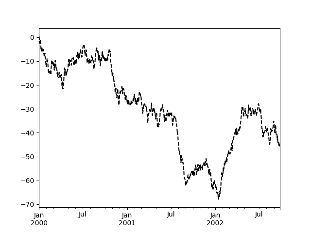
In [114]: ts.plot(style='k--', label='Series');
For each kind of plot (e.g. line, bar, scatter) any additional arguments keywords are passed along to the corresponding matplotlib function (ax.plot(),ax.bar(),ax.scatter()). These can be used to control additional styling, beyond what pandas provides.
Controlling the Legend
You may set the legend argument to False to hide the legend, which is shown by default.
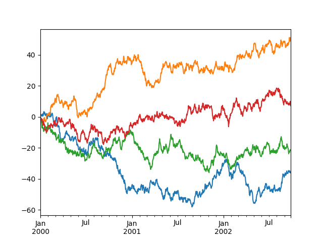
In [115]: df = pd.DataFrame(np.random.randn(1000, 4), .....: index=ts.index, columns=list('ABCD')) .....:
In [116]: df = df.cumsum()
In [117]: df.plot(legend=False) Out[117]: <matplotlib.axes._subplots.AxesSubplot at 0x7faf40a05588>
Scales
You may pass logy to get a log-scale Y axis.
In [118]: ts = pd.Series(np.random.randn(1000), .....: index=pd.date_range('1/1/2000', periods=1000)) .....:
In [119]: ts = np.exp(ts.cumsum())
In [120]: ts.plot(logy=True) Out[120]: <matplotlib.axes._subplots.AxesSubplot at 0x7faf4043f2e8>

See also the logx and loglog keyword arguments.
Plotting on a Secondary Y-axis
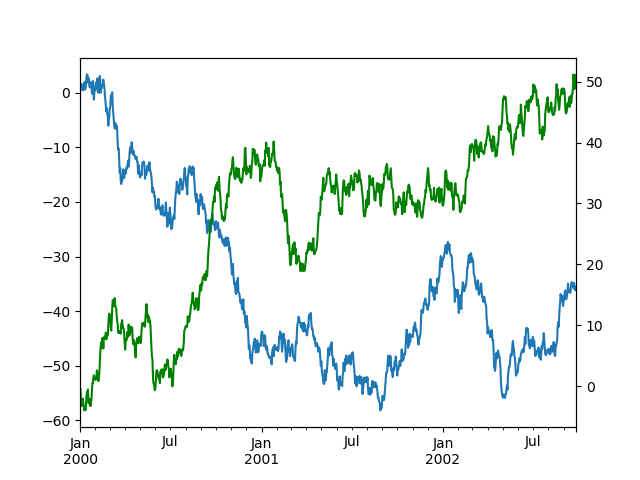
To plot data on a secondary y-axis, use the secondary_y keyword:
In [121]: df.A.plot() Out[121]: <matplotlib.axes._subplots.AxesSubplot at 0x7faf3bcd10f0>
In [122]: df.B.plot(secondary_y=True, style='g') Out[122]: <matplotlib.axes._subplots.AxesSubplot at 0x7faf3b88ae10>
To plot some columns in a DataFrame, give the column names to the secondary_ykeyword:
In [123]: plt.figure() Out[123]: <Figure size 640x480 with 0 Axes>
In [124]: ax = df.plot(secondary_y=['A', 'B'])
In [125]: ax.set_ylabel('CD scale') Out[125]: Text(0, 0.5, 'CD scale')
In [126]: ax.right_ax.set_ylabel('AB scale') Out[126]: Text(0, 0.5, 'AB scale')
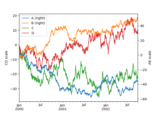
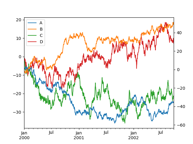
Note that the columns plotted on the secondary y-axis is automatically marked with “(right)” in the legend. To turn off the automatic marking, use themark_right=False keyword:
In [127]: plt.figure() Out[127]: <Figure size 640x480 with 0 Axes>
In [128]: df.plot(secondary_y=['A', 'B'], mark_right=False) Out[128]: <matplotlib.axes._subplots.AxesSubplot at 0x7faf3b640a58>
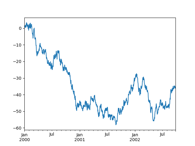
Suppressing Tick Resolution Adjustment
pandas includes automatic tick resolution adjustment for regular frequency time-series data. For limited cases where pandas cannot infer the frequency information (e.g., in an externally created twinx), you can choose to suppress this behavior for alignment purposes.
Here is the default behavior, notice how the x-axis tick labeling is performed:
In [129]: plt.figure() Out[129]: <Figure size 640x480 with 0 Axes>
In [130]: df.A.plot() Out[130]: <matplotlib.axes._subplots.AxesSubplot at 0x7faf40796ba8>
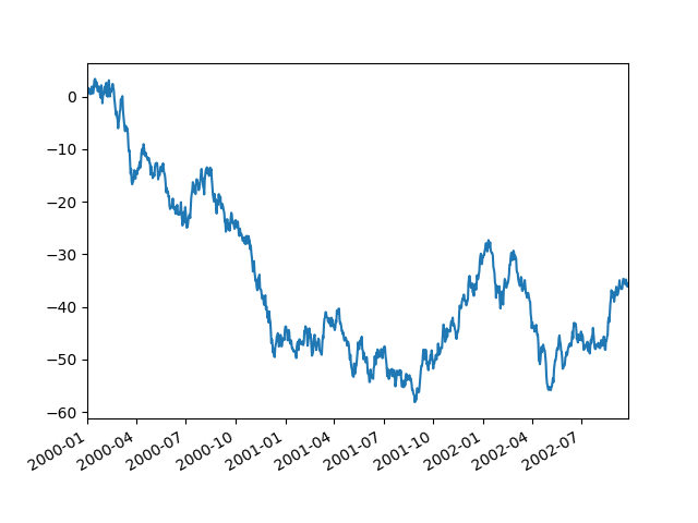
Using the x_compat parameter, you can suppress this behavior:
In [131]: plt.figure() Out[131]: <Figure size 640x480 with 0 Axes>
In [132]: df.A.plot(x_compat=True) Out[132]: <matplotlib.axes._subplots.AxesSubplot at 0x7faf3bff9860>
If you have more than one plot that needs to be suppressed, the use method in pandas.plotting.plot_params can be used in a with statement:
In [133]: plt.figure() Out[133]: <Figure size 640x480 with 0 Axes>
In [134]: with pd.plotting.plot_params.use('x_compat', True): .....: df.A.plot(color='r') .....: df.B.plot(color='g') .....: df.C.plot(color='b') .....:
Automatic Date Tick Adjustment
New in version 0.20.0.
TimedeltaIndex now uses the native matplotlib tick locator methods, it is useful to call the automatic date tick adjustment from matplotlib for figures whose ticklabels overlap.
See the autofmt_xdate method and thematplotlib documentation for more.
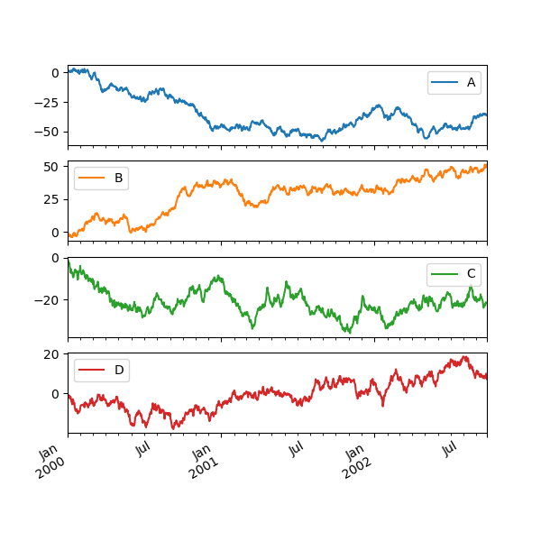
Subplots
Each Series in a DataFrame can be plotted on a different axis with the subplots keyword:
In [135]: df.plot(subplots=True, figsize=(6, 6));
Using Layout and Targeting Multiple Axes
The layout of subplots can be specified by the layout keyword. It can accept(rows, columns). The layout keyword can be used inhist and boxplot also. If the input is invalid, a ValueError will be raised.
The number of axes which can be contained by rows x columns specified by layout must be larger than the number of required subplots. If layout can contain more axes than required, blank axes are not drawn. Similar to a NumPy array’s reshape method, you can use -1 for one dimension to automatically calculate the number of rows or columns needed, given the other.
In [136]: df.plot(subplots=True, layout=(2, 3), figsize=(6, 6), sharex=False);
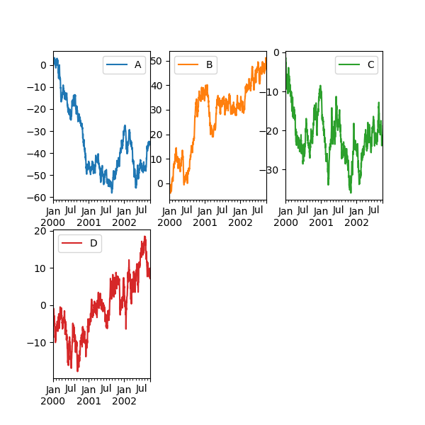
The above example is identical to using:
In [137]: df.plot(subplots=True, layout=(2, -1), figsize=(6, 6), sharex=False);
The required number of columns (3) is inferred from the number of series to plot and the given number of rows (2).
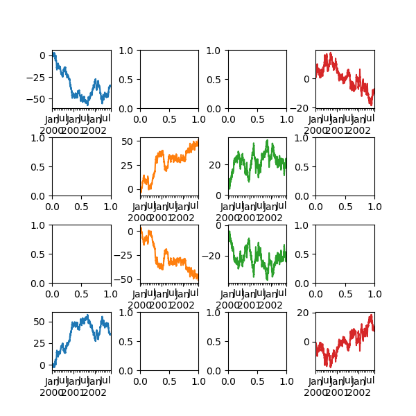
You can pass multiple axes created beforehand as list-like via ax keyword. This allows more complicated layouts. The passed axes must be the same number as the subplots being drawn.
When multiple axes are passed via the ax keyword, layout, sharex and sharey keywords don’t affect to the output. You should explicitly pass sharex=False and sharey=False, otherwise you will see a warning.
In [138]: fig, axes = plt.subplots(4, 4, figsize=(6, 6))
In [139]: plt.subplots_adjust(wspace=0.5, hspace=0.5)
In [140]: target1 = [axes[0][0], axes[1][1], axes[2][2], axes[3][3]]
In [141]: target2 = [axes[3][0], axes[2][1], axes[1][2], axes[0][3]]
In [142]: df.plot(subplots=True, ax=target1, legend=False, sharex=False, sharey=False);
In [143]: (-df).plot(subplots=True, ax=target2, legend=False, .....: sharex=False, sharey=False); .....:
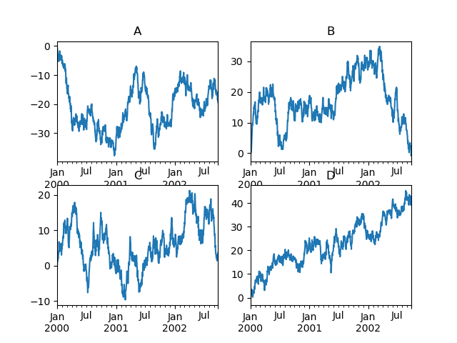
Another option is passing an ax argument to Series.plot() to plot on a particular axis:
In [144]: fig, axes = plt.subplots(nrows=2, ncols=2)
In [145]: df['A'].plot(ax=axes[0, 0]);
In [146]: axes[0, 0].set_title('A');
In [147]: df['B'].plot(ax=axes[0, 1]);
In [148]: axes[0, 1].set_title('B');
In [149]: df['C'].plot(ax=axes[1, 0]);
In [150]: axes[1, 0].set_title('C');
In [151]: df['D'].plot(ax=axes[1, 1]);
In [152]: axes[1, 1].set_title('D');
Plotting With Error Bars
Plotting with error bars is supported in DataFrame.plot() and Series.plot().
Horizontal and vertical error bars can be supplied to the xerr and yerr keyword arguments to plot(). The error values can be specified using a variety of formats:
- As a DataFrame or
dictof errors with column names matching thecolumnsattribute of the plotting DataFrame or matching thenameattribute of the Series. - As a
strindicating which of the columns of plotting DataFrame contain the error values. - As raw values (
list,tuple, ornp.ndarray). Must be the same length as the plotting DataFrame/Series.
Asymmetrical error bars are also supported, however raw error values must be provided in this case. For a M length Series, a Mx2 array should be provided indicating lower and upper (or left and right) errors. For a MxN DataFrame, asymmetrical errors should be in a Mx2xN array.
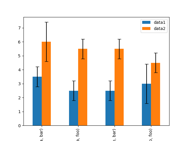
Here is an example of one way to easily plot group means with standard deviations from the raw data.
Generate the data
In [153]: ix3 = pd.MultiIndex.from_arrays([ .....: ['a', 'a', 'a', 'a', 'b', 'b', 'b', 'b'], .....: ['foo', 'foo', 'bar', 'bar', 'foo', 'foo', 'bar', 'bar']], .....: names=['letter', 'word']) .....:
In [154]: df3 = pd.DataFrame({'data1': [3, 2, 4, 3, 2, 4, 3, 2], .....: 'data2': [6, 5, 7, 5, 4, 5, 6, 5]}, index=ix3) .....:
Group by index labels and take the means and standard deviations
for each group
In [155]: gp3 = df3.groupby(level=('letter', 'word'))
In [156]: means = gp3.mean()
In [157]: errors = gp3.std()
In [158]: means
Out[158]:
data1 data2
letter word
a bar 3.5 6.0
foo 2.5 5.5
b bar 2.5 5.5
foo 3.0 4.5
In [159]: errors
Out[159]:
data1 data2
letter word
a bar 0.707107 1.414214
foo 0.707107 0.707107
b bar 0.707107 0.707107
foo 1.414214 0.707107
Plot
In [160]: fig, ax = plt.subplots()
In [161]: means.plot.bar(yerr=errors, ax=ax, capsize=4) Out[161]: <matplotlib.axes._subplots.AxesSubplot at 0x7faf38160f60>
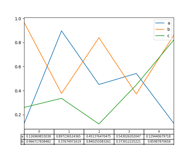
Plotting Tables
Plotting with matplotlib table is now supported in DataFrame.plot() and Series.plot() with a table keyword. The table keyword can accept bool, DataFrame or Series. The simple way to draw a table is to specify table=True. Data will be transposed to meet matplotlib’s default layout.
In [162]: fig, ax = plt.subplots(1, 1)
In [163]: df = pd.DataFrame(np.random.rand(5, 3), columns=['a', 'b', 'c'])
In [164]: ax.get_xaxis().set_visible(False) # Hide Ticks
In [165]: df.plot(table=True, ax=ax) Out[165]: <matplotlib.axes._subplots.AxesSubplot at 0x7faf38102ba8>
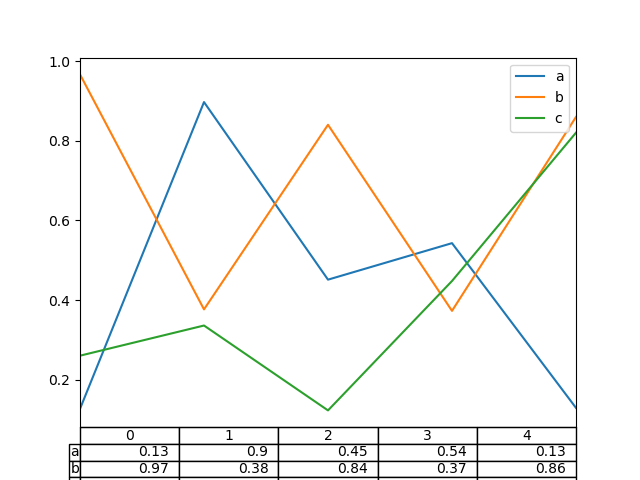
Also, you can pass a different DataFrame or Series to thetable keyword. The data will be drawn as displayed in print method (not transposed automatically). If required, it should be transposed manually as seen in the example below.
In [166]: fig, ax = plt.subplots(1, 1)
In [167]: ax.get_xaxis().set_visible(False) # Hide Ticks
In [168]: df.plot(table=np.round(df.T, 2), ax=ax) Out[168]: <matplotlib.axes._subplots.AxesSubplot at 0x7faf38009ac8>
There also exists a helper function pandas.plotting.table, which creates a table from DataFrame or Series, and adds it to anmatplotlib.Axes instance. This function can accept keywords which the matplotlib table has.
In [169]: from pandas.plotting import table
In [170]: fig, ax = plt.subplots(1, 1)
In [171]: table(ax, np.round(df.describe(), 2), .....: loc='upper right', colWidths=[0.2, 0.2, 0.2]) .....: Out[171]: <matplotlib.table.Table at 0x7faf33f47a90>
In [172]: df.plot(ax=ax, ylim=(0, 2), legend=None) Out[172]: <matplotlib.axes._subplots.AxesSubplot at 0x7faf33f9e128>
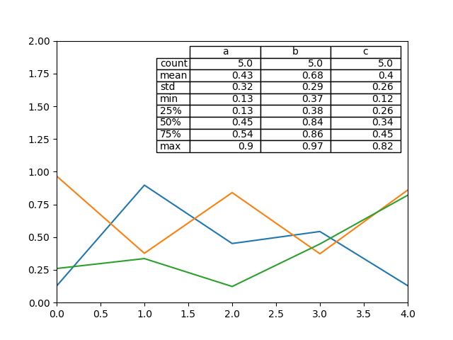
Note: You can get table instances on the axes using axes.tables property for further decorations. See the matplotlib table documentation for more.
Colormaps
A potential issue when plotting a large number of columns is that it can be difficult to distinguish some series due to repetition in the default colors. To remedy this, DataFrame plotting supports the use of the colormap argument, which accepts either a Matplotlib colormapor a string that is a name of a colormap registered with Matplotlib. A visualization of the default matplotlib colormaps is available here.
As matplotlib does not directly support colormaps for line-based plots, the colors are selected based on an even spacing determined by the number of columns in the DataFrame. There is no consideration made for background color, so some colormaps will produce lines that are not easily visible.
To use the cubehelix colormap, we can pass colormap='cubehelix'.
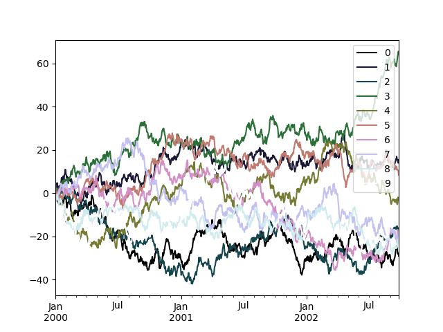
In [173]: df = pd.DataFrame(np.random.randn(1000, 10), index=ts.index)
In [174]: df = df.cumsum()
In [175]: plt.figure() Out[175]: <Figure size 640x480 with 0 Axes>
In [176]: df.plot(colormap='cubehelix') Out[176]: <matplotlib.axes._subplots.AxesSubplot at 0x7faf33ecf710>
Alternatively, we can pass the colormap itself:
In [177]: from matplotlib import cm
In [178]: plt.figure() Out[178]: <Figure size 640x480 with 0 Axes>
In [179]: df.plot(colormap=cm.cubehelix) Out[179]: <matplotlib.axes._subplots.AxesSubplot at 0x7faf33d71390>

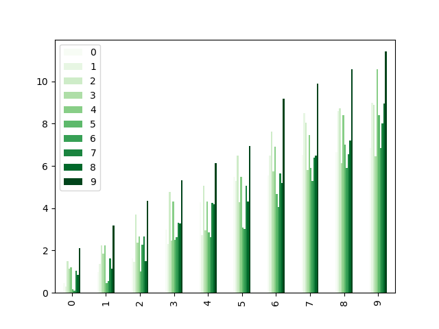
Colormaps can also be used other plot types, like bar charts:
In [180]: dd = pd.DataFrame(np.random.randn(10, 10)).applymap(abs)
In [181]: dd = dd.cumsum()
In [182]: plt.figure() Out[182]: <Figure size 640x480 with 0 Axes>
In [183]: dd.plot.bar(colormap='Greens') Out[183]: <matplotlib.axes._subplots.AxesSubplot at 0x7faf33b96550>
Parallel coordinates charts:
In [184]: plt.figure() Out[184]: <Figure size 640x480 with 0 Axes>
In [185]: parallel_coordinates(data, 'Name', colormap='gist_rainbow') Out[185]: <matplotlib.axes._subplots.AxesSubplot at 0x7faf380b2198>
Andrews curves charts:
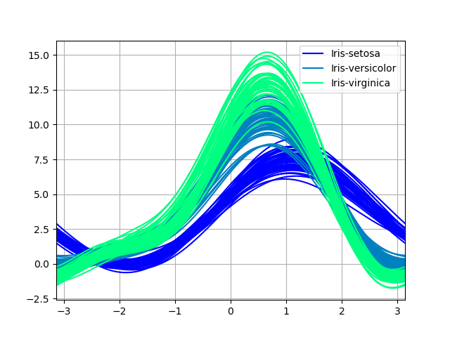
In [186]: plt.figure() Out[186]: <Figure size 640x480 with 0 Axes>
In [187]: andrews_curves(data, 'Name', colormap='winter') Out[187]: <matplotlib.axes._subplots.AxesSubplot at 0x7faf797af7b8>
Plotting directly with matplotlib
In some situations it may still be preferable or necessary to prepare plots directly with matplotlib, for instance when a certain type of plot or customization is not (yet) supported by pandas. Series and DataFrameobjects behave like arrays and can therefore be passed directly to matplotlib functions without explicit casts.
pandas also automatically registers formatters and locators that recognize date indices, thereby extending date and time support to practically all plot types available in matplotlib. Although this formatting does not provide the same level of refinement you would get when plotting via pandas, it can be faster when plotting a large number of points.
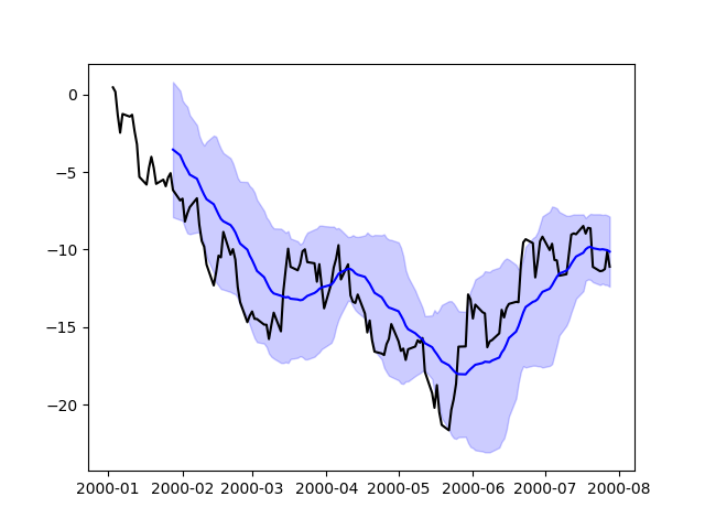
In [188]: price = pd.Series(np.random.randn(150).cumsum(), .....: index=pd.date_range('2000-1-1', periods=150, freq='B')) .....:
In [189]: ma = price.rolling(20).mean()
In [190]: mstd = price.rolling(20).std()
In [191]: plt.figure() Out[191]: <Figure size 640x480 with 0 Axes>
In [192]: plt.plot(price.index, price, 'k') Out[192]: [<matplotlib.lines.Line2D at 0x7faf410cea90>]
In [193]: plt.plot(ma.index, ma, 'b') Out[193]: [<matplotlib.lines.Line2D at 0x7faf406d1fd0>]
In [194]: plt.fill_between(mstd.index, ma - 2 * mstd, ma + 2 * mstd, .....: color='b', alpha=0.2) .....: Out[194]: <matplotlib.collections.PolyCollection at 0x7faf406e1e80>
Trellis plotting interface
Warning
The rplot trellis plotting interface has been removed. Please use external packages like seaborn for similar but more refined functionality and refer to our 0.18.1 documentationherefor how to convert to using it.