CSS Pseudoclasses (original) (raw)
CSS Pseudo-classes
Last Updated : 23 Jul, 2025
A pseudo-class is a keyword added to a CSS selector, prefixed by a colon (:), to define a specific state or condition of an element. It is used to style elements like a hovered button, the first child of a container, or checked input fields.
**Syntax
selector:pseudo-class {
/* styles */
}
Interactive/User Action Pseudo-Classes
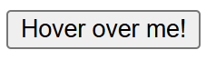
**1. :hover
This applies when the user hovers over an element.
HTML `
<style>
    button:hover {
        background-color: lightblue;
        color: white;
    }
</style>`
This will change the background color of the button when hovered over.
Output:
output
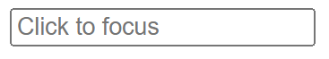
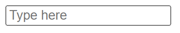
**2. :focus
Applies when an element receives focus (e.g., a text input clicked)
HTML `
<style>
    input:focus {
        border: 2px solid blue;
        outline: none;
    }
</style>
`
This will change the border of the input field to blue when it is focused.
output
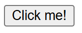
**3. :active
Applies when an element is being clicked .
HTML `
<style>
    button:active {
        background-color: darkblue;
        color: white;
    }
</style>`
This will change the background color of the button when it is being clicked (in the active state).
Output:
output
**4. :visited
Applies to links the user has visited.
HTML `
<style>
    a:visited {
        color: purple;
    }
</style>`
This will change the color of visited links to purple.
output
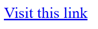
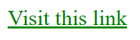
**5. :link
Applies to links that the user has not visited yet.
HTML `
<style>
    a:link {
        color: green;
    }
</style>`
This will make unvisited links appear in green.
Output:
output
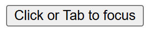
**6. :focus-visible
Applies when an element is focused, but only if the focus is visible (e.g., for accessibility).This Style is applied when user focus on an element using tab button.
HTML `
<style>
    button:focus-visible {
        outline: 3px solid orange;
    }
</style>`
Output:
output
**7. :focus-within
Applies to an element if it or its descendants have focus.
HTML `
<style>
    .form-container:focus-within {
        border: 2px solid green;
    }
</style>
`
This will apply a green border to the .form-container element when any of its descendants (like the input field) has focus.
Output:
output
Structural targeting pseudo classes
**1. :first-child
Matches the first child of its parent
HTML `
<style>
    p:first-child {
        color: red;
    }
</style>
This is the first paragraph.
This is the second paragraph.
`
Output:
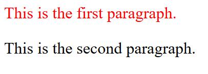
output
**2. :last-child
Matches the last child of its parent
HTML `
<style>
    p:last-child {
        color: blue;
    }
</style>
This is the first paragraph.
This is the last paragraph.
`
Output:
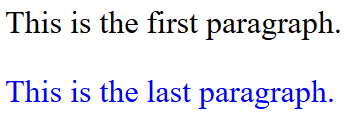
output
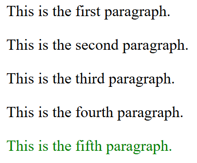
**3. :nth-child(n)
Matches the nth child of its parent
HTML `
<style>
    p:nth-child(5) {
        color: green;
    }
</style>
This is the first paragraph.
This is the second paragraph.
This is the third paragraph.
This is the fourth paragraph.
This is the fifth paragraph.
`
Output:
output
**4. :nth-last-child(n)
Matches the nth child from the end of its parent
HTML `
<style>
    p:nth-last-child(1) {
        color: orange;
    }
</style>
This is the first paragraph.
This is the second paragraph.
This is the third paragraph.
`
Output:
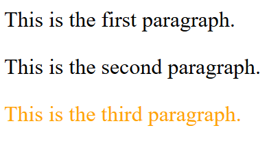
output
**5. :first-of-type
Matches the first instance of a specific type within a parent element.
HTML `
<style>
    p:first-of-type {
        color: purple;
    }
</style>This is the first paragraph.
This is another paragraph.
`
Output:
output
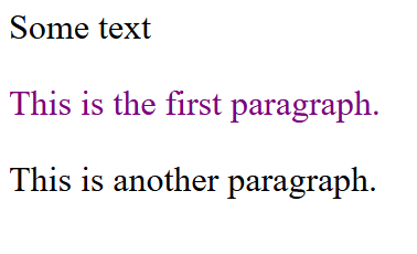
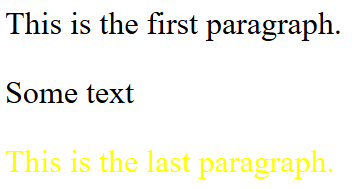
**6. :last-of-type
Matches the last instance of a specific type within a parent.
HTML `
<style>
    p:last-of-type {
        color: yellow;
    }
</style>
This is the first paragraph.
Some textThis is the last paragraph.
`
Output:
output
**7. :nth-of-type(n)
Matches the nth instance of a specific type.
HTML `
<style>
    p:nth-of-type(2) {
        color: pink;
    }
</style>
This is the first paragraph.
Some textThis is the second paragraph.
This is the third paragraph.
`
**8. :nth-last-of-type(n)
Matches the nth instance of a specific type from the end
HTML `
<style>
    p:nth-last-of-type(1) {
        color: brown;
    }
</style>
This is the first paragraph.
Some textThis is the second paragraph.
This is the third paragraph.
`
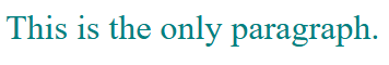
**9. :only-child
Matches elements that are the only child of their parent.
HTML `
<style>
    p:only-child {
        color: teal;
    }
</style>
This is the only paragraph.
`
**10. :only-of-type
Matches elements that are the only instance of their type within a parent.
HTML `
<style>
    p:only-of-type {
        color: coral;
    }
</style>
This is the only paragraph.
Some text`
Output:
output
**11. :empty
Matches elements with no children or content.
HTML `
<style>
    div:empty {
        background-color: green;
    }
    #one {
        height: 100px;
        width: 100px;
    }
</style>
This div has content.
`
Output:
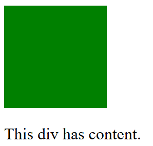
output
Form Pseudo-Classes
**1. :checked
Matches checkboxes or radio buttons that are selected.
HTML `
<style>
    input:checked {
        outline: 5px solid red;
    }
</style>`
Output:
output
**2. :disabled
Matches elements that are disabled.
HTML `
<style>
    input:disabled {
        background-color: lightgray;
    }
</style>
`
Output:
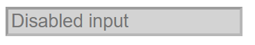
output
**3. :enabled
Matches elements that are enabled.
HTML `
<style>
    input:enabled {
        background-color: lightblue;
    }
</style>
`
Output:
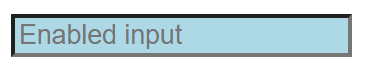
output
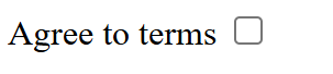
**4. :required
Matches form fields marked as required****.**
HTML `
<style>
    input:required {
        border: 2px solid red;
    }
</style>
`
Output:
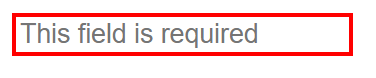
output
**5. :optional
Matches form fields that are not required.
HTML `
<style>
    input:optional {
        border: 2px solid green;
    }
</style>
`
Output:
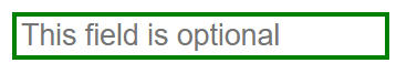
output
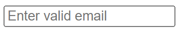
**6. :valid
Matches form fields with valid input types entered in them.
HTML `
<style>
    input:valid {
        border: 2px solid green;
    }
</style>
`
Output:
**7. :invalid
Matches form fields with invalid input entered in them.
HTML `
<style>
    input:invalid {
        border: 2px solid red;
    }
</style>
`
Output:
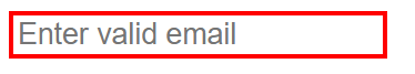
output
**8. :in-range
Matches inputs within a valid range (e.g., a number input).
HTML `
<style>
    input:in-range {
        background-color: lightgreen;
    }
</style>
`
Output:
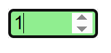
output
**9. :out-of-range
Matches inputs outside the valid range.
HTML `
<style>
    input:out-of-range {
        background-color: lightcoral;
    }
</style>
`
Output:
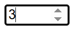
output
**10. :read-only
Matches elements that are read-only.
HTML `
<style>
    input:read-only {
        background-color: lightgray;
    }
</style>
`
Output:
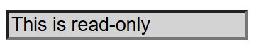
output
**11. :read-write
Matches elements that are editable.
HTML `
<style>
    input:read-write {
        background-color: lightyellow;
    }
</style>
`