Charts and Graphs for Data Visualization (original) (raw)
Last Updated : 22 Sep, 2025
Data Visualization is the art and science of transforming raw data into graphical or visual representations such as charts, graphs and plots. Instead of analyzing raw numbers in tables, visualization allows decision-makers to quickly interpret patterns, trends and anomalies. It turns complex datasets into actionable insights, enabling faster and more informed decisions.
Importance of Data Visualization
- **Trend Analysis: Track changes and patterns over time.
- **Comparisons: Easily compare categories, groups or metrics.
- **Relationships: Understand correlations or interactions between variables.
- **Anomaly Detection: Identify outliers, gaps and unusual behaviors.
- **Decision Support: Facilitate data-driven decision-making by making insights intuitive.
Let's see some widely used charts and graphs,
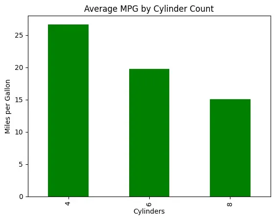
1. Bar Charts
Bar charts use rectangular bars to represent numerical values across different categories. The length or height of each bar indicates the magnitude of the data. Bars can be vertical or horizontal.
- **Applications: Comparing average miles per gallon (MPG) across different cylinder counts.
- **Advantages: Easy to read; effective for comparing multiple categories.
- **Disadvantages: Can be cluttered with too many categories; misleading if scales differ.
**Example:
Python `
import matplotlib.pyplot as plt import statsmodels.api as sm
df = sm.datasets.get_rdataset("mtcars").data
df.groupby("cyl")["mpg"].mean().plot(kind="bar", color="green") plt.title("Average MPG by Cylinder Count") plt.xlabel("Cylinders") plt.ylabel("Miles per Gallon") plt.show()
`
**Output:
Bar Chart
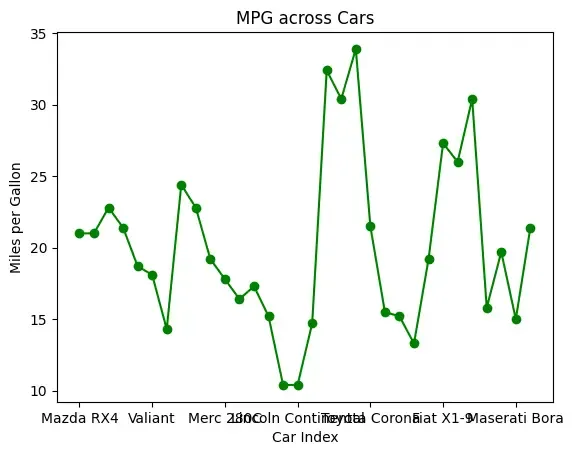
2. Line Charts
Line charts connect data points with lines across continuous intervals, such as time. They are ideal for displaying trends and patterns over time.
- **Applications: Showing MPG values across cars (index-wise).
- **Advantages: Clearly highlights trends over an ordered sequence.
- **Disadvantages: Not suitable for categorical data; can oversimplify complex patterns.
**Example:
Python `
df["mpg"].plot(kind="line", marker="o", color="green") plt.title("MPG across Cars") plt.xlabel("Car Index") plt.ylabel("Miles per Gallon") plt.show()
`
**Output:
Line Chart
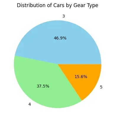
3. Pie Charts
Pie charts display data as proportional slices of a circle, representing each category’s contribution to the whole.
- **Applications: Showing distribution of cars by gear type.
- **Advantages: Intuitive and visually engaging; shows percentage contribution clearly.
- **Disadvantages: Difficult to interpret with many categories; slice comparisons may be imprecise.
**Example:
Python `
gear_counts = df["gear"].value_counts() gear_counts.plot(kind="pie", autopct="%1.1f%%", colors=[ "skyblue", "lightgreen", "orange"]) plt.title("Distribution of Cars by Gear Type") plt.ylabel("") plt.show()
`
**Output:
Pie chart
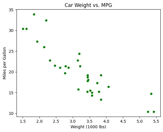
4. Scatter Plots
Scatter plots represent relationships between two numerical variables using points on a 2D plane. Patterns or correlations can be visually identified.
- **Applications: Examining relationship between car weight and MPG.
- **Advantages: Highlights correlations, clusters, and outliers effectively.
- **Disadvantages: Limited to two variables (unless using size/color to encode a third); not ideal for categorical comparisons.
**Example:
Python `
df.plot(kind="scatter", x="wt", y="mpg", c="green") plt.title("Car Weight vs. MPG") plt.xlabel("Weight (1000 lbs)") plt.ylabel("Miles per Gallon") plt.show()
`
**Output:
Scatter Plot
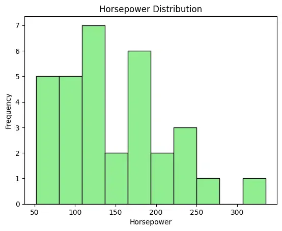
5. Histograms
Histograms display the distribution of continuous data by grouping values into intervals (bins). They help understand data frequency and spread.
- **Applications: Understanding horsepower distribution among cars.
- **Advantages: Shows distribution, peaks, and skewness clearly.
- **Disadvantages: Less effective for very small datasets; exact values within bins are not visible.
**Example:
Python `
df["hp"].plot(kind="hist", bins=10, color="lightgreen", edgecolor="black") plt.title("Horsepower Distribution") plt.xlabel("Horsepower") plt.show()
`
**Output:
Histogram
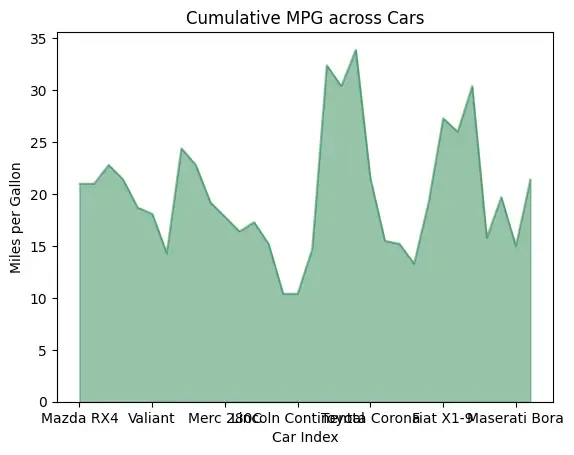
6. Area Charts
Area charts are line charts with the area beneath filled, emphasizing the magnitude of change over an ordered sequence.
- **Applications: Showing cumulative MPG across cars.
- **Advantages: Highlights cumulative trends; visually engaging.
- **Disadvantages: Can become cluttered with multiple series; less precise for exact values.
**Example:
Python `
df["mpg"].plot(kind="area", alpha=0.5, color="#2E8B57") plt.title("Cumulative MPG across Cars") plt.xlabel("Car Index") plt.ylabel("Miles per Gallon") plt.show()
`
**Output:
Area Chart
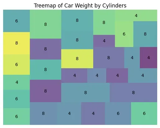
7. Treemaps
Treemaps display hierarchical data as nested rectangles, with size and color representing values. They are space-efficient and visually powerful for large datasets.
- **Applications: Visualizing car weights by cylinder counts.
- **Advantages: Efficient use of space; good for large datasets and proportions.
- **Disadvantages: Hard to compare exact values visually; layout influences interpretation.
**Example:
Python `
import squarify
sizes = df["wt"] labels = df["cyl"].astype(str)
squarify.plot(sizes=sizes, label=labels, alpha=0.7) plt.title("Treemap of Car Weight by Cylinders") plt.axis("off") plt.show()
`
**Output:
Treemap
Choosing the Right Chart
It is important to match the chart types with our data types and analysis goal.
| Chart Type | Goal/Purpose | When to Use |
|---|---|---|
| Bar Chart | Compare categories | Best for comparing values across groups, e.g., sales per region. |
| Pie Chart | Show proportions of a whole | Effective for displaying percentage distribution of categories. |
| Line Chart | Track trends over time | Ideal for monitoring patterns or changes, e.g., stock prices or website traffic. |
| Area Chart | Show cumulative totals | or monitoring patterns or changes, e.g., stock prices or website traffic. |
| Histogram | Analyze Distribution | Displays frequency of continuous variables, e.g., exam scores or income ranges. |
| Scatter Plot | Show correlation | Useful for identifying relationships, clusters, or outliers. |
| Treemap | Display hierarchical structure | Useful for showing nested categories and proportions efficiently. |