Types of Data Visualization Charts: From Basic to Advanced (original) (raw)
Last Updated : 16 Apr, 2026
Data visualization includes a variety of charts, each designed to present data in a clear and meaningful way. From simple bar and line charts to advanced visuals like heatmaps and scatter plots, the right chart helps turn raw data into useful insights.
Basic Charts for Data Visualization
Basic charts are best suited for displaying simple comparisons, trends over time and basic relationships within the data. These charts are easy to understand and ideal for communicating insights to a broad audience.
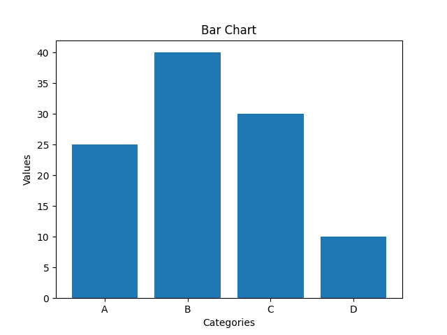
1. Bar Charts
Bar charts are used to compare values across different categories using rectangular bars. X-axis shows categories while Y-axis represents values. Common types include horizontal, stacked and grouped bar charts.
Below is the Example of Bar Chart:
Representation of Bar Chart
**When to Use:
- To compare different categories
- To rank values from highest to lowest
- To show relationships between multiple variables
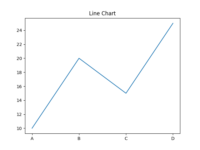
2. Line Charts
Line charts show how values change over time by connecting data points with lines. They help visualize trends like increases, decreases or stability.
Below is the example of line chart:
Representation of line chart
**When to Use:
- To track changes over time
- To compare trends across multiple data series
- For time series analysis
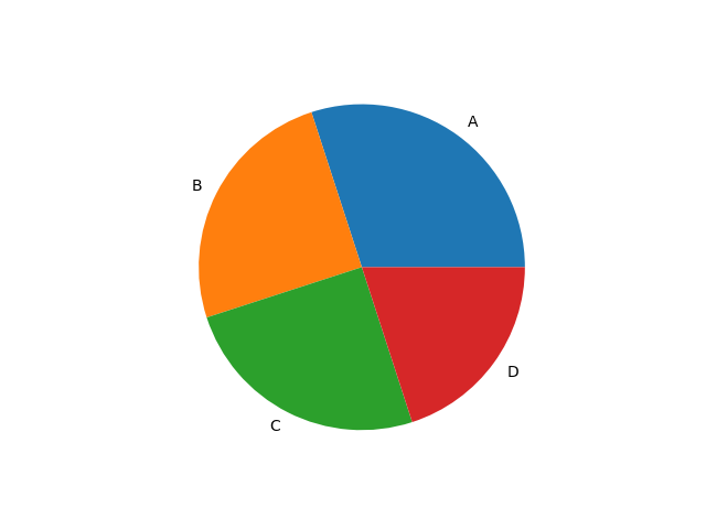
3. Pie Charts
Pie charts are round charts divided into slices, where each slice shows a part of the whole. The size of each slice represents its percentage.
Below is the example of pie chart:
Representation of pie chart
**When to Use:
- To show how different parts contribute to a whole
- To highlight a dominant category
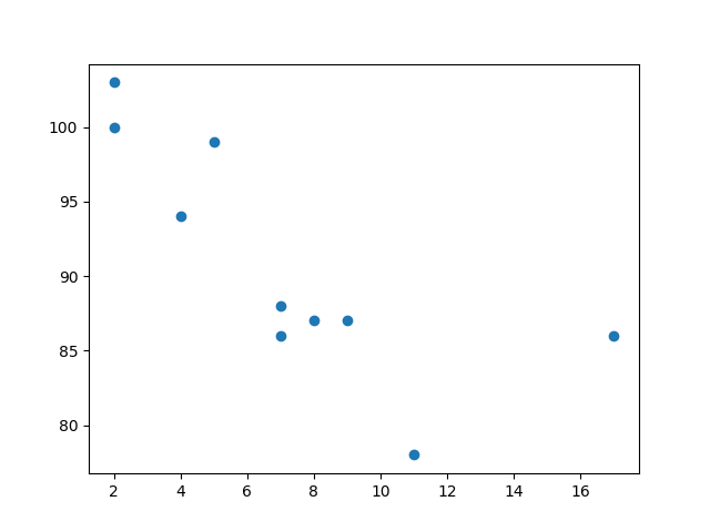
4. Scatter Chart (Plots)
Scatter charts use dots to show relationship between two numerical variables. X-axis shows the independent variable and Y-axis shows the dependent variable.
Below is the example of scatter chart:
Representation of Scatter Chart
**When to Use:
- To observe relationships between two variables
- To detect patterns, clusters or outliers in data
5. Histogram
A histogram displays the distribution of numerical data by grouping values into intervals (bins) and showing their frequency as bars. It helps reveal the shape, spread and patterns in the data.
Below is the example of histogram:
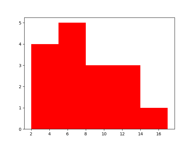
Representation of Histogram
**When to Use:
- To visualize the distribution of numerical data
- To explore patterns, trends and outliers
Advanced Charts for Data Visualization
Advanced charts are designed to handle more complex data. They help analyze multiple variables, uncover deeper insights and reveal patterns that might be missed with basic visuals.
1. Heatmap
A heatmap displays data in a matrix format using color to represent values. It's ideal for spotting patterns, correlations and variations in large datasets.
Below is the example of heatmap:
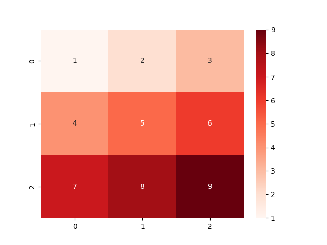
Representation of Heatmap
**When to Use:
- To identify clusters or groupings in data
- To visualize correlations between variables
- For risk analysis in fields like finance or network security
2. Area Chart
An area chart shows trends over time by filling the space beneath a line. It's ideal for visualizing time-series data and highlighting changes across periods.
Below is the example of area chart:
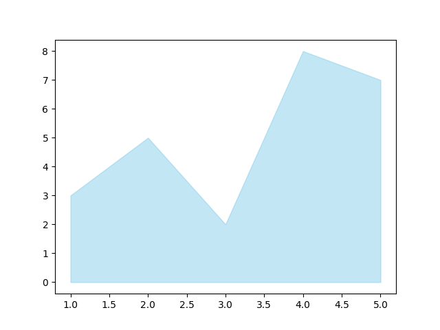
Representation of Area chart
**When to Use:
- To track changes or trends over time
- To compare multiple data series
- To highlight patterns like seasonality or cycles
3. Box Plot (Box-and-Whisker Plot)
A box plot displays distribution of numerical data, showing median, quartiles and outliers. It’s useful for understanding variability and detecting unusual values.
Below is the example of box plot:
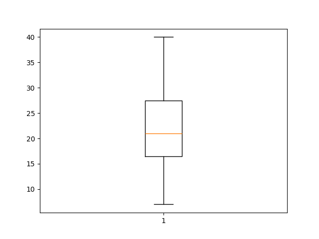
Representation of Box plot
**When to Use:
- To detect outliers in data
- To compare distributions across groups
- To visualize spread and variability
4. Bubble Chart
A bubble chart displays data points as circles, where size and color of each bubble represent additional variables. It’s useful for visualizing three or more dimensions in a single chart.
Below is the example of bubble chart:
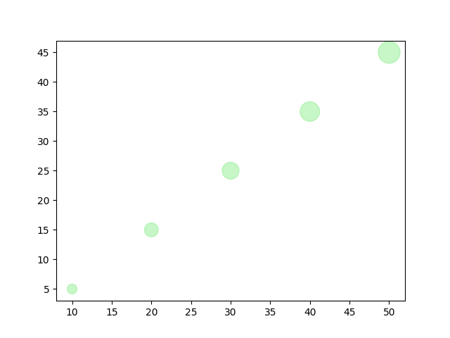
Representation of Bubble chart
**When to Use:
- To compare multiple variables at once
- To represent data using size and color
- To visualize relationships and detect patterns
5. Tree Map
A tree map visualizes hierarchical data using nested rectangles, where the size of each represents a value. It’s useful for showing structure and comparing proportions within a hierarchy.
Below is the example of tree map:
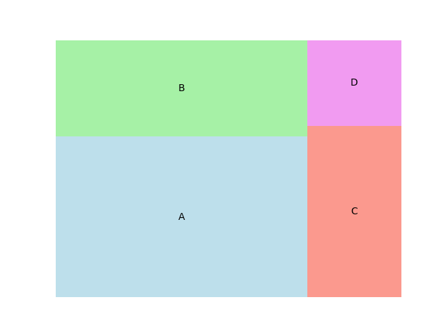
Representation of Tree map
**When to Use:
- To display hierarchical data
- To compare proportions within levels
- To visualize large datasets compactly
6. Parallel Coordinates
Parallel coordinates display multivariate data using lines that connect values across multiple axes. Each line represents a data point across several variables.
Below is the example of parallel coordinates:
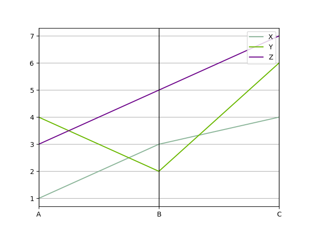
Representation of Parallel coordinates
**When to Use:
- To analyze multiple variables at once
- To visualize relationships or clusters
- To detect outliers in the data
7. Choropleth Map
A choropleth map uses color shading to represent data across geographic areas. It’s useful for showing differences like population density, income levels or disease spread across regions.
Below is the example of choropleth map:
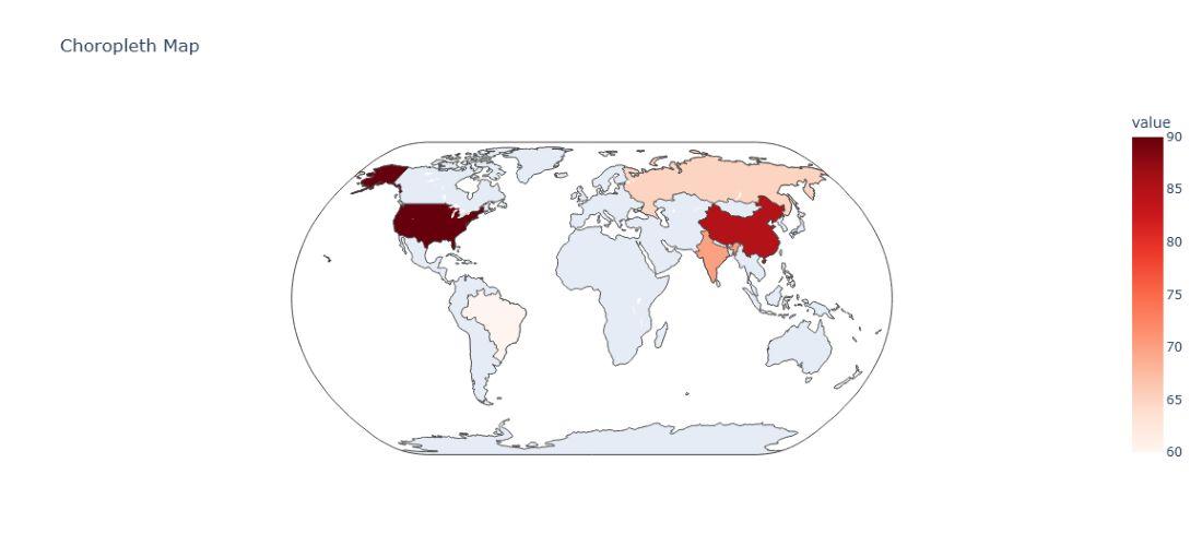
Representation of choropleth map
**When to Use:
- To compare data across locations
- To spot geographic patterns and trends
8. Sankey Diagram
A Sankey diagram shows the flow of data or resources between points (nodes) using arrows, where the width of each arrow represents the amount of flow. It's great for visualizing complex systems and spotting inefficiencies.
Below is the example of Sankey diagram:
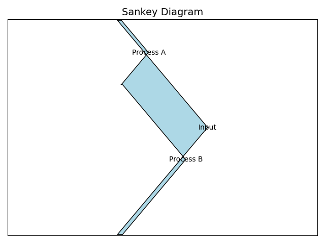
Representation of Sankey Diagram
**When to Use:
- Visualize Flows: Understand how resources move through a process.
- Find Bottlenecks: Identify points where flow slows or drops.
- Compare Scenarios: Track flow changes across time or conditions.
9. Radar Chart (Spider Chart)
A radar chart displays multivariate data using axes from a central point ideal for comparing variables across categories. Common in performance analysis, sports and decision-making.
Below is the example of Radar Chart:
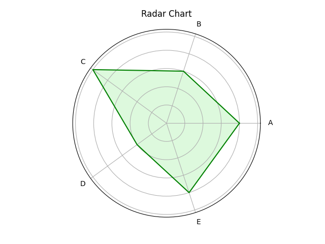
Representation of radar/spider chart
**When to Use:
- Multi-Criteria Comparison: Compare multiple variables at once.
- Strengths & Weaknesses: Visualize strong and weak areas.
- Pattern Recognition: Spot similarities or differences between categories.
10. Network Graph
A network graph shows relationships between entities as nodes and links (edges). It helps visualize complex networks like social media, transport routes or biological systems.
Below is the example of a network graph:
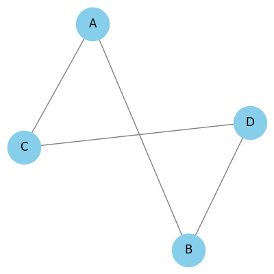
Representation of Network graph
**When to Use:
- Relationship Visualization: Helps show connections or interactions between entities.
- Community Detection: Useful to identify clusters or groups within a network.
- Path Analysis: Shows shortest or most efficient routes between nodes.
11. Donut or Doughnut chart
A donut chart is a circular chart like a pie chart but with a hole in the center. Each slice shows a category’s contribution to the whole, making it visually cleaner and ideal for comparisons.
Below is the example of a donut chart:
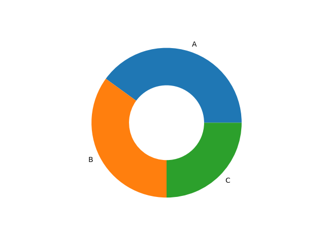
Representation of Donut Chart
**When to Use:
- Show part-to-whole relationships like sales or market share.
- Track progress toward a goal (e.g., 70% completed).
- Best when comparing a few categories.
12. Gauge Chart
A Gauge chart shows progress toward a goal using a dial-like arc, similar to a speedometer. It is useful for tracking a single value like a KPI or project status.
Below is the example of Gauge chart:
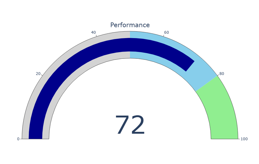
Representation of Gauge Chart
**When to Use:
- To monitor key metrics (e.g., sales, satisfaction) toward targets
- In KPI dashboards to track progress
- For project status tracking against deadlines
13. Sunburst Chart
A sunburst chart shows hierarchical data as nested rings. Each ring represents a level in the hierarchy making it useful for visualizing multi-level data structures like categories, subcategories or organizational hierarchies.
Below is the example of sunburst chart:
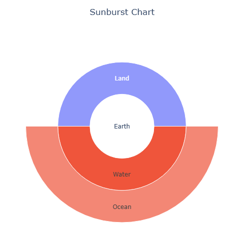
Representation of Sunburst Chart
**When to Use:
- To visualize hierarchical structures like org charts or file systems.
- To explore proportions and relationships within nested datasets.
- To simplify complex data in a clean, interactive layout.
14. Hexbin Plot
A hexbin plot groups points into hexagonal bins and colors them by how many points fall in each bin. It’s useful for large datasets to show density clearly without overplotting.
Below is the example of a hexbin plot:
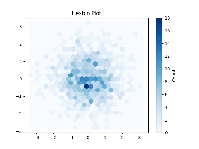
Representation of Hexbin Plot
**When to Use:
- To show data density in a 2D space.
- To spot clusters or patterns in large scatter data.
- To manage overlapping points in big datasets visually.
15. Violin Plot
A violin plot combines a box plot and a density plot to show distribution and summary statistics of data. It helps visualize the shape, spread and center of the data across categories.
Below is the example of violin plot:
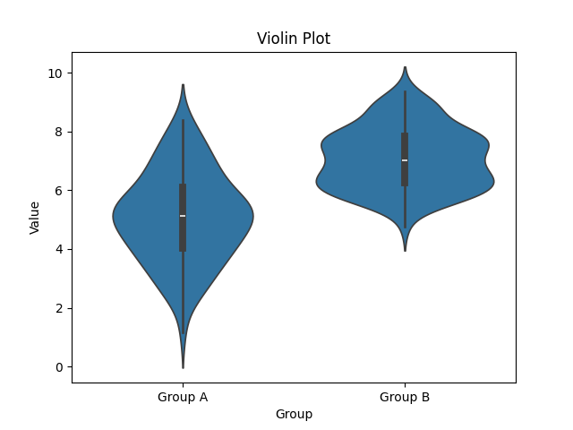
Representation of Violin plot
**When to Use:
- Compare distribution of continuous data across groups.
- Visualize data shape, spread, skewness or multimodal patterns.
- Highlight detailed distribution and outliers in a clean layout.
Visualization Charts for Textual and Symbolic data
Visualizing textual and symbolic data reveals patterns, frequency and relationships in non-numeric info like words, labels or icons. It focuses on how often items appear and how they relate to each other.
1. Word Cloud
A word cloud visually displays words sized by their frequency in a text, common words appear larger. It helps quickly identify key terms or themes in text data.
Below is the example of a word cloud:
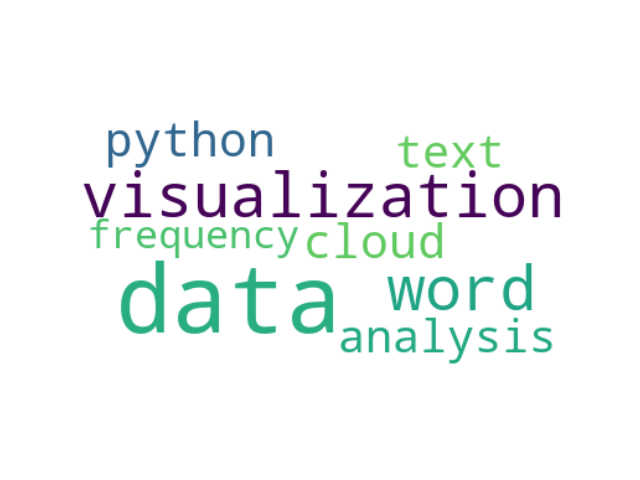
Representation of Word cloud
**When to use:
- To highlight key themes or topics in large text data.
- To visualize word frequency in text analysis.
- To emphasize important terms in qualitative or sentiment analysis.
2. Pictogram Chart
A pictogram chart uses icons or symbols to visually represent data. The number or size of icons reflects the value. It’s helpful for showing qualitative or categorical data in a simple way.
Below is the example of network graph:
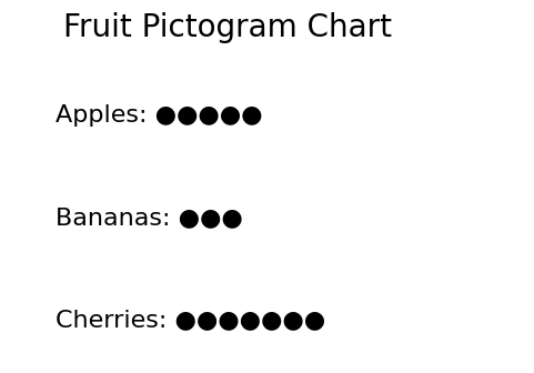
Representation of Pictogram Chart
**When to use:
- To present data using symbols, especially for non-numeric info.
- To communicate with audiences of all literacy levels.
- To highlight key trends using clear, recognizable icons.
Temporal and Trend Charts Data Visualization
Temporal and Trend Charts help visualize how data changes over time. They're ideal for time-series data where each point represents a moment. These charts reveal trends, patterns and fluctuations clearly.
1. Streamgraph
A streamgraph displays changes in data over time using flowing, stacked areas. It shows how different categories contribute to the whole across time.
Below is the example of streamgraph:
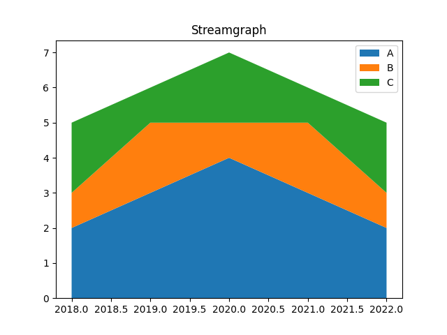
Representation of Streamgraph
**When to Use:
- To show trends and changes in category distribution over time
- To compare the size of different groups over time
- To highlight patterns in a smooth and visually appealing way
2. Bullet Graph
A bullet graph is a variant of a bar chart but it includes markers and reference lines to show progress toward a goal. It's useful for tracking performance against a target.
Below is the example of bullet graph:
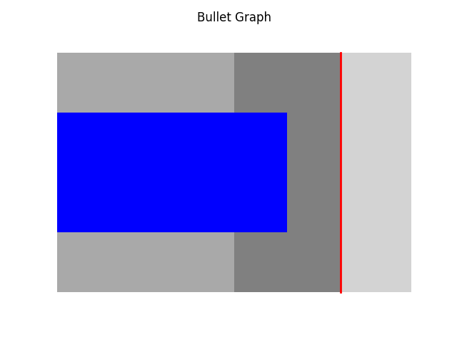
Representation of Bullet graph
**When to use:
- Show progress toward goals clearly and quickly.
- Compare actual performance with targets.
- Communicate key metrics in dashboards or reports.
3. Gantt Chart
A Gantt chart uses horizontal bars to show project tasks over time. It helps in planning, scheduling and tracking progress visually.
Below is the example of Gantt chart:
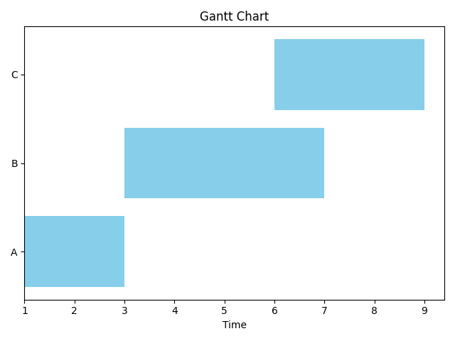
Represenatation of Gantt Chart
**When to use:
- Plan and schedule tasks with dependencies.
- Track progress and resource use over time.
- Communicate timelines and milestones clearly.
4. Waterfall Chart
A waterfall chart shows how positive and negative values affect a total over time. It’s useful for tracking changes in financial data, budgets or performance metrics.
Below is an example of a Waterfall chart:
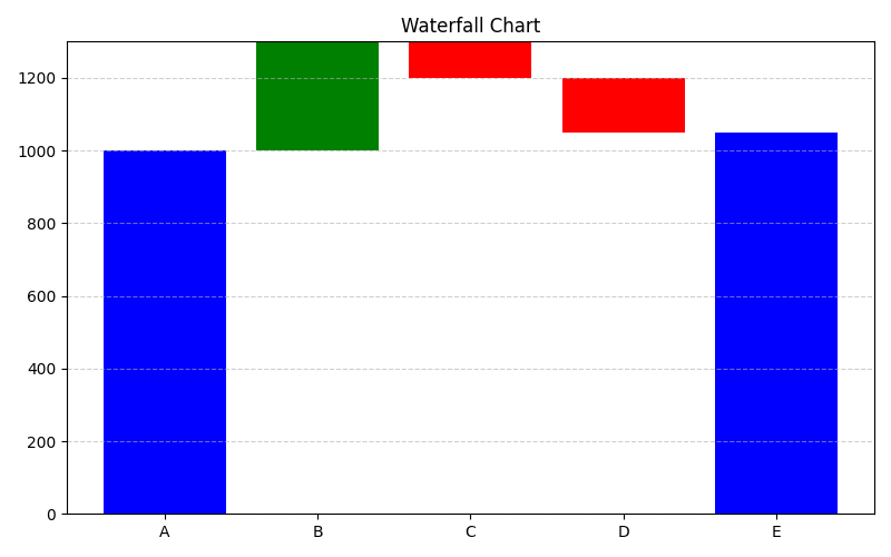
Representation
**When to Use:
- Analyze step-by-step gains or losses over time.
- Understand the impact of different factors on totals.
- Present complex changes clearly and visually.
**Related Articles: