How can Tensorflow be used with abalone dataset to build a sequential model? (original) (raw)
Last Updated : 23 Jul, 2025
In this article, we will learn how to build a sequential model using TensorFlow in Python to predict the age of an abalone. We may wonder what is an abalone. Answer to this question is that it is a kind of snail. Generally, the age of an Abalone is determined by the physical examination of the abalone but this is a boring task which is why we will try to build a regressor that can predict the age of abalone using some features which are easy to determine. We can download the abalone dataset from here.
Importing Libraries and Dataset
Python libraries make it easy for us to handle the data and perform typical and complex tasks with a single line of code.
- **Pandas - This library helps to load the data frame in a 2D array format and has multiple functions to perform analysis tasks in one go.
- **Numpy - Numpy arrays are very fast and can perform large computations in a very short time.
- **Matplotlib****/****Seaborn - This library is used to draw visualizations.
- **Sklearn - This module contains multiple libraries are having pre-implemented functions to perform tasks from data preprocessing to model development and evaluation. Python `
import numpy as np import pandas as pd import seaborn as sb import matplotlib.pyplot as plt
from sklearn.model_selection import train_test_split from sklearn.preprocessing import StandardScaler import tensorflow as tf from tensorflow import keras from keras import layers from tensorflow.keras.models import Sequential from tensorflow.keras.layers import Dense, Dropout, BatchNormalization import warnings warnings.filterwarnings('ignore')
`
Loading and Exploring the Dataset
df.head(): Displays the first few rows of the dataset to inspect the data and ensure it's loaded correctly.df.info(): Provides a summary of the DataFrame, showing the data types and non-null counts.df.describe().T: Generates descriptive statistics for the numerical columns in the dataset. Python `
column_names = ['Sex', 'Length', 'Diameter', 'Height', 'WholeWeight', 'ShuckedWeight', 'VisceraWeight', 'ShellWeight', 'Rings']
df = pd.read_csv('/content/abalone (1).zip', names=column_names) df.head()
`
**Output:
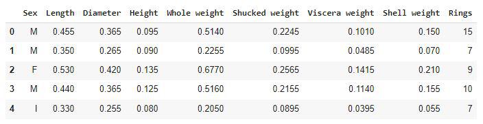
First five rows of the dataset
In this ring's feature is actually the age of the abalone. It can be calculated by adding 1.5 to the number of rings present in the abalone shell.
Python `
df.shape
`
**Output:
(4177, 9)
Let's check which column of the dataset contains which type of data.
Python `
df.info()
`
**Output:

Information on the column's data type
Checking some descriptive statistical measures of the dataset will help us to understand the distribution of the height and weight of an abalone.
Python `
df.describe().T
`
**Output:
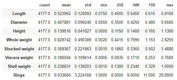
Descriptive statistical measures of the dataset
Exploratory Data Analysis
**EDA is an approach to analyzing the data using visual techniques. It is used to discover trends, and patterns, or to check assumptions with the help of statistical summaries and graphical representations.
df.isnull().sum(): Checks if there are any missing values in the dataset.df['Sex'].value_counts(): Counts the number of occurrences for each unique value in the 'Sex' column.plt.pie(values, labels=labels, autopct='%1.1f%%'): Creates a pie chart to visualize the distribution of values in the 'Sex' column, showing the percentage representation of each category.df.loc[:, 'Length':'ShellWeight'].columns: Defines the features (columns) to be plotted against the target variable 'Rings'.plt.subplots(figsize=(20, 10)): Initializes the plotting area with a specific size for the scatter plots.sb.scatterplot: Creates scatter plots to visualize the relationship between each feature and the target ('Rings'), colored by the 'Sex' column.LabelEncoder(): Initializes the LabelEncoder, which is used to convert categorical variables (like 'Sex') into numerical format.le.fit_transform(df['Sex']): Encodes the 'Sex' column into numerical values (0 for male, 1 for female).X_train.shape, X_val.shape: Displays the shape (number of rows and columns) of the training and validation sets to confirm the split. Python `
df.isnull().sum()
`
**Output:
Sex 0
Length 0
Diameter 0
Height 0
Whole weight 0
Shucked weight 0
Viscera weight 0
Shell weight 0
Rings 0
dtype: int64
Now let's check the distribution of the data in male, female and infant.
Python `
x = df['Sex'].value_counts() labels = x.index values = x.values plt.pie(values, labels=labels, autopct='%1.1f%%') plt.show()
`
**Output:
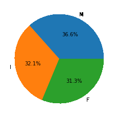
Pie chart for the distribution of sex
We can say that we have been provided with an equal amount of data for Male female and Infant abalone.
Python `
df.groupby('Sex').mean()
`
**Output:
Above is an interesting observation that the life expectancy of the female abalone is higher than that of the male abalone. In the other features as well we can see that the height weight, as well as length in all the attributes of the numbers for female abalones, is on the higher sides.
Python `
features = df.loc[:, 'Length':'ShellWeight'].columns
Scatter plots
plt.subplots(figsize=(20, 10)) for i, feat in enumerate(features): plt.subplot(2, 4, i+1) sb.scatterplot(data=df, x=feat, y='Rings', hue='Sex')
plt.show()
`
**Output:
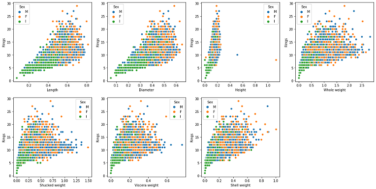
Scatterplot of Features v/s Ring
Observations from the above graph are as follows:
- A strong linear correlation between the age of the abalone and its height can be observed from the above graphs.
- Length and Diameter have the same kind of relation with age that is up to a certain age length increases and after that it became constant. A similar kind of relationship is present between the weight and the age feature. Python `
plt.subplots(figsize=(20, 10)) for i, feat in enumerate(features): plt.subplot(2, 4, i+1) sb.violinplot(data=df, x=feat, hue='Sex')
plt.subplot(2, 4, 8) sb.violinplot(data=df, x='Rings', hue='Sex') plt.show()
`
**Output:
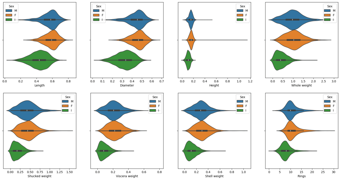
Violin plot of Features to visualize the distribution
Now we will separate the features and target variables and split them into training and validation data using which we will evaluate the performance of the model on the validation data.
Python `
from sklearn.model_selection import train_test_split
Features and target separation
features = df.drop('Rings', axis=1) target = df['Rings']
Split the data into training and validation sets (80% train, 20% validation)
X_train, X_val, y_train, y_val = train_test_split(features, target, test_size=0.2, random_state=22)
Check the shape of the training and validation sets
X_train.shape, X_val.shape
`
**Output:
((3341, 8), (836, 8))
Model Architecture
We will implement a **Sequential model which will contain the following parts:
- We will have two fully connected layers.
- We have included some **BatchNormalization layers to enable stable and fast training and a **Dropout layer before the final layer to avoid any possibility of overfitting.
Below we have the code explaination:
Sequential(): Initializes the model as a sequence of layers.Dense(256): Adds a fully connected layer with 256 neurons and ReLU activation function.BatchNormalization(): Adds batch normalization to stabilize the training process.Dropout(0.3): Adds dropout to prevent overfitting by randomly disabling 30% of neurons during training.model.compile(): Compiles the model using the Adam optimizer, mean squared error loss and includes evaluation metrics like mean absolute error (MAE) and mean absolute percentage error (MAPE).model.summary(): Displays the architecture of the model.model.fit(): Trains the model on the scaled training data (X_train_scaled), using the target variable (y_train). Model runs for 50 epochs with a batch size of 64. Validation data is passed for evaluation after each epoch.model.evaluate(): Evaluates the model on the validation data (X_val_scaledandy_val), and returns the loss, mean absolute error (MAE) and mean absolute percentage error (MAPE). Python `
model = Sequential()
model.add(Dense(256, input_dim=X_train_scaled.shape[1], activation='relu')) model.add(BatchNormalization()) model.add(Dropout(0.3))
model.add(Dense(256, activation='relu'))
model.add(BatchNormalization())
model.add(Dropout(0.3))
model.add(Dense(1))
model.compile(optimizer='adam', loss='mse', metrics=['mae', 'mape'])
model.summary()
`
While compiling a model we provide these three essential parameters:
- **optimizer – This is the method that helps to optimize the cost function by using gradient descent.
- **loss – The loss function by which we monitor whether the model is improving with training or not.
- **metrics – This helps to evaluate the model by predicting the training and the validation data. Python `
model.summary()
`
**Output:
Model: "sequential_15"
_________________________________________________________________
Layer (type) Output Shape Param #
=================================================================
dense (Dense) (None, 256) 2304batch_normalization (BatchN (None, 256) 1024
ormalization)dense_1 (Dense) (None, 256) 65792
dropout (Dropout) (None, 256) 0
batch_normalization_1 (Batc (None, 256) 1024
hNormalization)dense_2 (Dense) (None, 1) 257
=================================================================
Total params: 70,401
Trainable params: 69,377
Non-trainable params: 1,024
_________________________________________________________________
Now we will train our model.
Python `
history = model.fit(X_train_scaled, y_train, epochs=50, batch_size=64, validation_data=(X_val_scaled, y_val)) loss, mae, mape = model.evaluate(X_val_scaled, y_val) print(f"Validation Loss: {loss}, MAE: {mae}, MAPE: {mape}")
`
**Output:
Epoch 46/50
53/53 [==============================] - 0s 7ms/step - loss: 1.5060 - mape: 14.9777 - val_loss: 1.5403 - val_mape: 14.0747
Epoch 47/50
53/53 [==============================] - 0s 7ms/step - loss: 1.4989 - mape: 14.6385 - val_loss: 1.5414 - val_mape: 14.2294
Epoch 48/50
53/53 [==============================] - 0s 6ms/step - loss: 1.4995 - mape: 14.8053 - val_loss: 1.4832 - val_mape: 14.1244
Epoch 49/50
53/53 [==============================] - 0s 6ms/step - loss: 1.4951 - mape: 14.5988 - val_loss: 1.4735 - val_mape: 14.2099
Epoch 50/50
53/53 [==============================] - 0s 7ms/step - loss: 1.5013 - mape: 14.7809 - val_loss: 1.5196 - val_mape: 15.0205
Let’s visualize the training and validation mae and mape with each epoch.
Python `
hist_df=pd.DataFrame(history.history) hist_df.head()
`
**Output:
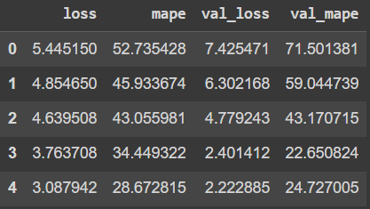
visualize the training and validation mae and mape with each epoch
Python `
plt.figure(figsize=(12, 6)) hist_df['loss'].plot(label='Training Loss') hist_df['val_loss'].plot(label='Validation Loss') plt.title('Loss vs Validation Loss') plt.xlabel('Epochs') plt.ylabel('Loss') plt.legend() plt.show()
`
**Output:
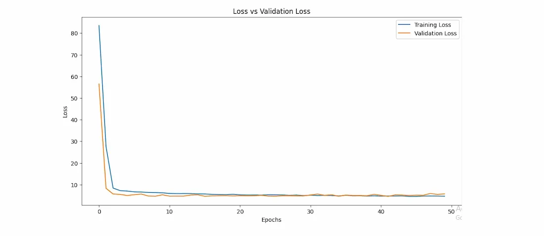
Loss v/s val_loss curve of model training
Python `
plt.figure(figsize=(12, 6)) hist_df['mape'].plot(label='Training MAPE') hist_df['val_mape'].plot(label='Validation MAPE') plt.title('MAPE vs Validation MAPE') plt.xlabel('Epochs') plt.ylabel('MAPE') plt.legend() plt.show()
`
**Output:
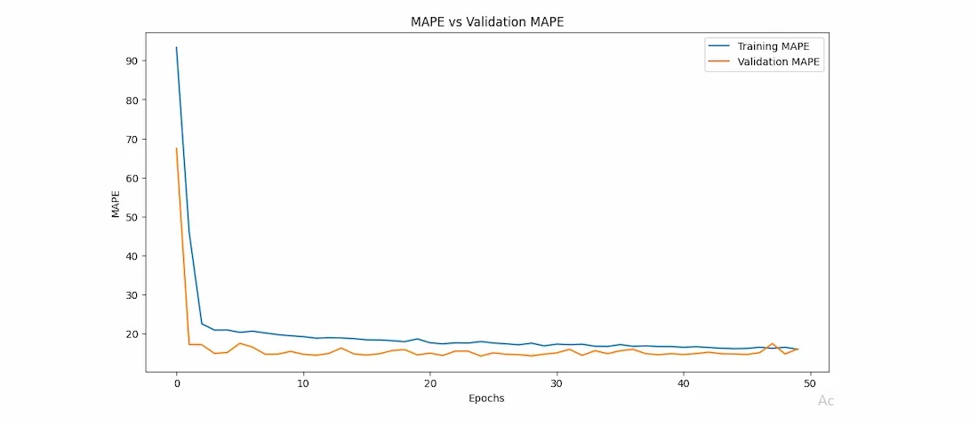
mape v/s val_mape curve of model training
From the above two graphs, we can certainly say that the two(mae and mape) error values have decreased simultaneously and continuously. Also, the saturation has been achieved after 15 epochs only.
You can download the source code from here: