ExpectationMaximization Algorithm ML (original) (raw)
Expectation-Maximization Algorithm - ML
Last Updated : 2 May, 2026
The Expectation-Maximization (EM) algorithm is an iterative optimization technique used to estimate unknown parameters in probabilistic models, particularly when the data is incomplete, noisy or contains hidden (latent) variables. It works in two steps:
- **E-step (Expectation Step): Using the current parameter estimates, the algorithm calculates the expected values of the missing or hidden variables. Essentially, it assigns probabilities or "responsibilities" to different hidden outcomes given the observed data.
- **M-step (Maximization Step): With these updated expectations from the E-step, the algorithm then re-estimates the model parameters by maximizing the expected log-likelihood. This improves how well the model explains the observed data.

Expectation and Maximization in EM Algorithm
These two steps are repeated until convergence, which typically means that:
- The parameter values stop changing significantly or
- The log-likelihood improves only by a negligible amount.
By iteratively repeating these steps the EM algorithm seeks to maximize the likelihood of the observed data.
Key Concepts
Lets understand about some of the most commonly used key terms in the Expectation-Maximization (EM) Algorithm:
- **Latent Variables: Variables that are not directly observed but are inferred from the data. They represent hidden structure (e.g., cluster assignments in Gaussian Mixture Models).
- **Likelihood: The probability of the observed data given a set of model parameters. EM aims to find parameter values that maximize this likelihood.
- **Log-Likelihood: The natural logarithm of the likelihood function. It simplifies calculations (turning products into sums) and is numerically more stable when dealing with very small probabilities.
- **Maximum Likelihood Estimation (MLE): A statistical approach to estimating parameters by choosing the values that maximize the likelihood of observing the given data. EM extends MLE to cases with hidden or missing variables.
- **Posterior Probability: In Bayesian inference, this represents the probability of parameters (or latent variables) given the observed data and prior knowledge. In EM, posterior probabilities are used in the E-step to estimate the "responsibility" of each hidden variable.
- **Convergence: The stopping criterion for the iterative process. EM is said to converge when updates to parameters or improvements in log-likelihood become negligibly small, meaning the algorithm has reached a stable solution.
Working
Here's a step-by-step breakdown of the process:
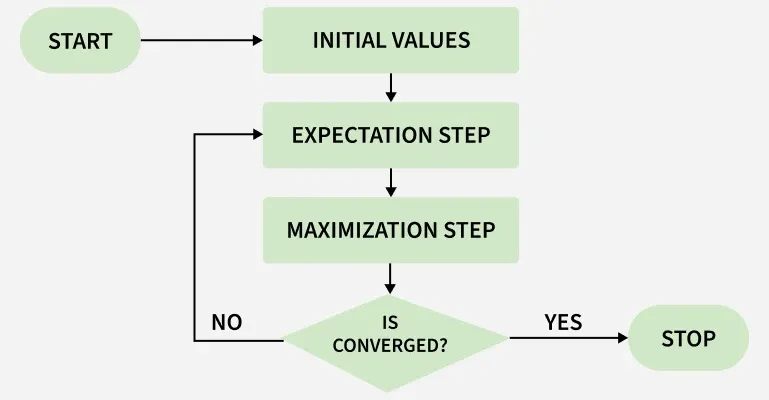
EM Algorithm Flowchart
**1. Initialization: The algorithm starts with initial parameter values and assumes the observed data comes from a specific model.
**2. E-Step (Expectation Step):
- Find the missing or hidden data based on the current parameters.
- Calculate the posterior probabilities (responsibilities) of the latent variables based on the observed data and current parameter estimates.
**3. M-Step (Maximization Step):
- Update the model parameters by maximize the log-likelihood.
- The better the model the higher this value.
**4. Convergence:
- Check if the model parameters are stable and converging.
- If the changes in log-likelihood or parameters are below a set threshold, stop. If not repeat the E-step and M-step until convergence is reached
Implementation of Expectation-Maximization Algorithm
Step 1 : Import the necessary libraries
First we will import the necessary Python libraries like NumPy, Seaborn, Matplotlib and SciPy.
Python `
import numpy as np import seaborn as sns import matplotlib.pyplot as plt from scipy.stats import norm, gaussian_kde
`
Step 2 : Generate a dataset with two Gaussian components
We generate two sets of data values from two different normal distributions:
- One centered around 2 (with more spread).
- Another around -1 (with less spread).
These two sets are then combined to form a single dataset. We plot this dataset to visualize how the values are distributed.
Python `
mu1, sigma1 = 2, 1 mu2, sigma2 = -1, 0.8
X1 = np.random.normal(mu1, sigma1, size=200) X2 = np.random.normal(mu2, sigma2, size=600) X = np.concatenate([X1, X2])
sns.kdeplot(X) plt.xlabel('X') plt.ylabel('Density') plt.title('Density Estimation of X') plt.show()
`
**Output:
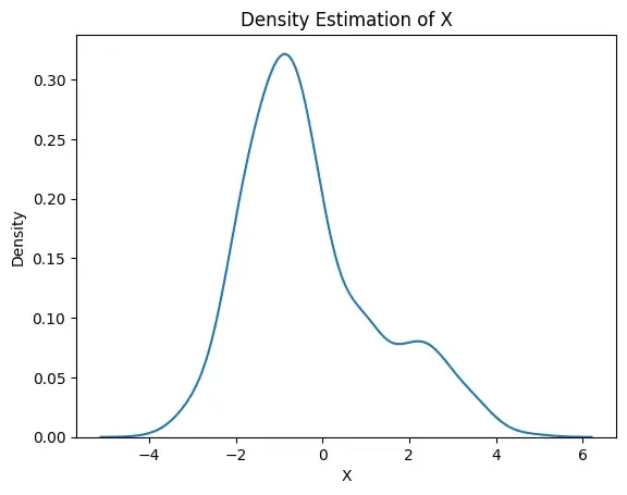
Density Plot
Step 3: Initialize parameters
We make initial guesses for each group’s:
- Mean (average),
- Standard deviation (spread),
- Proportion (how much each group contributes to the total data). Python `
mu1_hat, sigma1_hat = np.mean(X1), np.std(X1) mu2_hat, sigma2_hat = np.mean(X2), np.std(X2) pi1_hat, pi2_hat = len(X1) / len(X), len(X2) / len(X)
`
Step 4: Perform EM algorithm
We run a loop for 20 rounds called epochs. In each round:
- The E-step calculates the responsibilities (gamma values) by evaluating the Gaussian probability densities for each component and weighting them by the corresponding proportions.
- The M-step updates the parameters by computing the weighted mean and standard deviation for each component
We also calculate the log-likelihood in each round to check if the model is getting better. This is a measure of how well the model explains the data.
Python `
num_epochs = 20 log_likelihoods = []
for epoch in range(num_epochs): gamma1 = pi1_hat * norm.pdf(X, mu1_hat, sigma1_hat) gamma2 = pi2_hat * norm.pdf(X, mu2_hat, sigma2_hat) total = gamma1 + gamma2 gamma1 /= total gamma2 /= total
mu1_hat = np.sum(gamma1 * X) / np.sum(gamma1)
mu2_hat = np.sum(gamma2 * X) / np.sum(gamma2)
sigma1_hat = np.sqrt(np.sum(gamma1 * (X - mu1_hat)**2) / np.sum(gamma1))
sigma2_hat = np.sqrt(np.sum(gamma2 * (X - mu2_hat)**2) / np.sum(gamma2))
pi1_hat = np.mean(gamma1)
pi2_hat = np.mean(gamma2)

log_likelihood = np.sum(np.log(pi1_hat * norm.pdf(X, mu1_hat, sigma1_hat)
                               + pi2_hat * norm.pdf(X, mu2_hat, sigma2_hat)))
log_likelihoods.append(log_likelihood)
plt.plot(range(1, num_epochs + 1), log_likelihoods) plt.xlabel('Epoch') plt.ylabel('Log-Likelihood') plt.title('Log-Likelihood vs. Epoch') plt.show()
`
**Output:
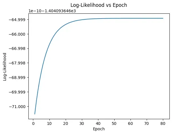
Epoch vs. Log-Likelihood Plot
Step 5: Visualize the Final Result
Now we will finally visualize the curve which compare the final estimated curve (in red) with the original data’s smooth curve (in green).
Python `
X_sorted = np.sort(X) density_estimation = (pi1_hat * norm.pdf(X_sorted, mu1_hat, sigma1_hat) + pi2_hat * norm.pdf(X_sorted, mu2_hat, sigma2_hat))
plt.plot(X_sorted, gaussian_kde(X_sorted)( X_sorted), color='green', linewidth=2) plt.plot(X_sorted, density_estimation, color='red', linewidth=2) plt.xlabel('X') plt.ylabel('Density') plt.title('Final Density Estimation') plt.legend(['Kernel Density Estimation', 'Mixture Density']) plt.show()
`
**Output:
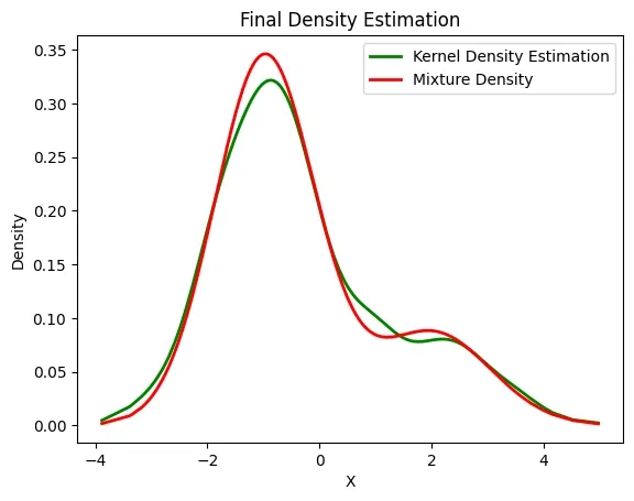
Estimated Density
The above image compares Kernel Density Estimation (green) and Mixture Density (red) for variable X. Both show similar patterns with a main peak near -1.5 and a smaller bump around 2 indicate two data clusters. The red curve is slightly smoother and sharper than the green one.
Applications
- **Clustering: Used in Gaussian Mixture Models (GMMs) to assign data points to clusters probabilistically.
- **Missing Data Imputation: Helps fill in missing values in datasets by estimating them iteratively.
- **Image Processing: Applied in image segmentation, denoising and restoration tasks where pixel classes are hidden.
- **Natural Language Processing (NLP): Used in tasks like word alignment in machine translation and topic modeling (LDA).
- **Hidden Markov Models (HMMs): EM’s variant, the Baum-Welch algorithm, estimates transition/emission probabilities for sequence data.
Advantages
- **Monotonic improvement: Each iteration increases (or at least never decreases) the log-likelihood.
- **Handles incomplete data well: Works effectively even with missing or hidden variables.
- **Flexibility: Can be applied to many probabilistic models, not just mixtures of Gaussians.
- **Easy to implement: The E-step and M-step are conceptually simple and often have closed-form updates.
Limitations
- **Slow convergence: Convergence can be very gradual, especially near the optimum.
- **Initialization sensitive: Requires good initial parameter guesses; poor choices may yield bad solutions.
- **No guarantee of global best solution: Unlike some optimization methods, EM doesn’t guarantee reaching the absolute best parameters.
- **Computationally intensive: For large datasets or complex models, repeated iterations can be costly.