scatterhistogram - Create scatter plot with histograms - MATLAB (original) (raw)
Create scatter plot with histograms

Syntax
Description
scatterhistogram([tbl](#mw%5F08f23dbe-f89e-495f-a78a-7256be0908f5),[xvar](#mw%5F2c1aab4d-eba1-4d8b-bc05-3bedcb1f910c),[yvar](#mw%5F397f90f3-8b5a-4fba-9280-c527e40974d0)) creates a scatter plot with marginal histograms from the table tbl. The xvar input indicates the table variable to display along the_x_-axis. The yvar input indicates the table variable to display along the _y_-axis.
scatterhistogram([tbl](#mw%5F08f23dbe-f89e-495f-a78a-7256be0908f5),[xvar](#mw%5F2c1aab4d-eba1-4d8b-bc05-3bedcb1f910c),[yvar](#mw%5F397f90f3-8b5a-4fba-9280-c527e40974d0),'GroupVariable',[grpvar](#mw%5F9217d53b-8de6-4511-9a42-56d29f594aff)) uses the table variable specified by grpvar to group observations specified by xvar and yvar.
scatterhistogram([xvalues](#mw%5F33b3ba2a-ccfc-4384-84b9-8319ef460236),[yvalues](#mw%5Fccd8392b-693f-40d9-beae-05f0b93aa758)) creates a scatter plot of the data in xvalues andyvalues and displays the marginal histograms for thexvalues and yvalues data along the_x_-axis and _y_-axis, respectively.
scatterhistogram([xvalues](#mw%5F33b3ba2a-ccfc-4384-84b9-8319ef460236),[yvalues](#mw%5Fccd8392b-693f-40d9-beae-05f0b93aa758),'GroupData',[grpvalues](#mw%5Ffe77f0c1-5d89-419f-a1cf-d479ae5b850d)) uses the data in grpvalues to group the data inxvalues and yvalues.
scatterhistogram(___,[Name,Value](#namevaluepairarguments)) specifies additional options for the scatter plot with marginal histograms using one or more name-value pair arguments. Specify the options after all other input arguments. For a list of properties, see ScatterHistogramChart Properties.
scatterhistogram([parent](#mw%5Fd347fffb-ee94-46d3-8c2e-4c9bd265a596%5Fsep%5Fmw%5F58c53d12-c3c1-4fe8-b606-f6a109982a64),___) creates the scatter plot with marginal histograms in the figure, panel, or tab specified by parent.
Examples
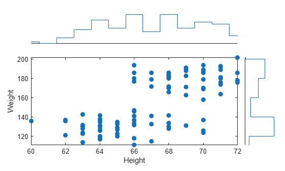
Create a scatter plot with marginal histograms from a table of data for medical patients.
Load the patients data set and create a table from a subset of the variables loaded into the workspace. Then, create a scatter histogram chart comparing the Height values to the Weight values.
load patients tbl = table(LastName,Age,Gender,Height,Weight); s = scatterhistogram(tbl,'Height','Weight');
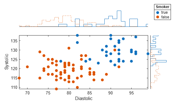
Using the patients data set, create a scatter plot with marginal histograms and specify the table variable to use for grouping the data.
Load the patients data set and create a scatter histogram chart from the data. Compare the patients' Systolic and Diastolic values. Group the data according to the patients' smoker status by setting the 'GroupVariable' name-value pair argument to 'Smoker'.
load patients tbl = table(LastName,Diastolic,Systolic,Smoker); s = scatterhistogram(tbl,'Diastolic','Systolic','GroupVariable','Smoker');
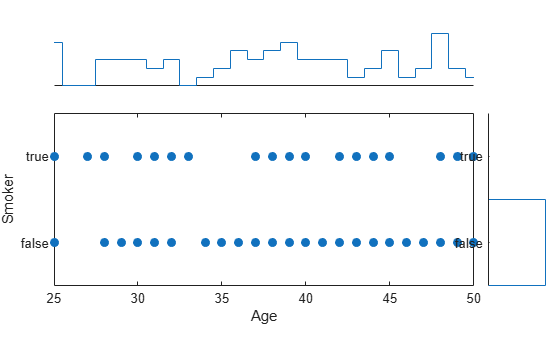
Use a scatter plot with marginal histograms to visualize categorical and numeric medical data.
Load the patients data set, and convert the Smoker data to a categorical array. Then, create a scatter histogram chart that compares patients' Age values to their smoker status. The resulting scatter plot contains overlapping data points. However, the _y_-axis marginal histogram indicates that there are far more nonsmokers than smokers in the data set.
load patients Smoker = categorical(Smoker); s = scatterhistogram(Age,Smoker); xlabel('Age') ylabel('Smoker')
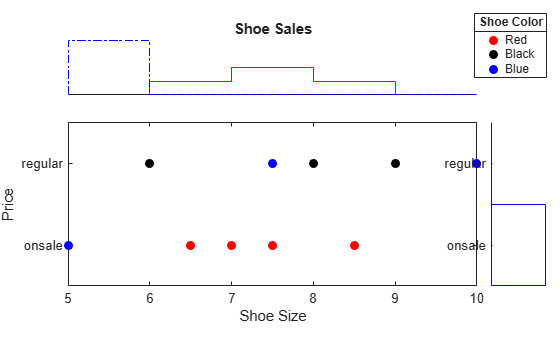
Create a scatter plot with marginal histograms using arrays of shoe data. Group the data according to shoe color, and customize properties of the scatter histogram chart.
Create arrays of data. Then, create a scatter histogram chart to visualize the data. Use custom labels along the _x_-axis and _y_-axis to specify the variable names of the first two input arguments. You can specify the title, axis labels, and legend title by setting properties of the ScatterHistogramChart object.
xvalues = [7 6 5 6.5 9 7.5 8.5 7.5 10 8]; yvalues = categorical({'onsale','regular','onsale','onsale', ... 'regular','regular','onsale','onsale','regular','regular'}); grpvalues = {'Red','Black','Blue','Red','Black','Blue','Red', ... 'Red','Blue','Black'}; s = scatterhistogram(xvalues,yvalues,'GroupData',grpvalues);
s.Title = 'Shoe Sales'; s.XLabel = 'Shoe Size'; s.YLabel = 'Price'; s.LegendTitle = 'Shoe Color';
Change the colors in the scatter histogram chart to match the group labels. Change the histogram bin widths to be the same for all groups.
s.Color = {'Red','Black','Blue'}; s.BinWidths = 1;
Create a scatter plot with marginal histograms. Specify the number of bins and line widths of the histograms, the location of the scatter plot, and the legend visibility.
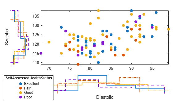
Load the patients data set and create a scatter histogram chart from the data. Compare the patients' Diastolic and Systolic values, and group the data according to the patients' SelfAssessedHealthStatus values. Adjust the histograms by specifying the NumBins and LineWidth options. Place the scatter plot in the 'NorthEast' location of the figure by using the ScatterPlotLocation option. Ensure the legend is visible by specifying the LegendVisible option as 'on'.
load patients tbl = table(LastName,Diastolic,Systolic,SelfAssessedHealthStatus); s = scatterhistogram(tbl,'Diastolic','Systolic','GroupVariable','SelfAssessedHealthStatus', ... 'NumBins',4,'LineWidth',1.5,'ScatterPlotLocation','NorthEast','LegendVisible','on');
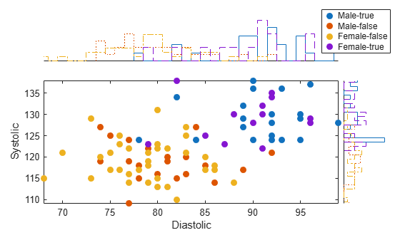
Create a scatter plot with marginal histograms. Group the data by using a combination of two different variables.
Load the patients data set. Combine the Smoker and Gender data to create a new variable. Create a scatter histogram chart that compares the Diastolic and Systolic values of the patients. Use the new variable SmokerGender to group the data in the scatter histogram chart.
load patients [idx,genderStatus,smokerStatus] = findgroups(string(Gender),string(Smoker)); SmokerGender = strcat(genderStatus(idx),"-",smokerStatus(idx)); s = scatterhistogram(Diastolic,Systolic,'GroupData',SmokerGender,'LegendVisible','on'); xlabel('Diastolic') ylabel('Systolic')
Create a scatter plot with marginal kernel density histograms.
Load the patients data set. Create a table from the Diastolic, Systolic, and Smoker variables.
load patients.mat tbl = table(Diastolic,Systolic,Smoker);
Create a scatter histogram chart that compares the Diastolic and Systolic pressure values of the patients. Use patient smoking status to group the data and display marginal kernel density plots. The plot shows that smokers have higher average systolic and diastolic blood pressure compared to nonsmokers.
s = scatterhistogram(tbl,"Diastolic","Systolic", ... GroupVariable="Smoker",HistogramDisplayStyle="smooth", ... LineStyle="-");

Input Arguments
Source table, specified as a table.
You can create a table from workspace variables using the table function, or you can import data as a table using the readtable function.
The SourceTable property of the ScatterHistogramChart object stores the source table.
Table variable for _x_-axis, specified in one of these forms:
- Character vector or string scalar — Indicating one of the variable names. For example,
scatterhistogram(tbl,'Acceleration','Horsepower')selects the variable named'Acceleration'for the_x_-axis. - Numeric scalar — Indicating the table variable index. For example,
scatterhistogram(tbl,5,3)selects the fifth variable in the table for the _x_-axis. - Logical vector — Containing one
trueelement.
The values associated with your table variable must be of a numeric type orcategorical.
The XVariable property of the ScatterHistogramChart object stores the selected variable name.
Table variable for _y_-axis, specified in one of these forms:
- Character vector or string scalar — Indicating one of the variable names. For example,
scatterhistogram(tbl,'Acceleration','Horsepower')selects the variable named'Horsepower'for the_y_-axis. - Numeric scalar — Indicating the table variable index. For example,
scatterhistogram(tbl,5,3)selects the third variable in the table for the _y_-axis. - Logical vector — Containing one
trueelement.
The values associated with your table variable must be of a numeric type orcategorical.
The YVariable property of the ScatterHistogramChart object stores the selected variable name.
Table variable for grouping data, specified in one of these forms:
- Character vector or string scalar — Indicating one of the variable names
- Numeric scalar — Indicating the table variable index
- Logical vector — Containing one
trueelement
The values associated with your table variable must form a numeric vector, logical vector, categorical array, string array, or cell array of character vectors.
grpvar splits the data in xvar andyvar into unique groups. Each group has a default color and an independent histogram in each axis. In the legend, scatterhistogram displays the group names in order of their first appearance inGroupData.
Example: 'Model_Year'
Example: 2
Values appearing along the _x_-axis, specified as a numeric vector or categorical array.
The XData property of theScatterHistogramChart object stores thexvalues data.
Example: [0.5 4.3 2.4 5.6 3.4]
Example: categorical({'small','medium','small','large','medium','small'})
Values appearing along the _y_-axis, specified as a numeric vector or categorical array.
The YData property of theScatterHistogramChart object stores theyvalues data.
Example: [0.5 4.3 2.4 5.6 3.4]
Example: categorical({'small','medium','small','large','medium','small'})
Group values for the scatter plot and the corresponding marginal histograms, specified as a numeric vector, logical vector, categorical array, string array, or cell array of character vectors.
grpvalues splits the data in xvalues andyvalues into unique groups. Each group has a default color and an independent histogram in each axis. In the legend, scatterhistogram displays the group names in order of their first appearance inGroupData.
Example: [1 2 1 3 2 1 3]
Example: categorical({'blue','green','green','blue','green'})
Parent container, specified as a Figure, Panel,Tab, TiledChartLayout, or GridLayout object.
Name-Value Arguments
Specify optional pairs of arguments asName1=Value1,...,NameN=ValueN, where Name is the argument name and Value is the corresponding value. Name-value arguments must appear after other arguments, but the order of the pairs does not matter.
Before R2021a, use commas to separate each name and value, and enclose Name in quotes.
Example: scatterhistogram(tbl,xvar,yvar,'GroupVariable',grpvar,'HistogramDisplayStyle','stairs') specifies grpvar as the grouping variable and displays stairstep plots next to the scatter plot.
Output Arguments
More About
A standalone visualization is a chart designed for a special purpose that works independently from other charts. Unlike other charts such as plot and surf, a standalone visualization has a preconfigured axes object built into it, and some customizations are not available. A standalone visualization also has these characteristics:
- It cannot be combined with other graphics elements, such as lines, patches, or surfaces. Thus, the
holdcommand is not supported. - The
gcafunction can return the chart object as the current axes. - You can pass the chart object to many MATLAB functions that accept an axes object as an input argument. For example, you can pass the chart object to the
titlefunction.
Tips
- To interactively explore the data in your
ScatterHistogramChartobject, use these options. Some of these options are not available in the Live Editor.- Zoom/pan — Use the scroll wheel or the + and - buttons to zoom. Click and drag the scatter plot to pan.
scatterhistogramupdates the marginal histograms based on the data within the current scatter plot limits. - Data tips — Hover over the scatter plot or marginal histograms to display a data tip.
- Zoom/pan — Use the scroll wheel or the + and - buttons to zoom. Click and drag the scatter plot to pan.
- If you create a scatter plot with marginal histograms from a table, then you can customize data tips for the scatter plot.
- To add or remove a row from the data tip, right-click anywhere on the scatter plot and point to . Then, select or deselect a variable.
- To add or remove multiple rows, right-click on the plot, point to , and select . Then, add variables by clicking>> or remove them by clicking**<<**.
Version History
Introduced in R2018b
Starting in R2024a, you can specify the HistogramDisplayStyle name-value argument as "smooth" without a Statistics and Machine Learning Toolbox™ license.