CSS Box Model (original) (raw)
Last Updated : 21 Jan, 2026
The CSS Box Model defines how elements are sized and positioned by assigning a box in the DOM tree that determines an element's dimensions and its position relative to other elements.
- Content: The area where text or other content is displayed.
- Padding: Space between the content and the element's border.
- Border: A frame that wraps around the padding and content.
- Margin: Space between the element's border and neighboring elements.
Components of the box model
Each element in the box model is made up of distinct layers that define its size and spacing on a web page.
1. Content Area
The content area is the core part of the CSS box model that holds the actual content of an element.
- The content area is the central part of the CSS box model, containing the main content (e.g., text, images, or elements like
or ).
- It can be styled with CSS properties like height and width.
The content edge refers to the four edges of the content area.
- Left content edge
- Right content edge
- Top content edge
- Bottom content edge
2. Padding Area
The padding area is the space between an element’s content and its border, contributing to the element’s overall size and spacing.
- The padding area is the space between the content and the border of an element.
- It includes the areas highlighted in light green and skin color in the example.
- The distance between the content edge and the border is the padding.
- The border marks the end of the padding area.
- The padding area contributes to the element's total dimensions.
- Padding can be adjusted using CSS properties.
- It works similarly with box-sizing: content-box and box-sizing: border-box, but with slight calculation differences.
3. Border Area
The border area is the outer boundary of an element that surrounds the padding and contributes to the element’s total height and width.
- The area that marks the end of an element is called as the border it is the outer fencing for the element.
- The default border properties are provided in CSS to control the thickness of this outer fencing.
- The border area also add 's up to the complete height and width of the element.
- The more the border width the more will be the height or width of the element.
- In the above image the area marked with skin color is called the border area.
4. Margin Area
The margin area is the space outside an element’s border that controls the distance between the element and surrounding or parent elements.
- The area outside the border of an element is called the margin area.
- Basically this area depends on the parent of the element.
- The distance between the border of the parent element and the border of the child element is called as the margin.
- CSS has provides certain margin properties to get control over this scenario.
Box Sizing Property in CSS
There are two type's of box-sizing properties in CSS
1. Content-Box(default property)
When box-sizing is set to content-box (the default), the element’s final size includes the content dimensions plus padding.
HTML `
<style>
    div {
        height: 20px;
        width: 20px;
        box-sizing: content-box;
        padding-left: 20px;
        padding-right: 20px;
        border-left: 5px solid red;
        border-right: 5px solid red;
    }
</style>`
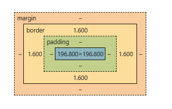
This code will create a box model with a border line width of 0.4px always and border-area of 1.6px and padding area as 20px width on both sides of the content area.
**Content Area (Width) :The width of the content area is fixed at 200px.
**Padding
- Padding adds extra space inside the element, around the content.
- Padding Left: 20px
- Padding Right: 20px
- Total padding width: 20px + 20px = 40px
**Border
- The border, being solid, has a width, but it is calculated differently from the padding.
- Line Width of Border: 0.4px (the width of the line itself)
- Area of Border: 1.6px (the actual space the border occupies visually)
- Border width for both sides: 1.6px (left) + 1.6px (right) = 3.2px
**Total Width
- Total width of the element can be calculated by adding the padding and border areas to the content area width.
- Formula for Total Width = (Padding-Left + Padding-Right + Border-Area-Left + Border-Area-Right) + Content Area Width
- Total Width = (20px + 20px + 1.6px + 1.6px) + 200px = 243.2px
- The total width of the element becomes 243.2px.
The reason the total width is increased unexpectedly is because box-sizing: content-box applies the width to the content area only .The padding and border are added outside the content area, leading to an increase in the overall width and height of the element.
2. Border-Box
When box-sizing: border-box is used, the element’s total size stays as specified, and the content area shrinks to accommodate padding and border.
HTML `
<style>
    div {
        height: 20px;
        width: 70px;
        box-sizing:border-box;
        padding-left: 20px;
        padding-right: 20px;
        border-left: 2px solid red;
        border-right: 2px solid red;
    }
</style>`
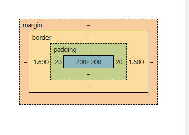
This code creates a box model where the content width is adjusted to accommodate the padding and border thickness.
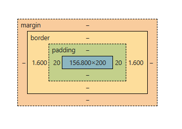
- **Width of Border and Padding Border width : 0.4px (line width) and 1.6px + 1.6px = 3.2px (total border area).
- **Padding width : 20px + 20px = 40px.
- **User-Entered Width : The width entered by the user is 200px, which applies to the content area only when box-sizing: content-box is used.
- **With box-sizing: content-box: Padding and border are added outside the content, increasing the total width.
- **Adjusting Content Area Width: To maintain a total width of 200px, the extra space added by padding and borders (43.2px) is subtracted from the content width.
- **New content area width : 200px - 43.2px = 156.8px.
- **Final Width Calculation : The final total width is: 156.8px (content area) + 40px (padding) + 3.2px (border) = 200px, ensuring the user’s entered width remains unchanged.
Use Cases of CSS Box Model
Here are some use cases of CSS Box Model:
Default box-sizing: content-box
Default behavior where padding and borders are added outside the content area, leading to an increased overall width/height.
HTML `
<style>
    div {
        width: 200px;
        padding: 20px;
        border: 2px solid black;
        box-sizing:content-box;
        background-color: lightgreen;
    }
</style>`
The total width of the element will be 200px + 20px (left) + 20px (right) + 5px (left border) + 5px (right border) = 250px.
Using box-sizing: border-box for Consistent Sizing
Ensure the padding and border are included within the specified width/height to maintain a fixed size for layout consistency.
HTML `
<style>
    div {
        width: 200px;
        padding: 20px;
        border: 2px solid black;
        box-sizing: border-box;
        background-color: lightcoral;
    }
</style>`
The total width remains 200px, with padding and border included in the 200px size.
Setting box-sizing for All Elements
Apply box-sizing: border-box to all elements globally to simplify layout calculations and prevent unexpected element size changes.
HTML `
<style>
    * {
        box-sizing: border-box;
    }
    div {
        width: 100%;
        padding: 20px;
        border: 2px solid blue;
        background-color: lightyellow;
    }
</style>`
All elements are sized consistently, with padding and borders included inside the width/height.
Fixed Layout with box-sizing: border-box
Creating a fixed-size element with padding and border without altering the layout dimensions.
HTML `
<style>
    div {
        width: 300px;
        height: 20px;
        padding: 15px;
        border: 10px solid green;
        box-sizing: border-box;
        background-color: lightblue;
        font-size: 12px;
}</style>`
Creating a Responsive Box with box-sizing
Ensuring that padding and borders do not cause layout issues in a responsive design.
HTML `
<style>
    * {
        box-sizing: border-box;
    }
    .container {
        max-width: 100%;
        padding: 20px;
        border: 5px solid purple;
        background-color: lightgreen;
    }
</style>`
The element resizes according to the screen width, with padding and borders included in the total size, avoiding overflow.