uicontrol - Create user interface control - MATLAB (original) (raw)
Create user interface control
Syntax
Description
Note
UI component functions such as uibutton are recommended over uicontrol, because they offer additional capabilities for customizing app components. For more information, see App Building Components.
c = uicontrol creates a push button (the default user interface control) in the current figure, and returns the UIControl object. If a figure does not exist, then MATLAB® calls the figure function to create one.
c = uicontrol([Name,Value](#namevaluepairarguments)) creates a user interface control with property values specified using one or more name-value pair arguments. For example, 'Style','checkbox' creates a check box.
c = uicontrol([parent](#mw%5Faad7ccca-6a5f-4a24-accf-9e356b55a394)) creates the default user interface control in the specified parent, instead of defaulting to the current figure.
c = uicontrol([parent](#mw%5Faad7ccca-6a5f-4a24-accf-9e356b55a394),[Name,Value](#namevaluepairarguments)) specifies the parent for the user interface control and one or more name-value pair arguments.
uicontrol([c](#mw%5F51fe35c7-a16d-4520-87ba-51e5907244d0)) gives focus to a previously defined user interface control.
Examples
Create a radio button by specifying the Style name-value argument as "radiobutton". Label the radio button by specifying a value for the String name-value argument.
c = uicontrol(Style="radiobutton",String="Option 1");

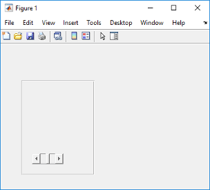
Create a figure and a panel positioned within it. Then, create a slider within the panel by calling the uicontrol function with the panel specified as the parent and Style specified as"slider". Next, set the slider Value property to 0.5.
f = figure; p = uipanel(f,'Position',[0.1 0.1 0.35 0.65]); c = uicontrol(p,'Style','slider'); c.Value = 0.5;
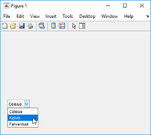
Create a pop-up menu that displays a list of choices when clicked. Use a callback function to determine the list item selected by the user and display the selection in the MATLAB Command Window.
Save this code as mytemps.m. This code creates a figure window with a pop-up menu containing three list items. Then, it uses a callback function to query the Value and String properties of the pop-up menu and displays the selected item at the command line.
function mytemps f = figure; c = uicontrol(f,Style="popupmenu"); c.Position = [50 75 100 20]; c.String = {'Celsius','Kelvin','Fahrenheit'}; c.Callback = @selection;
function selection(src,event)
    val = c.Value;
    str = c.String;
    str{val};
    disp(['Selection: ' str{val}]);
end
end
Run the program to generate the figure and its contents. Then, choose a different menu item to change the selection. For example, if you select "Kelvin" from the pop-up menu, the command line then displays the text Selection: Kelvin.
Create a push button that plots data when you click it.
Save this code as pushbuttonPlot.m. This code creates a figure window that contains axes and a push button. Each time you click the button, the callback function executes and plots a bar chart of five normally distributed random numbers.
function pushbuttonPlot f = figure; ax = axes(f); ax.Units = "pixels"; ax.Position = [75 75 325 280] c = uicontrol; c.String = "Plot Data"; c.Callback = @plotButtonPushed;
function plotButtonPushed(src,event)
    bar(randn(1,5));
end
end
Run pushbuttonPlot, and then click the push button. MATLAB plots the data.

Create an editable text field and bring it into focus by passing its function handle into the uicontrol function. This action causes the cursor to become active, and blink, within the editable text field.
c = uicontrol(Style="edit"); uicontrol(c);

Input Arguments
Parent object, specified as a Figure object or as aPanel, ButtonGroup, or Tab object in a figure. Use this argument to specify the parent container when creating a user interface control.
User interface control object, specified as a UIControl object. Use this argument to specify a previously defined user interface control that you wish to bring into focus.
Example: uicontrol(c)
Name-Value Arguments
Specify optional pairs of arguments asName1=Value1,...,NameN=ValueN, where Name is the argument name and Value is the corresponding value. Name-value arguments must appear after other arguments, but the order of the pairs does not matter.
Before R2021a, use commas to separate each name and value, and enclose Name in quotes.
Example: uicontrol('Style','checkbox') specifies a check box as the style of the user interface control.
Style of UIControl object, specified as a value from the following table.
| Style Property Value | Example | Description |
|---|---|---|
| 'pushbutton' |  |
Button that appears to depress until you release the mouse button. |
| 'togglebutton' |   |
Button that looks like a push button, but that visually indicates its state: selected or cleared. |
| 'checkbox' |   |
Option that can be selected or cleared independently. |
| 'radiobutton' |   |
Option that is intended to form part of a group, such that, when selected, it clears the other options within the group. To implement mutually exclusive behavior for a set of radio buttons, place them within a uibuttongroup. |
| 'edit' |  |
Editable text field. To enable multiple lines of text, set the Max andMin properties so that Max-Min > 1. |
| 'text' |  |
Static text field. Use static text to label other user interface controls, provide information to the user, or indicate values associated with a slider. To make static text respond to mouse clicks, set the Enable property to 'Inactive' and code a response with theButtonDownFcn callback. |
| 'slider' |  |
"Thumb" button that the user moves along a horizontal or vertical bar. The location of the button along the bar indicates a value within a specified range. |
| 'listbox' |  |
List of items from which the user can select one or more items. Unlike pop-up menus, list boxes do not expand when clicked. To enable multiple selection of items, set the Max and Min properties so that Max-Min > 1. To delay action when multiple items can be selected from a list box, you can associate aDone push button with the list box. Then, use the callback for that button to evaluate the list box Value property. |
| 'popupmenu' |  |
Pop-up menu (also known as drop-down menu) that expands to display a list of choices. When closed, a pop-up menu indicates the current choice. Use pop-up menus when you want to provide a number of mutually exclusive choices. |
| 'frame' | The'frame' option is not recommended. Use uipanel or uibuttongroup instead of frames. GUIDE continues to support frames in UIs that contain them, but the frame component does not appear in the GUIDE Layout Editor component palette. |
Text to display, specified as a character vector, cell array of character vectors, string array, categorical array, or pipe-delimited row vector. The Style property dictates the array format you can use.
| Style Property | Supported Array Formats | Examples |
|---|---|---|
| 'pushbutton' | Character vector Cell array of character vectors String array Categorical array | 'Option 1' {'Option 1'} "Option 1" categorical({'Option 1'}) |
| 'togglebutton' | ||
| 'checkbox' | ||
| 'radiobutton' | ||
| 'edit' | ||
| 'text' | ||
| 'listbox' | Character vector Cell array of character vectors String array Categorical array Pipe-delimited row vector | 'One' {'One','Two','Three'} ["One" "Two" "Three"] categorical({'one','two','three'}) 'One|Two |
| 'popupmenu' |
Note
If you specify a cell array or a categorical array for a push button, toggle button, check box, or radio button, MATLAB displays only the first element in the array.
Location and size, specified as a four-element vector of the form [left bottom width height]. Default measurement units are in pixels. The table describes each element in the vector.
| Element | Description |
|---|---|
| left | Distance from the inner left edge of the parent container to the outer left edge of the user interface control. |
| bottom | Distance from the inner bottom edge of the parent container to the outer bottom edge of the user interface control. |
| width | Distance between the right and left outer edges of the user interface control. |
| height | Distance between the top and bottom outer edges of the user interface control. |
Position values are relative to the parent container's drawable area. The drawable area is the area inside the borders of the container and does not include the area occupied by the title. If the parent container is a figure, the drawable area also excludes the menu bar and tool bar.
Current value, specified as a number. Use to query or modify the status of certain user interface controls. The table describes the Value property in relation to specific UIControl styles.
| Style Property | Description of Value Property |
|---|---|
| 'togglebutton' | Selected: Value of theMax property.Cleared: Value of theMin property. |
| 'checkbox' | Selected: Value of theMax property.Cleared: Value of theMin property. |
| 'radiobutton' | Selected: Value of theMax property.Cleared: Value of theMin property. |
| 'slider' | Value associated with the thumb location along the slider bar. |
| 'listbox' | Array index corresponding to the selected item in the list box. A value of 1 (default) corresponds to the first item in the list. When multiple items are selected, the Value property stores the row indexes as a vector. |
| 'popupmenu' | Array index corresponding to the selected item in the pop-up menu. A value of 1 (default) corresponds to the first item in the pop-up menu. |
Version History
Introduced before R2006a