heatmap - Create heatmap chart - MATLAB (original) (raw)

Syntax
Description
Table Data
heatmap([tbl](#bvh0gj7-1-tbl),[xvar](#bvh0gj7-1-xvar),[yvar](#bvh0gj7-1-yvar)) creates a heatmap by aggregating the variables in the tabletbl. Specify xvar andyvar as the table variables that you want to visualize. The numbers in the cells and the default colors correspond to the number of times each (x, y) pair appears together in the table. The resulting _x_-axis and _y_-axis show unique values from the xvar and yvar variables respectively.
heatmap([tbl](#bvh0gj7-1-tbl),[xvar](#bvh0gj7-1-xvar),[yvar](#bvh0gj7-1-yvar),'ColorVariable',[cvar](#bvh0gj7-1-cvar)) uses the table variable specified by cvar to calculate the numbers in the cells and the corresponding colors. The default calculation method is a mean aggregation, so the cell numbers and colors are based on the average value of cvar for each (x,y) pair that appears together in the table.
Matrix Data
heatmap([cdata](#bvh0gj7-1-cdata)) creates a heatmap from the 2-D matrix cdata, which contains pre-aggregated data. The heatmap has one cell for each value incdata.
heatmap([xvalues](#bvh0gj7-1-xvalues),[yvalues](#bvh0gj7-1-yvalues),[cdata](#bvh0gj7-1-cdata)) specifies the labels for the values that appear along the_x_-axis and _y_-axis.
Additional Options
heatmap(___,[Name,Value](#namevaluepairarguments)) specifies additional options for the heatmap using one or more name-value pair arguments. Specify the options after all other input arguments. For a list of properties, see HeatmapChart Properties.
heatmap([parent](#bvh0gj7-1%5Fsep%5Fmw%5F58c53d12-c3c1-4fe8-b606-f6a109982a64),___) creates the heatmap in the figure, panel, or tab specified byparent.
[h](#mw%5F12519bfd-c465-4674-be75-24184958d07b) = heatmap(___) returns the HeatmapChart object. Use h to modify properties of the chart after creating it. For a list of properties, see HeatmapChart Properties.
Examples
Create Heatmap from Tabular Data
Create a heatmap from a table of data for medical patients.
Load the patients data set and create a table from a subset of the variables loaded into the workspace. Then create a heatmap that counts the total number of patients with the same set of Smoker and SelfAssessedHealthStatus values.
load patients tbl = table(LastName,Age,Gender,SelfAssessedHealthStatus,... Smoker,Weight,Location); h = heatmap(tbl,'Smoker','SelfAssessedHealthStatus');
Reorder Heatmap Labels
Create a heatmap and reorder the labels along the _y_-axis.
Load the patients data set and create a heatmap from the data. Assign the HeatmapChart object to the variable h.
load patients tbl = table(LastName,Age,Gender,SelfAssessedHealthStatus,... Smoker,Weight,Location); h = heatmap(tbl,'Smoker','SelfAssessedHealthStatus');
Reorder the labels along the _y_-axis.
h.YDisplayData = {'Excellent','Good','Fair','Poor'};
Alternatively, you can reorder the labels by changing the data to categorical data and then reordering the categories using the reordercats function. Similarly, you can add, remove, or rename the heatmap labels using the addcats, removecats, or renamecats functions, respectively.
Specify Table Variable for Heatmap Colors
Create a heatmap and specify the table variable to use when determining the heatmap cell colors.
Load the patients data set and create a heatmap from the data. Color each cell using the average age of patients with a particular pair of Smoker and SelfAssessedHealthStatus values by setting the ColorVariable option to 'Age'.
load patients tbl = table(LastName,Age,Gender,SelfAssessedHealthStatus,... Smoker,Weight,Location);
h = heatmap(tbl,'Smoker','SelfAssessedHealthStatus',... 'ColorVariable','Age');
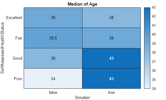
Specify Calculation Method for Color Data
Create a heatmap and specify the table variable and calculation method to use when determining the heatmap cell colors.
Load the patients data set and create a heatmap from the data. Color each cell using the median age of patients with a particular pair of Smoker and SelfAssessedHealthStatus values. Specify the ColorVariable option as 'Age' and the ColorMethod option as 'median'.
load patients tbl = table(LastName,Age,Gender,SelfAssessedHealthStatus,... Smoker,Weight,Location); h = heatmap(tbl,'Smoker','SelfAssessedHealthStatus',... 'ColorVariable','Age','ColorMethod','median');
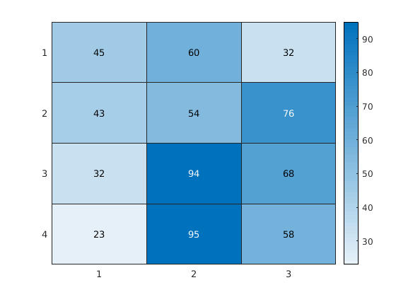
Create Heatmap from Matrix Data
Create a matrix of data. Then create a heatmap of the matrix values. The default labels along the _x_-axis and _y_-axis appear as 1, 2, 3, and so on.
cdata = [45 60 32; 43 54 76; 32 94 68; 23 95 58]; h = heatmap(cdata);
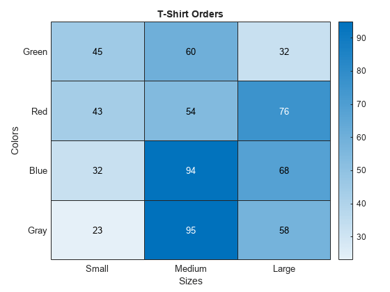
Create Heatmap from Matrix Data Using Custom Axis Labels
Create a matrix of data. Then create a heatmap of the matrix values. Use custom labels along the _x_-axis and _y_-axis by specifying the first two input arguments as the labels you want. Specify the title and axis labels by setting properties of the HeatmapChart object.
cdata = [45 60 32; 43 54 76; 32 94 68; 23 95 58]; xvalues = {'Small','Medium','Large'}; yvalues = {'Green','Red','Blue','Gray'}; h = heatmap(xvalues,yvalues,cdata);
h.Title = 'T-Shirt Orders'; h.XLabel = 'Sizes'; h.YLabel = 'Colors';
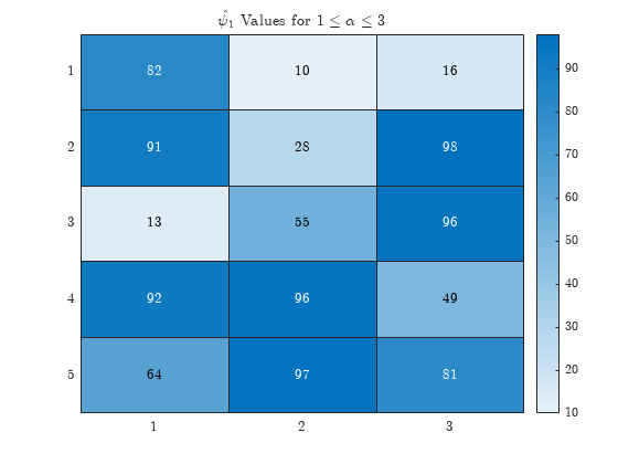
Use LaTeX for Greek Letters in Title
Since R2023b
To use LaTeX (or TeX) markup in the title, axis labels, or data tips, set the Interpreter property of the HeatmapChart object.
For example, create a heatmap chart with a title that uses LaTeX to display Greek letters. Set the Interpreter property to "latex" when you create the chart. Then include the markup when you call the title function.
heatmap(randi(100,5,3),Interpreter="latex") title("$\hat{\psi_1}$ Values for 1≤α≤3{1\le\alpha\le3}1≤α≤3")
Normalize Colors Along Each Row or Column
Create a heatmap and normalize the colors along each column or row by setting the ColorScaling property.
Read the sample file outages.csv into a table. The sample file contains data representing electric utility outages in the Unites States. The table contains six columns: Region, OutageTime, Loss, Customers, RestorationTime, and Cause. Display the first five rows of each column.
T = readtable('outages.csv'); T(1:5,:)
ans=5×6 table
Region OutageTime Loss Customers RestorationTime Cause
_____________ ________________ ______ __________ ________________ ___________________
{'SouthWest'} 2002-02-01 12:18 458.98 1.8202e+06 2002-02-07 16:50 {'winter storm' }
{'SouthEast'} 2003-01-23 00:49 530.14 2.1204e+05 NaT {'winter storm' }
{'SouthEast'} 2003-02-07 21:15 289.4 1.4294e+05 2003-02-17 08:14 {'winter storm' }
{'West' } 2004-04-06 05:44 434.81 3.4037e+05 2004-04-06 06:10 {'equipment fault'}
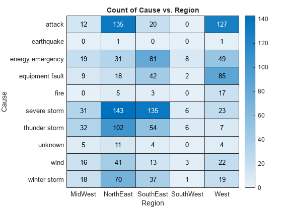
{'MidWest' } 2002-03-16 06:18 186.44 2.1275e+05 2002-03-18 23:23 {'severe storm' }Create a heatmap that shows the different regions along the _x_-axis and the different outage causes along the _y_-axis. In each cell, show how many times each region experienced a power outage due to a particular cause.
h = heatmap(T,'Region','Cause');
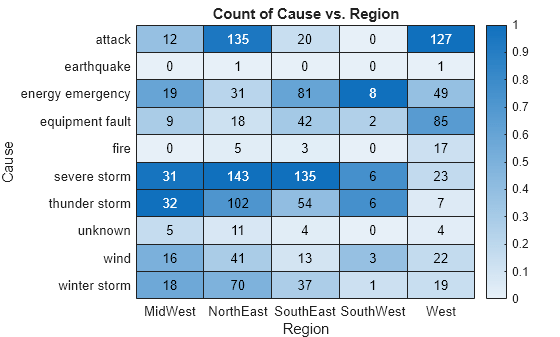
Normalize the colors along each column. The smallest value in each column maps to the first color in the colormap and the largest value maps to the last color. The last color indicates the cause that caused the most power outages for each region.
h.ColorScaling = 'scaledcolumns';
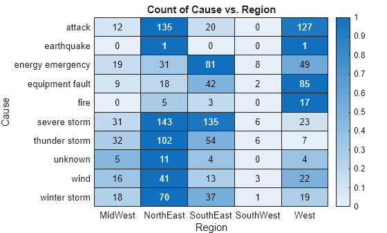
Normalize the colors along each row instead. The smallest value in each row maps to the first color in the colormap and the largest value maps to the last color. The last color indicates the region that experienced the most power outages due to each cause.
h.ColorScaling = 'scaledrows';
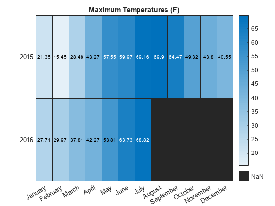
Compute Color Data Using Custom Aggregation Method
Create a heatmap and color the cells using data computed with a custom aggregation method. Use the pivot function to compute the color data.
Read the sample file TemperatureData.csv into a table. The file contains four columns: Year, Month, Day, and TemperatureF.
tbl = readtable('TemperatureData.csv');
Compute the color data as the maximum temperature for each month and year combination using the pivot function. Use NaN for missing month and year combinations.
P = pivot(tbl,Columns="Month",Rows="Year",DataVariable="TemperatureF",Method=@(x) mean(x,"includenan"))
P=2×13 table Year April August December February January July June March May November October September ____ ______ ______ ________ ________ _______ ______ ______ ______ ______ ________ _______ _________
2015    43.267    69.903     40.548      15.448     21.355     69.161    59.967    28.484    57.548      43.8      49.323      64.467
2016    42.267       NaN        NaN      29.966      27.71     68.824    63.733    37.806    53.806       NaN         NaN         NaN
Rearrange the variables in the pivoted table.
P = P(:,["Year" "January" "February" "March" "April" "May" "June" "July" "August" "September" "October" "November" "December"]);
Create the heatmap, and color the heatmap cells using the computed data values.
xvar = P.Properties.VariableNames(2:end); yvar = string(P.(1)); cvar = P{:,2:end}; heatmap(xvar,yvar,cvar) title("Maximum Temperatures (F)")
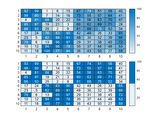
Compare Heatmaps with Different Numbers of Colors
Heatmap charts use the 256-sampling of the sky colormap by default. You can change the sampling by specifying the Colormap name-value argument.
For example, create two heatmap charts in a 2-by-1 tiled chart layout. The top chart uses the default set of 256 colors, and the bottom chart uses only two colors.
tiledlayout(2,1,TileSpacing="compact")
% Top chart with default colors nexttile heatmap(magic(10))
% Bottom chart with two colors nexttile heatmap(magic(10),Colormap=sky(2))
Input Arguments
tbl — Source table
table | timetable
Source table, specified as a table or timetable.
You can create a table from workspace variables using the table function, or you can import data as a table using the readtable function. You can create a timetable from workspace variables using the timetable function.
The SourceTable property of the HeatmapChart object stores the source table.
xvar — Table variable for _x_-axis
character vector | string scalar | numeric scalar | logical vector
Table variable for _x_-axis, specified in one of these forms:
- Character vector or string scalar indicating one of the variable names. For example,
heatmap(tbl,'HealthStatus','Gender')selects the variable named'HealthStatus'for the _x_-axis. - Numeric scalar indicating the table variable index. For example,
heatmap(tbl,2,3)selects the second variable in the table for the _x_-axis. - Logical vector containing one
trueelement.
The values associated with your table variable must be grouped into a finite set of discrete categories that the categorical function accepts. If the values are not grouped into a finite set of categories, use the discretize function to group them.
The labels that appear along the _x_-axis are in alphabetical order. You can customize the labels using categorical arrays. For an example, see Create Heatmap from Tabular Data.
The XVariable property of the HeatmapChart object stores the selected variable.
yvar — Table variable for _y_-axis
character vector | string scalar | numeric scalar | logical vector
Table variable for _y_-axis, specified in one of these forms:
- Character vector or string scalar of one of the variable names. For example,
heatmap(tbl,'HealthStatus','Gender')selects the variable named'Gender'for the_y_-axis. - Numeric scalar indicating the table variable index. For example,
heatmap(tbl,2,3)selects the third variable in the table for the _y_-axis. - Logical vector containing one
trueelement.
The values associated with your table variable must be grouped into a finite set of discrete categories that the categorical function accepts. If the values are not grouped into a finite set of categories, use the discretize function to group them.
The labels that appear along the _y_-axis are in alphabetical order. You can customize the labels using categorical arrays. For an example, see Create Heatmap from Tabular Data.
The YVariable property of the HeatmapChart object stores the selected variable.
cvar — Table variable for color data
character vector | string scalar | numeric scalar | logical vector
Table variable for color data, specified in one of these forms:
- A character vector or string scalar of one of the variable names. For example,
heatmap(__,'ColorVariable','HealthStatus')selects the variable named'HealthStatus'for the _y_-axis. - A numeric scalar indicating the table variable index. For example,
heatmap(__,'ColorVariable',1)selects the third variable in the table for the _y_-axis. - A logical vector containing one
trueelement.
The values associated with your table variable must be of a numeric type or logical.
The property value is empty [] when using matrix data. TheColorVariable property of theHeatmapChart object stores the selected variable. TheColorData property populates with data based on the selected variable.
By default, heatmap calculates the color data based on a mean aggregation. To change the calculation method, set the ColorMethod property.
cdata — Color data
matrix
Color data for the heatmap cells, specified as a matrix.
The ColorData property of theHeatmapChart object stores the values.
Example: [40 24 68; 68 37 58; 49 23 46]
xvalues — Values appearing along _x_-axis
categorical array | string array | numeric array | cell array of character vectors
Values appearing along the _x_-axis, specified as a categorical array, string array, numeric array, or cell array of character vectors.
Example: {'small','medium','large'}
Example: categorical({'small','medium','large'})
yvalues — Values appearing along _y_-axis
categorical array | string array | numeric array | cell array of character vectors
Values appearing along _y_-axis, specified as a categorical array, string array, numeric array, or cell array of character vectors.
Example: {'small','medium','large'}
Example: categorical({'small','medium','large'})
parent — Parent container
Figure object | Panel object | Tab object | TiledChartLayout object | GridLayout object
Parent container, specified as a Figure, Panel,Tab, TiledChartLayout, or GridLayout object.
Name-Value Arguments
Specify optional pairs of arguments asName1=Value1,...,NameN=ValueN, where Name is the argument name and Value is the corresponding value. Name-value arguments must appear after other arguments, but the order of the pairs does not matter.
Before R2021a, use commas to separate each name and value, and enclose Name in quotes.
Example: heatmap(tbl,xvar,yvar,'ColorVariable','Temperatures','ColorMethod','median')
Chart title, specified as a character vector, cell array of character vectors, string array, or categorical array.
Example: h = heatmap(rand(10,10),'Title','My Title Text')
Example: h.Title = 'My Title Text';
To create a multiline title, specify a cell array of character vectors or a string array. Each element in the array corresponds to a line of text.
Example: h.Title = {'My','Title'};
If you specify the title as a categorical array, MATLAB® uses the values in the array, not the categories.
If you create the chart using tabular data, the default chart has an autogenerated title. If you do not want a title, specify ''.
By default, heatmaps support a subset of TeX markup for the text you specify. Use TeX markup to add superscripts and subscripts, modify the font type and color, and include special characters in the text. If you want a TeX markup character in regular text, such as an underscore (_), then insert a backslash (\) before the character you want to include. The backslash is the TeX escape character. For more information, see the Interpreter property of the text object.
Method to calculate the color data values (stored in ColorData), specified as 'count', 'mean', 'median','sum', 'max', 'min', or'none'.
If you do not want to use a third variable from the table for the color data, then specify the method as 'count'. When the method is 'count', the heatmap does not use the ColorVariable property and instead counts the number of times each pair of x and y values appears in the source table. This value is the default value when you are using tabular data and do not specify the ColorVariable parameter.
If you want to use a third variable from the table for the color data, then set the ColorVariable property to the variable you want and specify the ColorMethod property as one of the methods listed in this table. For each pair of x and y values, the methods use the corresponding values in the ColorVariable column of the source table to calculate the data.
| Method | Description |
|---|---|
| 'mean' | Calculate the average value. This value is the default value when you specify the ColorVariable property. |
| 'median' | Calculate the median value. |
| 'sum' | Sum the values. |
| 'max' | Use the maximum value. |
| 'min' | Use the minimum value. |
| 'none' | Use the value exactly. The table cannot contain more than one instance of each pair of_x_ and y values. This value is the default value when using matrix data. |
If you want to compute your own matrix of aggregated data, use the accumarray function. Specify the matrix as input to the heatmap function.
Example: h = heatmap(__,'ColorMethod','median')
Example: h.ColorMethod = 'median'
Output Arguments
h — Heatmap chart object
HeatmapChart object
HeatmapChart object, which is a standalone visualization. Use h to set properties on the heatmap chart after creating it.
More About
Standalone Visualization
A standalone visualization is a chart designed for a special purpose that works independently from other charts. Unlike other charts such as plot and surf, a standalone visualization has a preconfigured axes object built into it, and some customizations are not available. A standalone visualization also has these characteristics:
- It cannot be combined with other graphics elements, such as lines, patches, or surfaces. Thus, the
holdcommand is not supported. - The
gcafunction can return the chart object as the current axes. - You can pass the chart object to many MATLAB functions that accept an axes object as an input argument. For example, you can pass the chart object to the
titlefunction.
Tips
- To interactively explore the data in your heatmap, use these options.
- Zoom — Use the scroll wheel or the + and- keys to zoom.
- Pan — Click and drag the heatmap or use the arrow keys to pan across the rows or columns.
- Data tips — Hover over the heatmap to display a data tip.
- Rearrange rows and columns — Click and drag a row or column label to move it to a different position.
- Sort values — Click the icon that appears when you hover over the row or column label. Click once to sort the values in ascending order, twice to sort the values in descending order, and a third time to reset the order.
- If you create a heatmap chart from a table, then you can customize its data tips.
- To add or remove a row from the data tip, right-click anywhere on the chart and point to . Then, select or deselect a variable.
- To add or remove multiple rows, right-click on the chart, point to , and select . Then, add variables by clicking>> or remove them by clicking**<<**.
Extended Capabilities
Tall Arrays
Calculate with arrays that have more rows than fit in memory.
Theheatmap function supports tall arrays with the following usage notes and limitations:
- The value of
ColorMethodcannot be'none'or'median'. - The returned
HeatmapChartobject contains only the summary data, not the original tall table data.
For more information, see Tall Arrays.
Version History
Introduced in R2017a
R2019a: Heatmaps interpret text using TeX markup
Starting in R2019a, heatmaps interpret text using TeX markup instead of displaying the literal characters. If you want to use a TeX markup character in regular text, such as an underscore (_), then insert a backslash (\) before the character you want to include. The backslash is the TeX escape character. For more information on using TeX markup, see the Interpreter property of the text object.