DropDown - Drop-down UI component - MATLAB (original) (raw)
Main Content
Description
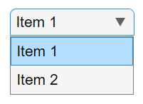
A drop-down UI component allows an app user to select an option or type in text. Use the DropDown object to modify the appearance and behavior of a drop-down list after you create it.
Creation
Create a drop-down list in an app using the uidropdown function.
Properties
Drop-Down
Value, specified as an element of the Items orItemsData arrays. By default, Value is the first element in Items.
Specifying Value as an element of Items selects the drop-down item that matches that element. If ItemsData is not empty, then Value must be set to an element ofItemsData, and the drop-down will select the associated item in the list.
When Editable is set to 'on', you can additionally specify Value as a character vector or string scalar.
Drop-down items, specified as a cell array of character vectors, string array, or 1-D categorical array. Duplicate elements are allowed. The drop-down component displays as many options as there are elements in the Items array. If you specify this property as a categorical array, MATLAB® uses the values in the array, not the full set of categories.
Example: {'Red','Yellow','Blue'}
Example: {'1','2','3'}
Data associated with each element of the Items property value, specified as a 1-by-n numeric array or a 1-by-n cell array. Duplicate elements are allowed.
For example, if you set the Items value to employee names, you might set the ItemsData value to corresponding employee ID numbers. The ItemsData value is not visible to the app user.
If the number of array elements in the ItemsData value and the Items value do not match, one of the following occurs:
- When the
ItemsDatavalue is empty, then all the elements of theItemsvalue are presented to the app user. - When the
ItemsDatavalue has more elements than theItemsvalue, then all the elements of theItemsvalue are presented to the app user. MATLAB ignores the extraItemsDataelements. - When the
ItemsDatavalue is not empty, but has fewer elements than theItemsvalue, the only elements of theItemsvalue presented to the app user are those that have a corresponding element in theItemsDatavalue.
Example: {'One','Two','Three'}
Example: [10 20 30 40]
ValueIndex — Index of value in items
1 (default) | positive integer
Index of the component value in the list of items or item data, specified as a positive integer.
In most cases, you can use the Value property to query and update the component value. However, the ValueIndex property can be useful when both the Items and ItemsData properties are nonempty. In this case, you can use the ValueIndex property to query the element of Items that corresponds to the current value.
fig = uifigure; dd = uidropdown(fig, ... "Items",["Red","Green","Blue"], ... "ItemsData",["#F00","#0F0","#00F"]); idx = dd.ValueIndex;
disp(dd.Items(idx) + ": " + dd.Value)
When the Editable property of the drop-down component is set to 'on', you can additionally specifyValueIndex as an empty array ([]). MATLAB sets the ValueIndex property to an empty array when an app user types a value into the component that does not correspond to an item inItems. If you set ValueIndex to an empty array, MATLAB sets the Value property to''.
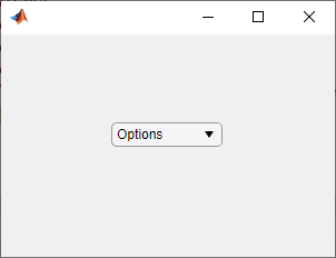
Placeholder — Placeholder text
'' (default) | character vector | string scalar
Placeholder text, specified as a character vector or string scalar. The placeholder provides a short description of the drop-down items. The placeholder text appears only when the drop-down component displays ''. There are two situations where this happens:
- The
Valueproperty is set to''. - The
Valueproperty is set to an element ofItemsDatawhose corresponding item is''.
For example, to display a placeholder in a drop-down component with noItemsData, add '' to Items and set the Value property to '':
fig = uifigure('Position',[100 100 300 200]); dd = uidropdown(fig,'Items',{'','One','Two'}, ... 'Value','', ... 'Placeholder','Options');
Font and Color
Font name, specified as a system supported font name. The default font depends on the specific operating system and locale.
If the specified font is not available, then MATLAB uses the best match among the fonts available on the system where the app is running.
Example: 'Arial'
Font size, specified as a positive number. The units of measurement are pixels. The default font size depends on the specific operating system and locale.
Example: 14
Font weight, specified as one of these values:
'normal'— Default weight as defined by the particular font'bold'— Thicker character outlines than'normal'
Not all fonts have a bold font weight. For fonts that do not, specifying'bold' results in the normal font weight.
Font angle, specified as 'normal' or 'italic'. Not all fonts have an italic font angle. For fonts that do not, specifying'italic' results in the normal font angle.
Font color, specified as an RGB triplet, a hexadecimal color code, or one of the options listed in the table.
RGB triplets and hexadecimal color codes are useful for specifying custom colors.
- An RGB triplet is a three-element row vector whose elements specify the intensities of the red, green, and blue components of the color. The intensities must be in the range
[0,1]; for example,[0.4 0.6 0.7]. - A hexadecimal color code is a character vector or a string scalar that starts with a hash symbol (
#) followed by three or six hexadecimal digits, which can range from0toF. The values are not case sensitive. Thus, the color codes"#FF8800","#ff8800","#F80", and"#f80"are equivalent.
Alternatively, you can specify some common colors by name. This table lists the named color options, the equivalent RGB triplets, and hexadecimal color codes.
| Color Name | Short Name | RGB Triplet | Hexadecimal Color Code | Appearance |
|---|---|---|---|---|
| "red" | "r" | [1 0 0] | "#FF0000" |  |
| "green" | "g" | [0 1 0] | "#00FF00" |  |
| "blue" | "b" | [0 0 1] | "#0000FF" |  |
| "cyan" | "c" | [0 1 1] | "#00FFFF" |  |
| "magenta" | "m" | [1 0 1] | "#FF00FF" |  |
| "yellow" | "y" | [1 1 0] | "#FFFF00" |  |
| "black" | "k" | [0 0 0] | "#000000" |  |
| "white" | "w" | [1 1 1] | "#FFFFFF" |  |
Here are the RGB triplets and hexadecimal color codes for the default colors MATLAB uses in many types of plots.
| RGB Triplet | Hexadecimal Color Code | Appearance |
|---|---|---|
| [0 0.4470 0.7410] | "#0072BD" | ![Sample of RGB triplet [0 0.4470 0.7410], which appears as dark blue](https://www.mathworks.com/help/matlab/ref/colororder1.png) |
| [0.8500 0.3250 0.0980] | "#D95319" | ![Sample of RGB triplet [0.8500 0.3250 0.0980], which appears as dark orange](https://www.mathworks.com/help/matlab/ref/colororder2.png) |
| [0.9290 0.6940 0.1250] | "#EDB120" | ![Sample of RGB triplet [0.9290 0.6940 0.1250], which appears as dark yellow](https://www.mathworks.com/help/matlab/ref/colororder3.png) |
| [0.4940 0.1840 0.5560] | "#7E2F8E" | ![Sample of RGB triplet [0.4940 0.1840 0.5560], which appears as dark purple](https://www.mathworks.com/help/matlab/ref/colororder4.png) |
| [0.4660 0.6740 0.1880] | "#77AC30" | ![Sample of RGB triplet [0.4660 0.6740 0.1880], which appears as medium green](https://www.mathworks.com/help/matlab/ref/colororder5.png) |
| [0.3010 0.7450 0.9330] | "#4DBEEE" | ![Sample of RGB triplet [0.3010 0.7450 0.9330], which appears as light blue](https://www.mathworks.com/help/matlab/ref/colororder6.png) |
| [0.6350 0.0780 0.1840] | "#A2142F" | ![Sample of RGB triplet [0.6350 0.0780 0.1840], which appears as dark red](https://www.mathworks.com/help/matlab/ref/colororder7.png) |
BackgroundColor — Background color
[0.96 0.96 0.96] (default) | RGB triplet | hexadecimal color code | 'r' | 'g' | 'b' | ...
Background color, specified as an RGB triplet, a hexadecimal color code, or one of the color options listed in the table.
RGB triplets and hexadecimal color codes are useful for specifying custom colors.
- An RGB triplet is a three-element row vector whose elements specify the intensities of the red, green, and blue components of the color. The intensities must be in the range
[0,1]; for example,[0.4 0.6 0.7]. - A hexadecimal color code is a character vector or a string scalar that starts with a hash symbol (
#) followed by three or six hexadecimal digits, which can range from0toF. The values are not case sensitive. Thus, the color codes"#FF8800","#ff8800","#F80", and"#f80"are equivalent.
Alternatively, you can specify some common colors by name. This table lists the named color options, the equivalent RGB triplets, and hexadecimal color codes.
| Color Name | Short Name | RGB Triplet | Hexadecimal Color Code | Appearance |
|---|---|---|---|---|
| "red" | "r" | [1 0 0] | "#FF0000" | |
| "green" | "g" | [0 1 0] | "#00FF00" | |
| "blue" | "b" | [0 0 1] | "#0000FF" | |
| "cyan" | "c" | [0 1 1] | "#00FFFF" | |
| "magenta" | "m" | [1 0 1] | "#FF00FF" | |
| "yellow" | "y" | [1 1 0] | "#FFFF00" | |
| "black" | "k" | [0 0 0] | "#000000" | |
| "white" | "w" | [1 1 1] | "#FFFFFF" | |
Here are the RGB triplets and hexadecimal color codes for the default colors MATLAB uses in many types of plots.
| RGB Triplet | Hexadecimal Color Code | Appearance |
|---|---|---|
| [0 0.4470 0.7410] | "#0072BD" | |
| [0.8500 0.3250 0.0980] | "#D95319" | |
| [0.9290 0.6940 0.1250] | "#EDB120" | |
| [0.4940 0.1840 0.5560] | "#7E2F8E" | |
| [0.4660 0.6740 0.1880] | "#77AC30" | |
| [0.3010 0.7450 0.9330] | "#4DBEEE" | |
| [0.6350 0.0780 0.1840] | "#A2142F" | |
StyleConfigurations — Configurations of added styles
empty n-by-3 table array (default) | n-by-3 table array
This property is read-only.
Configuration of added styles created using the uistyle function, returned as an n-by-3 table array. Each row of the table array corresponds to a style that is currently applied to the drop-down component. Styles that are added consecutively are given a style order number ofn+1. The Target andTargetIndex columns specify the part of the component that the style was added to. The Style column specifies the style class name.
Use this property if you want to remove a style from the drop-down component using the removeStyle function.
Example: Remove a Style
First, add two styles to a drop-down component.
fig = uifigure; fig.Position = [100 100 300 250]; dd = uidropdown(fig);
s1 = uistyle("FontColor","blue"); s2 = uistyle("FontColor","red");
addStyle(dd,s1,"item",1); addStyle(dd,s2,"item",[2 3 4]);
When you query dd.StyleConfigurations, MATLAB returns a 2-by-3 table array. The blue font style was added to the component first, so it is style order number 1. TheTargetIndex value for the level style,{[1]}, indicates that the style was applied to the first item in the component. Similarly, the second style was added to the last three items in the component
ans =
2×3 table
     Target    TargetIndex              Style
     ______    ___________    _________________________

1     item      {[    1]}     1×1 matlab.ui.style.Style
2     item      {[2 3 4]}     1×1 matlab.ui.style.Style
Remove the second style that was added to the drop-down component by specifying style order number 2. The component appearance updates to use only the first style.
Interactivity
State of visibility, specified as 'on' or 'off', or as numeric or logical 1 (true) or0 (false). A value of 'on' is equivalent to true, and 'off' is equivalent tofalse. Thus, you can use the value of this property as a logical value. The value is stored as an on/off logical value of type matlab.lang.OnOffSwitchState.
'on'— Display the object.'off'— Hide the object without deleting it. You still can access the properties of an invisible UI component.
To make your app start faster, set the Visible property to'off' for all UI components that do not need to appear at startup.
Editable state of the drop-down component, specified as 'off' or'on', or as numeric or logical 1 (true) or 0 (false). A value of 'on' is equivalent to true, and'off' is equivalent to false. Thus, you can use the value of this property as a logical value. The value is stored as an on/off logical value of type matlab.lang.OnOffSwitchState.
If the Enable property value is 'off', then the app user cannot change the drop-down component text, even if the Editable property value is 'on'.
Operational state, specified as 'on' or 'off', or as numeric or logical 1 (true) or0 (false). A value of 'on' is equivalent to true, and 'off' is equivalent tofalse. Thus, you can use the value of this property as a logical value. The value is stored as an on/off logical value of type matlab.lang.OnOffSwitchState.
- If you set this property to
'on', the app user can interact with the component. - If you set this property to
'off', the component appears dimmed, indicating that the app user cannot interact with it, and that it will not trigger a callback.
Tooltip — Tooltip
'' (default) | character vector | cell array of character vectors | string array | 1-D categorical array
Tooltip, specified as a character vector, cell array of character vectors, string array, or 1-D categorical array. Use this property to display a message when the user hovers the pointer over the component at run time. The tooltip displays even when the component is disabled. To display multiple lines of text, specify a cell array of character vectors or a string array. Each element in the array becomes a separate line of text. If you specify this property as a categorical array, MATLAB uses the values in the array, not the full set of categories.
— Context menu
empty GraphicsPlaceholder array (default) | ContextMenu object
Context menu, specified as a ContextMenu object created using the uicontextmenu function. Use this property to display a context menu when you right-click on a component.
Position
Location and size of the drop-down component relative to the parent, specified as the vector [left bottom width height]. This table describes each element in the vector.
| Element | Description |
|---|---|
| left | Distance from the inner left edge of the parent container to the outer left edge of the drop-down component |
| bottom | Distance from the inner bottom edge of the parent container to the outer bottom edge of the drop-down component |
| width | Distance between the right and left outer edges of the drop-down component |
| height | Distance between the top and bottom outer edges of the drop-down component |
All measurements are in pixel units.
The Position values are relative to the_drawable area_ of the parent container. The drawable area is the area inside the borders of the container and does not include the area occupied by decorations such as a menu bar or title.
Example: [100 100 100 22]
InnerPosition — Inner location and size of drop-down component
[100 100 100 22] (default) | [left bottom width height]
Inner location and size of the drop-down component, specified as [left bottom width height]. Position values are relative to the parent container. All measurements are in pixel units. This property value is identical toPosition for drop-down components.
OuterPosition — Outer location and size of drop-down component
[100 100 100 22]] (default) | [left bottom width height]
This property is read-only.
Outer location and size of drop-down component returned as [left bottom width height]. Position values are relative to the parent container. All measurements are in pixel units. This property value is identical toPosition for drop-down components.
Layout — Layout options
empty LayoutOptions array (default) | GridLayoutOptions object
Layout options, specified as aGridLayoutOptions object. This property specifies options for components that are children of grid layout containers. If the component is not a child of a grid layout container (for example, it is a child of a figure or panel), then this property is empty and has no effect. However, if the component is a child of a grid layout container, you can place the component in the desired row and column of the grid by setting the Row and Column properties on the GridLayoutOptions object.
For example, this code places a drop-down in the third row and second column of its parent grid.
g = uigridlayout([4 3]); dd = uidropdown(g); dd.Layout.Row = 3; dd.Layout.Column = 2;
To make the drop-down span multiple rows or columns, specify theRow or Column property as a two-element vector. For example, this drop-down spans columns 2 through3:
dd.Layout.Column = [2 3];
Callbacks
Value changed callback, specified as one of these values:
- A function handle.
- A cell array in which the first element is a function handle. Subsequent elements in the cell array are the arguments to pass to the callback function.
- A character vector containing a valid MATLAB expression (not recommended). MATLAB evaluates this expression in the base workspace.
This callback function executes when the user selects a different option from the drop-down list. It does not execute if the Value property changes programmatically.
This callback function can access specific information about the user’s interaction with the drop-down. MATLAB passes this information in a ValueChangedData object as the second argument to your callback function. In App Designer, the argument is called event. You can query the object properties using dot notation. For example,event.PreviousValue returns the previous value of the drop-down. The ValueChangedData object is not available to callback functions specified as character vectors.
The following table lists the properties of the ValueChangedData object.
| Property | Value |
|---|---|
| Value | Value of drop-down component after the app user’s most recent interaction |
| PreviousValue | Value of drop-down component before the app user’s most recent interaction |
| Edited | Logical value that indicates whether the callback was executed as a result of typing a new value into the drop-down component. 0 (false) — The app user selected or typed an element of theItems property of the drop-down component.1 (true) — The app user typed a value that is not an element of theItems property of the drop-down component. |
| ValueIndex | Index of drop-down component value in items after the app user’s most recent interaction |
| PreviousValueIndex | Index of drop-down component value in items before the app user’s most recent interaction |
| Source | Component that executes the callback |
| EventName | 'ValueChanged' |
For more information about writing callbacks, see Callbacks in App Designer.
DropDownOpeningFcn — Drop-down menu opening callback
'' (default) | function handle | cell array | character vector
Drop-down menu opening callback, specified as one of these values:
- A function handle.
- A cell array in which the first element is a function handle. Subsequent elements in the cell array are the arguments to pass to the callback function.
- A character vector containing a valid MATLAB expression (not recommended). MATLAB evaluates this expression in the base workspace.
This property specifies a callback function to execute when the user clicks to open the drop-down menu. A possible use for this callback is to dynamically update the list of entries in the drop-down menu.
This callback function can access specific information about the user’s interaction with the drop-down. MATLAB passes this information in a DropDownOpeningData object as the second argument to your callback function. In App Designer, the argument is called event. You can query the object properties using dot notation. For example,event.Source returns the DropDown object that the user interacts with to trigger the callback. The DropDownOpeningData object is not available to callback functions specified as character vectors.
The following table lists the properties of the DropDownOpeningData object.
| Property | Value |
|---|---|
| Source | Component that executes the callback |
| EventName | 'DropDownOpening' |
For more information about writing callbacks, see Callbacks in App Designer.
ClickedFcn — Clicked callback
'' (default) | function handle | cell array | character vector
Clicked callback, specified as one of these values:
- A function handle.
- A cell array in which the first element is a function handle. Subsequent elements in the cell array are the arguments to pass to the callback function.
- A character vector containing a valid MATLAB expression (not recommended). MATLAB evaluates this expression in the base workspace.
This callback function executes when the user clicks anywhere in the drop-down component.
This callback function can access specific information about the user’s interaction with the drop-down component. MATLAB passes this information in a ClickedData object as the second argument to your callback function. In App Designer, the argument is called event. You can query the object properties using dot notation. For example,event.InteractionInformation returns information about where the user clicked in the drop-down component. The ClickedData object is not available to callback functions specified as character vectors.
This table lists the properties of the ClickedData object.
| Property | Value |
|---|---|
| InteractionInformation | Information about where in the component the app user clicked. This information is stored as an object with these properties: ItemScreenLocationLocationYou can query the object properties using dot notation. For example, event.InteractionInformation.Item returns which item of the drop-down component the user clicked. |
| Source | Component that executes the callback |
| EventName | 'Clicked' |
This table lists the properties of the InteractionInformation object associated with the drop-down component.
| Property | Value |
|---|---|
| Item | Index of the clicked drop-down component item, returned as a scalar.If the user clicked an area of the drop-down component that is not associated with an item, then Item is an empty array. |
| Location | Location where the user clicked relative to the bottom-left corner of the drop-down component parent container, returned as a two-element vector of the form [x y].The value ofx represents the horizontal distance from the left edge of parent container to the click location. The value of y represents the vertical distance from the bottom edge of the parent container to the click location. Distances are measured in pixels. |
| ScreenLocation | Location where the user clicked relative to the bottom-left corner of their primary display, returned as a two-element vector of the form[x y].The value of x represents the horizontal distance from the left edge of the display to the click location. The value of y represents the vertical distance from the bottom edge of the display to the click location. Distances are measured in pixels. |
For more information about writing callbacks, see Callbacks in App Designer.
Example: Display Data When Drop-Down Component Is Clicked
Create a drop-down component with items that represent groceries and item data that represents their cost. Specify a ClickedFcn callback function named displayCost that executes when a user clicks the component. In the displayCost function:
- Use the
event.InteractionInformationobject to access information about whether the user clicked an item. - If the user did click an item (as opposed to a location in the drop-down component that is not associated with an item), query the item and its cost.
- Display the item and its cost in the Command Window.
To try this example, save the code in a new script and run it. Click an item in the drop-down component to display its cost.
fig = uifigure; dd = uidropdown(fig); dd.Items = ["Apple","Banana","Orange"]; dd.ItemsData = [1.2,0.5,1.2]; dd.ClickedFcn = @displayCost;
function displayCost(dd,event) idx = event.InteractionInformation.Item; if ~isempty(idx) fruit = dd.Items(idx); cost = dd.ItemsData(idx); disp(fruit + " cost $" + cost) end end
Object creation function, specified as one of these values:
- Function handle.
- Cell array in which the first element is a function handle. Subsequent elements in the cell array are the arguments to pass to the callback function.
- Character vector containing a valid MATLAB expression (not recommended). MATLAB evaluates this expression in the base workspace.
For more information about specifying a callback as a function handle, cell array, or character vector, see Callbacks in App Designer.
This property specifies a callback function to execute when MATLAB creates the object. MATLAB initializes all property values before executing the CreateFcn callback. If you do not specify the CreateFcn property, then MATLAB executes a default creation function.
Setting the CreateFcn property on an existing component has no effect.
If you specify this property as a function handle or cell array, you can access the object that is being created using the first argument of the callback function. Otherwise, use the gcbo function to access the object.
Object deletion function, specified as one of these values:
- Function handle.
- Cell array in which the first element is a function handle. Subsequent elements in the cell array are the arguments to pass to the callback function.
- Character vector containing a valid MATLAB expression (not recommended). MATLAB evaluates this expression in the base workspace.
For more information about specifying a callback as a function handle, cell array, or character vector, see Callbacks in App Designer.
This property specifies a callback function to execute when MATLAB deletes the object. MATLAB executes the DeleteFcn callback before destroying the properties of the object. If you do not specify the DeleteFcn property, then MATLAB executes a default deletion function.
If you specify this property as a function handle or cell array, you can access the object that is being deleted using the first argument of the callback function. Otherwise, use the gcbo function to access the object.
Callback Execution Control
Callback interruption, specified as 'on' or 'off', or as numeric or logical 1 (true) or0 (false). A value of 'on' is equivalent to true, and 'off' is equivalent tofalse. Thus, you can use the value of this property as a logical value. The value is stored as an on/off logical value of type matlab.lang.OnOffSwitchState.
This property determines if a running callback can be interrupted. There are two callback states to consider:
- The running callback is the currently executing callback.
- The interrupting callback is a callback that tries to interrupt the running callback.
MATLAB determines callback interruption behavior whenever it executes a command that processes the callback queue. These commands include drawnow, figure, uifigure, getframe, waitfor, and pause.
If the running callback does not contain one of these commands, then no interruption occurs. MATLAB first finishes executing the running callback, and later executes the interrupting callback.
If the running callback does contain one of these commands, then theInterruptible property of the object that owns the running callback determines if the interruption occurs:
- If the value of
Interruptibleis'off', then no interruption occurs. Instead, theBusyActionproperty of the object that owns the interrupting callback determines if the interrupting callback is discarded or added to the callback queue. - If the value of
Interruptibleis'on', then the interruption occurs. The next time MATLAB processes the callback queue, it stops the execution of the running callback and executes the interrupting callback. After the interrupting callback completes, MATLAB then resumes executing the running callback.
Note
Callback interruption and execution behave differently in these situations:
- If the interrupting callback is a
DeleteFcn,CloseRequestFcn, orSizeChangedFcncallback, then the interruption occurs regardless of theInterruptibleproperty value. - If the running callback is currently executing the
waitforfunction, then the interruption occurs regardless of theInterruptibleproperty value. - If the interrupting callback is owned by a
Timerobject, then the callback executes according to schedule regardless of theInterruptibleproperty value.
Note
When an interruption occurs, MATLAB does not save the state of properties or the display. For example, the object returned by the gca or gcf command might change when another callback executes.
Callback queuing, specified as 'queue' or 'cancel'. The BusyAction property determines how MATLAB handles the execution of interrupting callbacks. There are two callback states to consider:
- The running callback is the currently executing callback.
- The interrupting callback is a callback that tries to interrupt the running callback.
The BusyAction property determines callback queuing behavior only when both of these conditions are met:
- The running callback contains a command that processes the callback queue, such as drawnow, figure, uifigure, getframe, waitfor, or pause.
- The value of the
Interruptibleproperty of the object that owns the running callback is'off'.
Under these conditions, the BusyAction property of the object that owns the interrupting callback determines how MATLAB handles the interrupting callback. These are possible values of theBusyAction property:
'queue'— Puts the interrupting callback in a queue to be processed after the running callback finishes execution.'cancel'— Does not execute the interrupting callback.
This property is read-only.
Deletion status, returned as an on/off logical value of type matlab.lang.OnOffSwitchState.
MATLAB sets the BeingDeleted property to'on' when the DeleteFcn callback begins execution. The BeingDeleted property remains set to'on' until the component object no longer exists.
Check the value of the BeingDeleted property to verify that the object is not about to be deleted before querying or modifying it.
Parent/Child
Parent — Parent container
Figure object (default) | Panel object | Tab object | ButtonGroup object | GridLayout object
Parent container, specified as a Figure object created using the uifigure function, or one of its child containers: Tab, Panel, ButtonGroup, or GridLayout. If no container is specified, MATLAB calls the uifigure function to create a new Figure object that serves as the parent container.
Visibility of the object handle, specified as 'on', 'callback', or 'off'.
This property controls the visibility of the object in its parent's list of children. When an object is not visible in its parent's list of children, it is not returned by functions that obtain objects by searching the object hierarchy or querying properties. These functions include get, findobj, clf, and close. Objects are valid even if they are not visible. If you can access an object, you can set and get its properties, and pass it to any function that operates on objects.
| HandleVisibility Value | Description |
|---|---|
| 'on' | The object is always visible. |
| 'callback' | The object is visible from within callbacks or functions invoked by callbacks, but not from within functions invoked from the command line. This option blocks access to the object at the command-line, but allows callback functions to access it. |
| 'off' | The object is invisible at all times. This option is useful for preventing unintended changes to the UI by another function. Set the HandleVisibility to 'off' to temporarily hide the object during the execution of that function. |
Identifiers
Type — Type of graphics object
'uidropdown'
This property is read-only.
Type of graphics object, returned as 'uidropdown'.
Object identifier, specified as a character vector or string scalar. You can specify a unique Tag value to serve as an identifier for an object. When you need access to the object elsewhere in your code, you can use the findobj function to search for the object based on the Tag value.
User data, specified as any MATLAB array. For example, you can specify a scalar, vector, matrix, cell array, character array, table, or structure. Use this property to store arbitrary data on an object.
If you are working in App Designer, create public or private properties in the app to share data instead of using the UserData property. For more information, see Share Data Within App Designer Apps.
Object Functions
Examples
Set and Access Drop-Down Component Properties
Create a drop-down component in a UI figure and specify the items.
fig = uifigure; dd = uidropdown(fig,"Items",["Red","Yellow","Blue","Green"]);
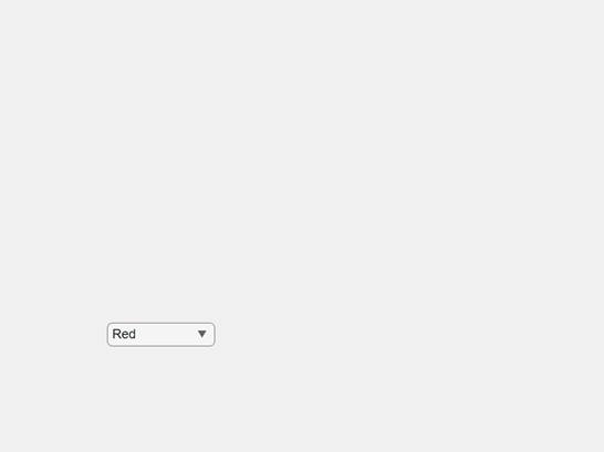
Determine the value associated with the selected item. When theItemsData property is empty (the default), the drop-down component Value property stores the name of the selected item as it appears in the Items property.
Associate a hexadecimal color code with each drop-down component item by specifying the ItemsData property.
dd.ItemsData = ["#F00" "#FF0" "#00F" "#0F0"];
When ItemsData is nonempty, the drop-down componentValue property stores the data associated with the selected item.
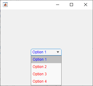
Add Colors to Drop-Down Component Items
Since R2023a
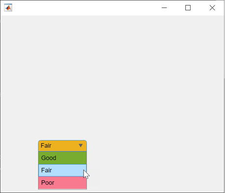
Create a drop-down UI component with three items.
fig = uifigure; dd = uidropdown(fig,"Items",["Good","Fair","Poor"]);
Create three background color styles.
s1 = uistyle("BackgroundColor","#77AC30"); s2 = uistyle("BackgroundColor","#EDB120"); s3 = uistyle("BackgroundColor","#F77A8F");
Add the styles to the drop-down component items to change their background colors.
addStyle(dd,s1,"item",1); addStyle(dd,s2,"item",2); addStyle(dd,s3,"item",3);
The item background colors update, and the appearance of the component reflects the style of the selected item. The style does not change the color that displays when a user points to an item.
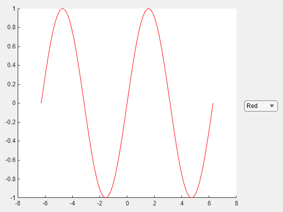
Code Response to Item Selection
Create an app that changes the color of a plotted line when an app user makes a selection from a drop-down list.
In a file named plotOptions.m, write a function that implements the app:
- Create a UI figure and a grid layout manager to lay out the app.
- Create UI axes and a drop-down component in the grid layout manager.
- Write a callback function named
updatePlotthat changes the plot color based on the selected drop-down component item, and assign the function to theValueChangedFcncallback property. For more information about callbacks, see Create Callbacks for Apps Created Programmatically.
function plotOptions fig = uifigure; g = uigridlayout(fig); g.RowHeight = {'1x','fit','1x'}; g.ColumnWidth = {'1x','fit'};
ax = uiaxes(g); ax.Layout.Row = [1 3]; ax.Layout.Column = 1;
x = linspace(-2pi,2pi); y = sin(x); p = plot(ax,x,y,"Color","#F00");
dd = uidropdown(g, ... "Items",["Red","Yellow","Blue","Green"], ... "ItemsData",["#F00" "#FF0" "#00F" "#0F0"], ... "ValueChangedFcn",@(src,event) updatePlot(src,p)); dd.Layout.Row = 2; dd.Layout.Column = 2; end
function updatePlot(src,p) val = src.Value; p.Color = val; end
Run the plotOptions function. Select an item from the drop-down list to change the plot color.
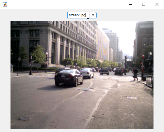
Code Response to Selection in Editable Drop-Down Component
Create an app that allows a user to choose an image to display. Because the app contains an editable drop-down component, write your code to handle users selecting an existing item and users entering their own value.
In a file named imageApp.m, write a function that implements the app:
- Create a UI figure and a grid layout manager to lay out the app.
- Create an editable drop-down component and an image component in the grid layout manager.
- Write a callback function named
updateImagethat changes the image based on the selected drop-down component item, and assign the function to theValueChangedFcncallback property. Query the callback event data to check if the new value was selected from the existing items or was entered by the user, and validate any user-entered value. For more information about callbacks, see Create Callbacks for Apps Created Programmatically.
function imageApp fig = uifigure; g = uigridlayout(fig,[2 3]); g.RowHeight = {22,'1x'}; g.ColumnWidth = {'1x','fit','1x'};
dd = uidropdown(g, ... "Editable","on", ... "Items",["peppers.png","street1.jpg"]); dd.Layout.Row = 1; dd.Layout.Column = 2;
im = uiimage(g,"ImageSource","peppers.png"); im.Layout.Row = 2; im.Layout.Column = [1 3];
dd.ValueChangedFcn = @(src,event)updateImage(src,event,im,fig); end
function updateImage(src,event,im,fig) val = src.Value; if event.Edited && ~exist(val,"file") im.ImageSource = ""; uialert(fig,"Enter a file on the MATLAB path","Invalid Image") else im.ImageSource = val; end end
Run the imageApp function and update the image by selecting an existing item or by entering your own image path.
Version History
Introduced in R2016a
R2023b: Access index of component value in list of items
Access the index of the component value in the list of items by using theValueIndex property.
R2023a: Style drop-down component items
Create styles for drop-down components using the uistyle function, and add the styles to individual items or entire drop-down components using theaddStyle function.
R2022b: Program a response to a user clicking the drop-down component
Use the ClickedFcn callback property to program a response to a user clicking the drop-down component.
R2021a: Specify placeholder text
Provide a short hint that describes the expected drop-down component input by using thePlaceholder property.