arviz.plot_ppc — ArviZ dev documentation (original) (raw)
arviz.plot_ppc(data, kind='kde', alpha=None, mean=True, observed=None, observed_rug=False, color=None, colors=None, grid=None, figsize=None, textsize=None, data_pairs=None, var_names=None, filter_vars=None, coords=None, flatten=None, flatten_pp=None, num_pp_samples=None, random_seed=None, jitter=None, animated=False, animation_kwargs=None, legend=True, labeller=None, ax=None, backend=None, backend_kwargs=None, group='posterior', show=None)[source]#
Plot for posterior/prior predictive checks.
Parameters:
dataInferenceData
arviz.InferenceData object containing the observed and posterior/prior predictive data.
kindstr, default “kde”
Type of plot to display (“kde”, “cumulative”, or “scatter”).
alphafloat, optional
Opacity of posterior/prior predictive density curves. Defaults to 0.2 for kind = kde and cumulative, for scatter defaults to 0.7.
Whether or not to plot the mean posterior/prior predictive distribution.
observedbool, optional
Whether or not to plot the observed data. Defaults to True for group = posteriorand False for group = prior.
observed_rugbool, default False
Whether or not to plot a rug plot for the observed data. Only valid if observed isTrue and for kind kde or cumulative.
colorlist, optional
List with valid matplotlib colors corresponding to the posterior/prior predictive distribution, observed data and mean of the posterior/prior predictive distribution. Defaults to [“C0”, “k”, “C1”].
gridtuple, optional
Number of rows and columns. Defaults to None, the rows and columns are automatically inferred.
figsizetuple, optional
Figure size. If None, it will be defined automatically.
textsizefloat, optional
Text size scaling factor for labels, titles and lines. If None, it will be autoscaled based on figsize.
data_pairsdict, optional
Dictionary containing relations between observed data and posterior/prior predictive data. Dictionary structure:
- key = data var_name
- value = posterior/prior predictive var_name
For example, data_pairs = {'y' : 'y_hat'}If None, it will assume that the observed data and the posterior/prior predictive data have the same variable name.
var_nameslist of str, optional
Variables to be plotted, if None all variable are plotted. Prefix the variables by ~ when you want to exclude them from the plot.
filter_vars{None, “like”, “regex”}, default None
If None (default), interpret var_names as the real variables names. If “like”, interpret var_names as substrings of the real variables names. If “regex”, interpret var_names as regular expressions on the real variables names. A lapandas.filter.
coordsdict, optional
Dictionary mapping dimensions to selected coordinates to be plotted. Dimensions without a mapping specified will include all coordinates for that dimension. Defaults to including all coordinates for all dimensions if None.
flattenlist
List of dimensions to flatten in observed_data. Only flattens across the coordinates specified in the coords argument. Defaults to flattening all of the dimensions.
flatten_pplist
List of dimensions to flatten in posterior_predictive/prior_predictive. Only flattens across the coordinates specified in the coords argument. Defaults to flattening all of the dimensions. Dimensions should match flatten excluding dimensions for data_pairsparameters. If flatten is defined and flatten_pp is None, thenflatten_pp = flatten.
num_pp_samplesint
The number of posterior/prior predictive samples to plot. For kind = ‘scatter’ andanimation = False if defaults to a maximum of 5 samples and will set jitter to 0.7. unless defined. Otherwise it defaults to all provided samples.
random_seedint
Random number generator seed passed to numpy.random.seed to allow reproducibility of the plot. By default, no seed will be provided and the plot will change each call if a random sample is specified by num_pp_samples.
jitterfloat, default 0
If kind is “scatter”, jitter will add random uniform noise to the height of the ppc samples and observed data.
Create an animation of one posterior/prior predictive sample per frame. Only works with matploblib backend. To run animations inside a notebook you have to use the nbAgg matplotlib’s backend. Try with %matplotlib notebook or %matplotlib nbAgg. You can switch back to the default matplotlib’s backend with %matplotlib inline or %matplotlib auto. If switching back and forth between matplotlib’s backend, you may need to run twice the cell with the animation. If you experience problems rendering the animation try settinganimation_kwargs({'blit':False}) or changing the matplotlib’s backend (e.g. to TkAgg) If you run the animation from a script write ax, ani = az.plot_ppc(.)
animation_kwargsdict
Keywords passed to matplotlib.animation.FuncAnimation. Ignored with matplotlib backend.
Add legend to figure.
labellerlabeller, optional
Class providing the method make_pp_label to generate the labels in the plot titles. Read the Label guide for more details and usage examples.
axnumpy array_like of matplotlib Axes or bokeh figures, optional
A 2D array of locations into which to plot the densities. If not supplied, Arviz will create its own array of plot areas (and return it).
backendstr, optional
Select plotting backend {“matplotlib”,”bokeh”}. Default to “matplotlib”.
backend_kwargsdict, optional
These are kwargs specific to the backend being used, passed tomatplotlib.pyplot.subplots() or bokeh.plotting.figure(). For additional documentation check the plotting method of the backend.
group{“prior”, “posterior”}, optional
Specifies which InferenceData group should be plotted. Defaults to ‘posterior’. Other value can be ‘prior’.
showbool, optional
Call backend show function.
Returns:
axesmatplotlib Axes or bokeh_figures
animatplotlib.animation.FuncAnimation, optional
Only provided if animated is True.
See also
Plot Bayesian p-value for observed data and Posterior/Prior predictive.
Plot for posterior predictive checks using cross validation.
Posterior predictive and mean plots for regression-like data.
Plot timeseries data.
Examples
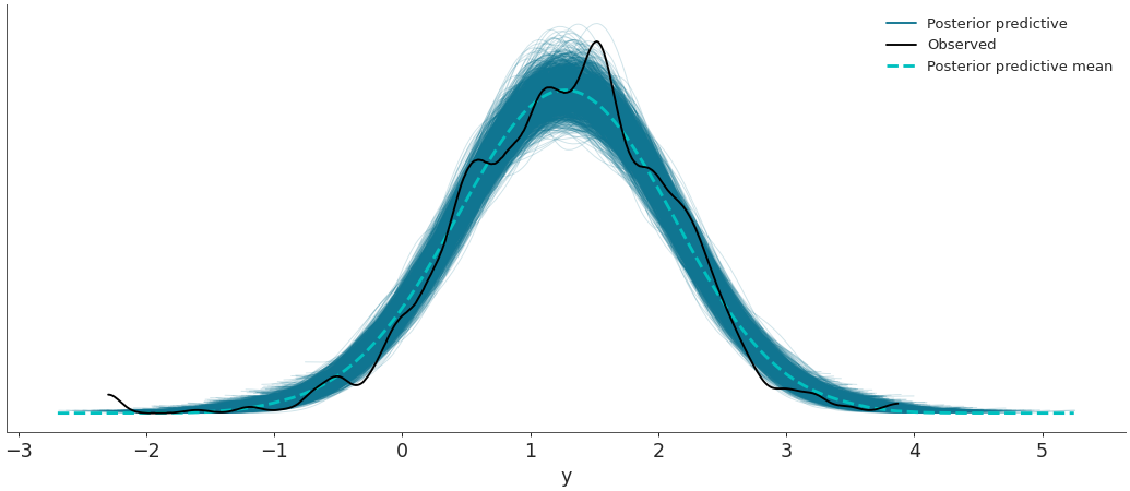
Plot the observed data KDE overlaid on posterior predictive KDEs.
import arviz as az data = az.load_arviz_data('radon') az.plot_ppc(data, data_pairs={"y":"y"})
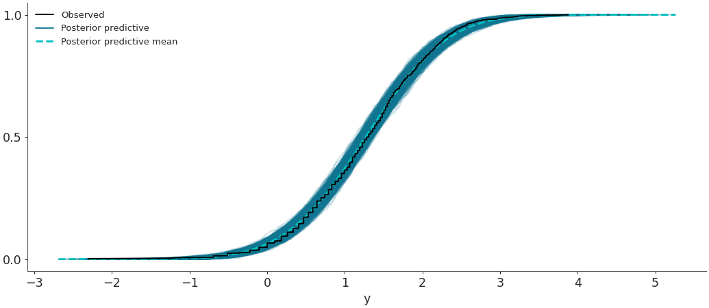
Plot the overlay with empirical CDFs.
az.plot_ppc(data, kind='cumulative')
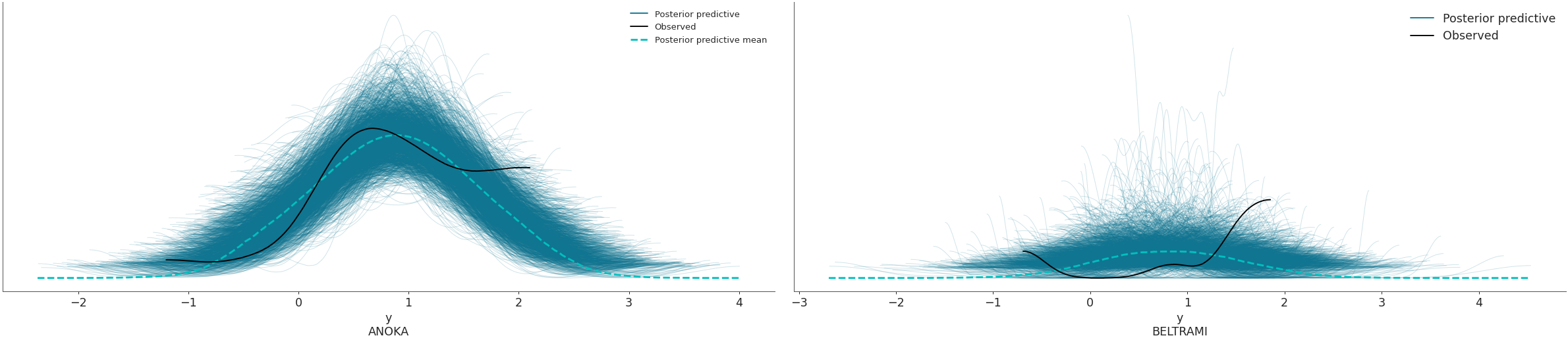
Use the coords and flatten parameters to plot selected variable dimensions across multiple plots. We will now modify the dimension obs_id to contain indicate the name of the county where the measure was taken. The change has to be done on both posterior_predictive and observed_data groups, which is why we will use map() to apply the same function to both groups. Afterwards, we will select the counties to be plotted with thecoords arg.
obs_county = data.posterior["County"][data.constant_data["county_idx"]] data = data.assign_coords(obs_id=obs_county, groups="observed_vars") az.plot_ppc(data, coords={'obs_id': ['ANOKA', 'BELTRAMI']}, flatten=[])
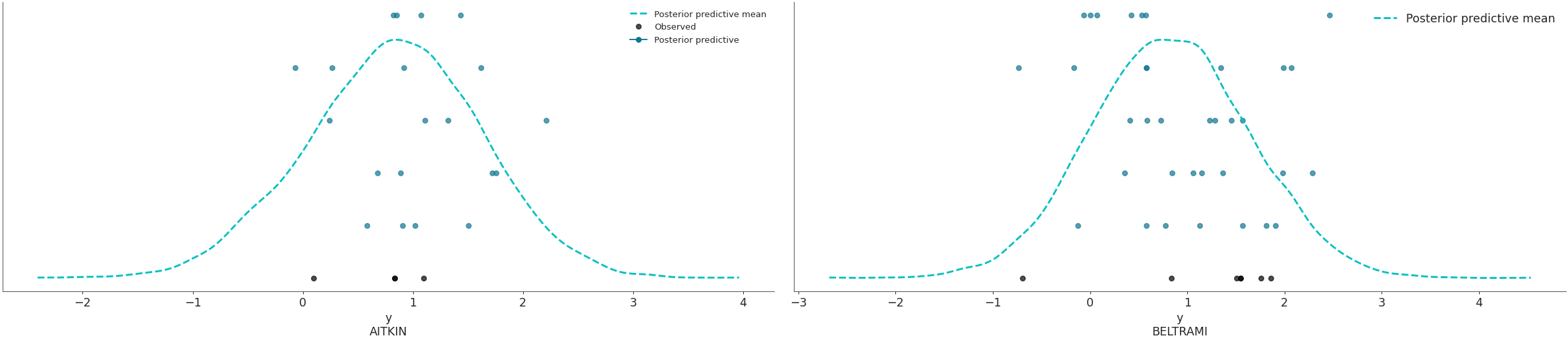
Plot the overlay using a stacked scatter plot that is particularly useful when the sample sizes are small.
az.plot_ppc(data, kind='scatter', flatten=[], coords={'obs_id': ['AITKIN', 'BELTRAMI']})
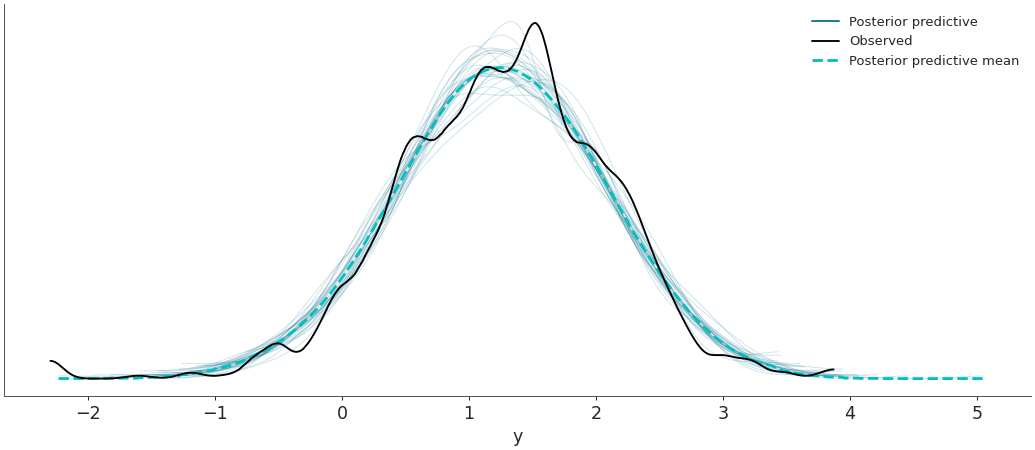
Plot random posterior predictive sub-samples.
az.plot_ppc(data, num_pp_samples=30, random_seed=7)