Gold Price Prediction using Machine Learning (original) (raw)
Last Updated : 23 Jul, 2025
In This article, We will be making a project from scratch about Gold price prediction. To build any data science project We have to follow certain steps that need not be in the same order. In our project, We will go through these steps sequentially.
- Problem Formulation
- Data preprocessing
- Data wrangling
- Model Development
- Model Explainability
- Model Deployment
Problem Formulation
Problem Formulation is one of the most important steps We do before starting any project. there has to be a clear idea about the goal of our data science project. In our case, the goal of this project is to analyze the price of gold. The price of gold is volatile, they change rapidly with time. Our main Aim of this project will be to predict the price of gold per unit.
Importing Libraries
We will import all the libraries that we will be using throughout this article in one place so that do not have to import every time we use it this will save both our time and effort.
- **Pandas **- A Python library built on top of NumPy for effective matrix multiplication and dataframe manipulation, it is also used for data cleaning, data merging, data reshaping, and data aggregation
- **Numpy - A Python library that is used for numerical mathematical computation and handling multidimensional ndarray, it also has a very large collection of mathematical functions to operate on this array
- **Matplotlib - It is used for plotting 2D and 3D visualization plots, it also supports a variety of output formats including graphs
- **Seaborn - seaborn library is made on top of Matplotlib it is used for plotting beautiful plots. Python `
import numpy as np
import pandas as pd
import seaborn as sns
import matplotlib.pyplot as plt
import warnings warnings.filterwarnings("ignore") sns.set_style("darkgrid", {"grid.color": ".6", "grid.linestyle": ":"})
from sklearn.preprocessing import StandardScaler from sklearn.model_selection import train_test_split from sklearn.preprocessing import PolynomialFeatures from sklearn.pipeline import make_pipeline from sklearn.linear_model import Lasso
from sklearn.ensemble import RandomForestRegressor from xgboost import XGBRegressor from sklearn.metrics import r2_score from sklearn.metrics import mean_squared_error from sklearn.model_selection import GridSearchCV
`
Loading the Dataset
We will read the dataset using the pandas read_csv() function, we can also specify the parse_dates argument which will convert the data type of the Dates column in datetime dtype. One Thing to notice initially the Dates dtype is an object. But when We change it datetime dtype it can be useful in many plotting and other computation. You can download the dataset from here which has been used in this article for the model development.
Python `
read dataset using pndas function
use parse_dates argument to change datetime dtype
dataset = pd.read_csv("gold_price_data.csv", parse_dates=["Date"])
`
We will use pandas' inbuilt function to see the data type of columns and also see if the columns have null values or not. It is a Pandas inbuilt function that we use to see information about the columns of the dataset.
Python `
information about the dataset
dataset.info()
`
**Output:
<class 'pandas.core.frame.DataFrame'>
RangeIndex: 2290 entries, 0 to 2289
Data columns (total 6 columns):
Column Non-Null Count Dtype
0 Date 2290 non-null datetime64[ns]
1 SPX 2290 non-null float64
2 GLD 2290 non-null float64
3 USO 2290 non-null float64
4 SLV 2290 non-null float64
5 EUR/USD 2290 non-null float64
dtypes: datetime64ns, float64(5)
memory usage: 107.5 KB
Data preprocessing - Missing Values/Null Values
Missing values have a very drastic effect on our model training. some of the models like LinearRegression do not fit the dataset which has missing values in it. However, there are some models which work well even with a missing dataset like RandomForest. But it is always a good practice to handle missing values first when working with the dataset. Also, one thing to note is that when we load the data using pandas it automatically detects null values and replaces them with NAN.
Python `
Missing Values/Null Values Count
dataset.isna().sum().sort_values(ascending=False)
`
**Output:
Date 0
SPX 0
GLD 0
USO 0
SLV 0
EUR/USD 0
dtype: int64
It will count the number of null values in each column of the dataset and display it in the notebook.
Correlation Between Columns
We should always check if there is any correlation between the two columns of our dataset. If two or more columns are correlated with each other and none of them is a target variable then we must use a method to remove this correlation. Some of the popular methods are PCA(principal component Analysis). We can also remove one of two columns or make a new one using these two.
Python `
Calculate correlation matrix
correlation = dataset.corr()
Create heatmap
sns.heatmap(correlation, cmap='coolwarm', center=0, annot=True)
Set title and axis labels
plt.title('Correlation Matrix Heatmap') plt.xlabel('Features') plt.ylabel('Features')
Show plot
plt.show()
`
**Output:

Identifying highly correlated features using the heatmap
Here the two columns SLV and GLD are strongly correlated with each other compared to others, here we will drop SLV since GLD column also has a large correlation with our target column. Here We have used the pandas Drop function to drop the column along axis=1.
Python `
drop SlV column
dataset.drop("SLV", axis=1, inplace=True)
`
Data Wrangling
Data wrangling is one of the main steps We use in a data science project to gain insight and knowledge from the data. We see data through every aspect and try to fetch most of the information from the dataframe.
We will first set the Date column as the index of the dataframe using the date as an index will add an advantage in plotting the data
Python `
reset the index to date column
dataset.set_index("Date", inplace=True)
`
We will first observe the change in Gold price with each consecutive day throughout the year.
Python `
plot price of gold for each increasing day
dataset["EUR/USD"].plot() plt.title("Change in price of gold through date") plt.xlabel("date") plt.ylabel("price") plt.show()
`
**Output:

Trend in gold price using a line chart
Through this graph, we are unable to find any good insight into the change in the price of gold. It looks very noisy, to see the trend in the data we have to make the graph smooth
Trend in Gold Prices Using Moving Averages
To visualize the trend in the data we have to apply a smoothing process on this line which looks very noisy. There are several ways to apply to smooth. In our project, we will take an average of 20 previous data points using the pandas rolling function. This is also known as the Moving Average.
Python `
apply rolling mean with window size of 3
dataset["price_trend"] = dataset["EUR/USD"]
.rolling(window=20).mean()
reset the index to date column
dataset.reset_index("Date", inplace=True)
since we have used rolling method
for 20 rows first 2 rows will be NAN
dataset["price_trend"].loc[20:].plot()
set title of the chart
plt.title("Trend in price of gold through date")
set x_label of the plot
plt.xlabel("date") plt.ylabel("price") plt.show()
`
**Output:

the smooth trend in the gold price using a line chart
Now the graph looks less noisy and here we can analyze the trend in change in the gold price.
Distribution of Columns
To see the distribution of numerical columns we will plot the histogram of each column in one figure to do this we will use the Matplotlib subplot function.
Python `
fig = plt.figure(figsize=(8, 8))
suptitle of the graph
fig.suptitle('Distribution of data across column') temp = dataset.drop("Date", axis=1).columns.tolist() for i, item in enumerate(temp): plt.subplot(2, 3, i+1) sns.histplot(data=dataset, x=item, kde=True) plt.tight_layout(pad=0.4, w_pad=0.5, h_pad=2.0) plt.show()
`
**Output:
.png)
Distribution of columns using histplot
Here we have used plt.figure to initialize a figure and set its size. One thing to note is that whenever we create a graph using matplotlib plot it automatically calls this function with the default figsize here We used sns.histplot function to create the histogram plot with kde equal True. The data distribution looks good However, we will check the skewness of each column using the pandas function.
Python `
skewness along the index axis
print(dataset.drop("Date", axis=1).skew(axis=0, skipna=True))
This code is modified by Susobhan Akhuli
`
**Output:
SPX 0.300362
GLD 0.334138
USO 1.699331
EUR/USD -0.005292
price_trend -0.029588
dtype: float64
Column USO has the highest skewness of 0.98, so here we will apply square root transformation on this column to reduce its skewness to 0. We can use different transformation functions to lower the skewness some are logarithmic transformation, inverse transformation, etc.
Python `
apply saquare root transformation
on the skewed dataset
dataset["USO"] = dataset["USO"]
.apply(lambda x: np.sqrt(x))
`
Handling Outliers
Outliers can have a very bad effect on our model like in linear regression if a data point is an outlier then it can add a very large mean square error. Removing outliers is a good process in EDA. Some models like Decisiontree and ensemble methods like RandomForests are not that much by outliers. However, it is always a good practice to handle the outlier.
Plotting Boxplot to Visualize the Outliers
Boxplots are very useful in plotting the spread and skewness of the data, it is also useful in plotting the individual's outlier data points, they consist of the box which represents points in the range of 25% to 75% quantiles. While the line in the middle of the box represents the median and the whisker at the end of the box shows the range of below 25 % and 75% excluding outliers.
Python `
fig = plt.figure(figsize=(8, 8)) temp = dataset.drop("Date", axis=1).columns.tolist() for i, item in enumerate(temp): plt.subplot(2, 3, i+1) sns.boxplot(data=dataset, x=item, color='violet') plt.tight_layout(pad=0.4, w_pad=0.5, h_pad=2.0) plt.show()
`
**Output:
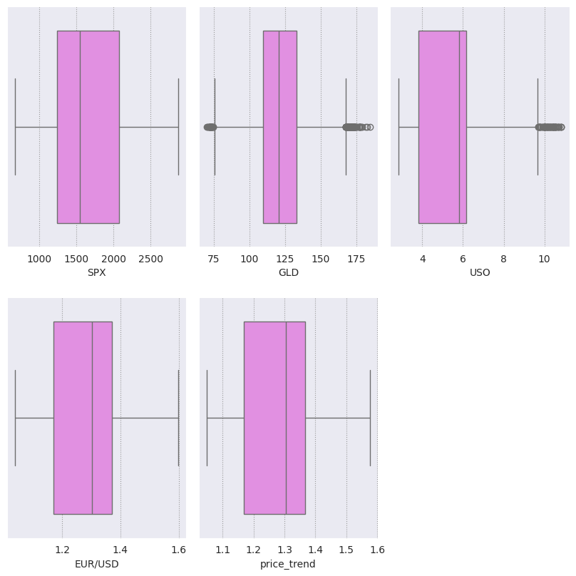
boxplot
It can be seen clearly that the column 'USO' has outliers present in the column, so we create a function to normalize the outlier present in the column.
Python `
def outlier_removal(column): # Capping the outlier rows with Percentiles upper_limit = column.quantile(.95) # set upper limit to 95percentile lower_limit = column.quantile(.05) # set lower limit to 5 percentile column.loc[(column > upper_limit)] = upper_limit column.loc[(column < lower_limit)] = lower_limit return column
`
Here We have set the upper limit of the column to 95 %of the data and the lower limit to the 5 %. that means that which are greater than 95% percentile of the data are normalized to the data 95% value same for the data points which are lower than 5% of the data.
Python `
Normalize outliers in columns except Date
dataset[['SPX', 'GLD', 'USO', 'EUR/USD']] =
dataset[['SPX', 'GLD', 'USO', 'EUR/USD']].apply(outlier_removal)
`
Here using the pandas apply function We have applied the outlier_removal function to each of the rows of the columns
Modeling the Data
Before We start modeling the data must divide the data into train and test, so that after training the data We can see how much our data is learning the pattern and generalizing on new data points. it is also a way to see that our model is not learning the noise in the data or say it is not overfitting the dataset
Python `
select the features and target variable
X = dataset.drop(['Date', 'EUR/USD'], axis=1)
y = dataset['EUR/USD']
dividing dataset in to train test
x_train, x_test,
y_train, y_test = train_test_split(X, y,
test_size=0.2)
`
Here we are first dropping the Date and our target variable and storing it in variable X which will be our independent variable also we are storing our target variable in the Y variable. Here we are dividing the data in the ratio of 80:20. However, we can change it according to our needs.
Scaling the Data
Before we train the model on our data we should perform scaling on our data to normalize. After scaling the data our mean of each column becomes zero and their standard deviation becomes 1. It is also called z-score normalization since we subtract the mean of the column from each element and divide it by the standard deviation of the column. It brings all the columns to the same scale and directly comparable with one another.
Python `
Create an instance of the StandardScaler
scaler = StandardScaler()
Fit the StandardScaler on the training dataset
scaler.fit(x_train)
Transform the training dataset
using the StandardScaler
x_train_scaled = scaler.transform(x_train) x_test_scaled = scaler.transform(x_test)
`
It is always advisable to start fitting the data from a simple model and then move it to a complex one. One of the reasons for doing this is simple model takes less time and storage to train on the data. Also, many simple models work far better than complex ones and these models are also more interpretable than complex models.
Lasso Regression
In this model, we have used linear regression with L1 Regularization, also with help of the make_pipeline object, we will use lasso regression with 2 degrees. We will also use the GridSearch object in every model to get the best-performing hyperparameter and lower the variance.
Python `
Impute missing values using SimpleImputer
from sklearn.impute import SimpleImputer imputer = SimpleImputer(strategy='mean') # Replace NaNs with the mean of each column
Fit and transform the imputer on the scaled training data
x_train_scaled = imputer.fit_transform(x_train_scaled)
Transform the scaled test data using the trained imputer
x_test_scaled = imputer.transform(x_test_scaled)
Create a PolynomialFeatures object of degree 2
poly = PolynomialFeatures(degree=2)
Create a Lasso object
lasso = Lasso()
Define a dictionary of parameter
#values to search over param_grid = {'lasso__alpha': [1e-4, 1e-3, 1e-2, 1e-1, 1, 5, 10, 20, 30, 40]}
Create a pipeline that first applies
polynomial features and then applies Lasso regression
pipeline = make_pipeline(poly, lasso)
Create a GridSearchCV object with
#the pipeline and parameter grid lasso_grid_search = GridSearchCV(pipeline, param_grid, scoring='r2', cv=3)
Fit the GridSearchCV object to the training data
lasso_grid_search.fit(x_train_scaled, y_train)
Predict the target variable using
the fitted model and the test data
y_pred = lasso_grid_search.predict(x_train_scaled)
Compute the R-squared of the fitted model on the train data
r2 = r2_score(y_train, y_pred)
Print the R-squared
print("R-squared: ", r2)
Print the best parameter values and score
print('Best parameter values: ', lasso_grid_search.best_params_) print('Best score: ', lasso_grid_search.best_score_)
`
**Output :
R-squared: 0.9686719102717767
Best parameter values: {'lasso__alpha': 0.0001}
Best score: 0.967745658870399
Here we are fitting our multiple regression of degree, however, to use lasso regression with multiple regression we must use the pipeline method from sklearn. We will also use the grid search method for cross-validation and selecting the best-performing hyperparameter for the training data. Grid search is one of the best ways to find a model which does not overfit the training data.
We have used the R-squared evaluation matrix throughout our model. We have used this matrix since We want to compare our model and choose which is best performing.
RandomForestRegressor for Regression
In the second model, we will use the ensemble method to fit our training data. like in Random Forest it uses several decision trees to fit on the data, one thing to note is that in random forest regressor m number of rows are used for training which is always less than n (m<n). where n is the total number of original columns present in the training dataset, also for row points random forest select these row's element.
Python `
Insiate param grid for which to search
param_grid = {'n_estimators': [50, 80, 100], 'max_depth': [3, 5, 7]}
create instance of the Randomforest regressor
rf = RandomForestRegressor()
Define Girdsearch with random forest
object parameter grid scoring and cv
rf_grid_search = GridSearchCV(rf, param_grid, scoring='r2', cv=2)
Fit the GridSearchCV object to the training data
rf_grid_search.fit(x_train_scaled, y_train)
Print the best parameter values and score
print('Best parameter values: ', rf_grid_search.best_params_) print('Best score: ', rf_grid_search.best_score_)
`
**Output:
Best parameter values: {'max_depth': 7, 'n_estimators': 100}
Best score: 0.9787032905195875
Here We have used both RandomForest regressor and Gridsearchcv, The Gridsearch will help in selecting the best number of decision trees from 50,80,100. We have also specified the maximum depth of the tree as a parameter which can be 3,5 or 7.
The best parameter value shows that the model gives the best result when it takes the average result of one hundred Decision trees having a maximum depth of 7.
Python `
Compute the R-squared of the
fitted model on the test data
r2 = r2_score(y_test, rf_grid_search.predict(x_test_scaled))
Print the R-squared
print("R-squared:", r2)
`
**Output:
R-squared: 0.9696215232931432
These models are called Black box models since We won't be able to visualize what is happening under the hood of the model however, we will plot the bar chart of the feature importance from the dataset.
Python `
features = dataset.drop("Date", axis=1).columns
store the importance of the feature
importances = rf_grid_search.best_estimator_.
feature_importances_
indices = np.argsort(importances)
title of the graph
plt.title('Feature Importance')
plt.barh(range(len(indices)), importances[indices], color='red', align='center')
plot bar chart
plt.yticks(range(len(indices)), [features[i] for i in indices]) plt.xlabel('Relative Importance') plt.show()
`
**Output:

Feature Importance
This feature importance graph shows that USO column plays a major effect (more than 2x) in deciding the gold price in USD.
XGBoost Model for Regression
In Boosting Technique the data is fitted in several sequential Weak learning algorithm models which are only slightly better than random guessing. In each next sequential model more Weights are given to the points are which are misclassified/regressed by previous models
In our models, we will use the XGBOOST model for fitting our training dataset.
Python `
Create an instance of the XGBRegressor model
model_xgb = XGBRegressor()
Fit the model to the training data
model_xgb.fit(x_train_scaled, y_train)
Print the R-squared score on the training data
print("Xgboost Accuracy =", r2_score( y_train, model_xgb.predict(x_train_scaled)))
`
**Output:
Xgboost Accuracy = 0.9994835742847374
Now let's evaluate this model as well using the testing data.
Python `
Print the R-squared score on the test data
print("Xgboost Accuracy on test data =", r2_score(y_test, model_xgb.predict(x_test_scaled)))
`
**Output:
Xgboost Accuracy on test data = 0.9796807369084466
Through the graph, we can see that USO column plays a major role in deciding the prediction value.
Model Explainability
In the black box model Boosting and Bagging, we will not be able to see the actual weights given to these columns hoWever there are some libraries that we can use to the fraction of Weight out of 1 given to a particular column when we predict on a single vector. We will be using eli5 package to demonstrate the model explainability. You can install this package by running the following command in the terminal.
!pip uninstall scikit-learn -y
!pip install scikit-learn==1.2.2
!pip install eli5
The name eli5 stands for "Explain like I'm 5" it's a popular Python library that is used for debugging and explaining machine learning models. We will use eli5 to see the Weights of our best-performing model which is XGBOOST best on its train and test accuracy.
Python `
import eli5 as eli
weight of variables in xgboost model
Get the names of the features
feature_names = x_train.columns.tolist()
Explain the weights of the features using ELI5
eli.explain_weights(model_xgb, feature_names=feature_names)
`
**Output:
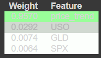
Explaining the weights of the features
Model Deployment using Pickle
To deploy the model We will use the pickle library from the Python language. We will deploy our best-performing model which is XGBoost. Pickle is a Python module that is used for serializing and deserializing the model i.e saving and loading the model. It stores Python objects which can be moved to a disk(serializing) and then again from disk to memory(deserialize).
Python `
dump model using pickle library
import pickle
dump model in file model.pkl
pickle.dump(model_xgb, open('model.pkl', 'wb'))
`
Now we can use the load function from pickle to load the model_xgb into memory to predict a new vector dataset.
Conclusions
We have made our data science project from scratch to deployment after saving the file into a disk using Pickle. dump which stores it into byte data files. We can again load these model.pkl files using Pickle. Load and after loading the file. We can take the help of Flask or another framework to run and use our model to predict live coming datasets.
Get the Complete notebook:
**Notebook: **click here.
**Dataset: **click here.