Graphical Representation of Data (original) (raw)
Last Updated : 2 Jun, 2026
Graphical Representation is a way of representing any data in pictorial form. It helps a reader to understand the large set of data very easily, as it gives us various data patterns in a visualized form.
Types of graphical representation of data:
**Line Graphs
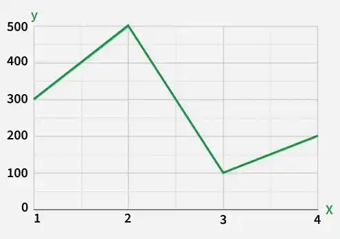
A Line Graph is used to show how the value of a particular variable changes with time. We plot this graph by connecting the points at different values of the variable. It can be useful for analyzing the trends in the data and predicting further trends.
**Example: Draw a line graph for the given data
| **x | 1 | 2 | 3 | 4 |
|---|---|---|---|---|
| **y | 300 | 500 | 100 | 200 |
**Bar Graphs
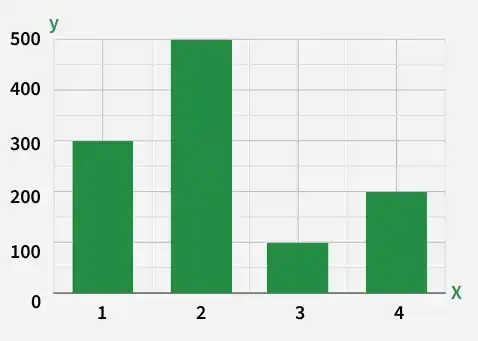
A bar graph is a type of graphical representation of the data in which bars of uniform width are drawn with equal spacing between them on one axis (x-axis usually), depicting the variable. The values of the variables are represented by the height of the bars.
**Example: Draw a bar graph for the given data
| **x | 1 | 2 | 3 | 4 |
|---|---|---|---|---|
| **y | 300 | 500 | 100 | 200 |
**Histograms
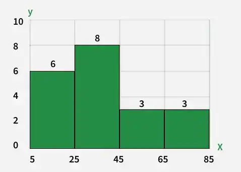
A Histogram is a type of graph used to represent the frequency distribution of continuous data.
It uses rectangular bars where:
- the x-axis represents class intervals (ranges of data)
- the y-axis represents frequency
- the bars touch each other because the data is continuous
**Example: Draw a Histogram for the given data
| **x | 5 - 25 | 25 - 45 | 45 - 65 | 65 - 85 |
|---|---|---|---|---|
| **y | 6 | 8 | 3 | 3 |
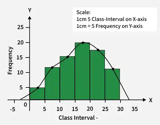
Frequency Polygon
A frequency polygon is a graphical representation of a frequency distribution. It is formed by plotting the midpoints of class intervals on the x-axis and their corresponding frequencies on the y-axis, and then joining the points using straight lines. It is commonly used to study the shape of the distribution and compare multiple data sets.
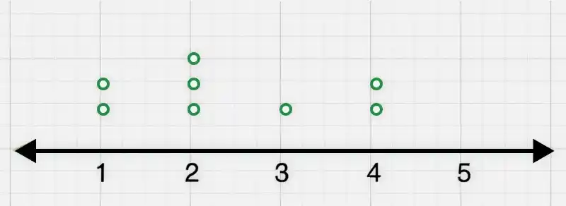
**Line Plot
A Line Plot is a type of graph used to display data points along a number line. It helps show how frequently different values occur in a dataset. Each value is marked with symbols such as dots above the number line.
**Example: Line Plot for the given data:
| Number | Frequency |
|---|---|
| 1 | 2 |
| 2 | 3 |
| 3 | 1 |
| 4 | 2 |
| 5 | 0 |
**Stem and Leaf Plot
The Stem and Leaf Plot is a type of plot in which each value is split into a "leaf"(in most cases, it is the last digit) and"stem" (the other remaining digits). For example: the number 42 is split into leaf (2) and stem (4).
**Example:
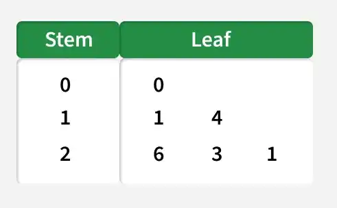
The data represented in the stem and leaf plot is as follows: 03, 11, 14, 21, 23, 26.
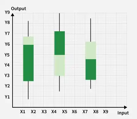
**Box and Whisker Plot
A Box and Whisker Plot(also called a box plot) is a graph used to show the distribution of data using five important values.
It helps you understand:
- the spread of data
- the center of data
- variability
- possible outliers
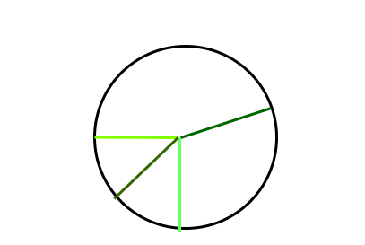
**Pie Chart
A Pie Chart is a circular graph used to represent data as parts of a whole. The circle is divided into sectors (slices), and each slice represents a category’s proportion or percentage of the total data.
Principles of Graphical Representations
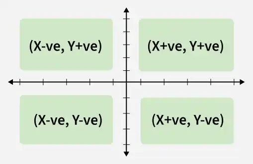
- When plotting a graph, there's an origin and two axes.
- The x-axis is horizontal, and the y-axis is vertical.
- The axes divide the plane into four quadrants.
- The origin is where the axes intersect.
- Positive x-values are to the right of the origin; negative x-values are to the left.
- Positive y-values are above the x-axis; negative y-values are below.
General Rules
The following things should be kept in mind while plotting the above graphs:
- Whenever possible, the data source must be mentioned to the viewer.
- Always choose the proper colors and font sizes.
- The measurement Unit should be mentioned in the top right corner of the graph.
- The proper scale should be chosen while making the graph, it should be chosen such that the graph looks accurate.
- Last but not least, a suitable title should be chosen.
Solved Examples
**Question 1: What are different types of frequency-based plots?
Types of frequency-based plots:
- Histogram
- Frequency Polygon
- Frequency Curve
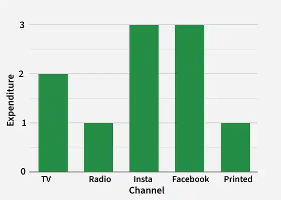
**Question 2: A company with an advertising budget of Rs 10,00,00,000 has planned the following expenditure in the different advertising channels such as TV Advertisement, Radio, Facebook, Instagram, and Printed media. The table represents the money spent on different channels.
| Advertising Channel | Expenditure (In Crores) |
|---|---|
| TV Advertisement | 2 |
| Radio | 1 |
| 3 | |
| 3 | |
| Printed Media | 1 |
**Draw a bar graph for the following data.
**Steps:
- Put each of the channels on the x-axis
- The height of the bars is decided by the value of each channel.
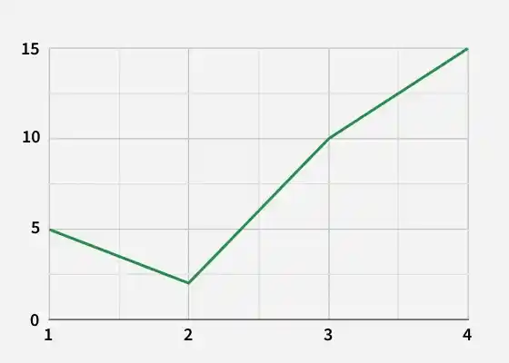
**Question 3: Draw a line plot for the following data
| x | 1 | 2 | 3 | 4 | 5 | 6 |
|---|---|---|---|---|---|---|
| y | 5 | 2 | 10 | 15 | 12 | 8 |
**Steps:
- Put each of the x-axis row value on the x-axis
- joint the value corresponding to the each value of the x-axis.
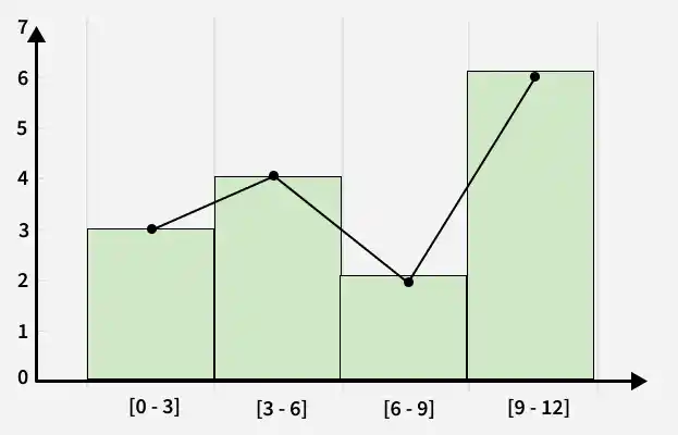
**Question 4: Make a frequency plot of the following data:
| x | [0 - 3] | [3 - 16] | [6 - 9] | [9 - 12] |
|---|---|---|---|---|
| y | 3 | 4 | 2 | 6 |
**Steps:
- Draw the class intervals on the x-axis and frequencies on the y-axis.
- Calculate the midpoint of each class interval.
**Class Interval **Mid Point **Frequency 0 - 3 1.5 3 3 - 6 4.5 4 6 - 9 7.5 2 9 - 12 10.5 6 Now join the mid points of the intervals and their corresponding frequencies on the graph.
This graph shows both the histogram and frequency polygon for the given distribution.
Practice Problems
**Question 1: Draw a Bar Graph for the following data
| Month | January | February | March | April |
|---|---|---|---|---|
| Books Sold | 120 | 150 | 100 | 180 |
**Question 2: Draw a Histogram for the following data
| Class Interval | 0 - 10 | 10 - 20 | 20 - 30 | 30 - 40 |
|---|---|---|---|---|
| Frequency | 4 | 7 | 5 | 3 |
**Question 3: Construct a Frequency Polygon for the following data
| Class Interval | 5 - 15 | 15 - 25 | 25 - 35 | 35 - 45 |
|---|---|---|---|---|
| Frequency | 2 | 6 | 5 | 4 |