bubblechart - Bubble chart - MATLAB (original) (raw)

Syntax
Description
Vector and Matrix Data
bubblechart([x](#mw%5F62edb4a8-fb11-4a76-b27a-17e0f7effbd2),[y](#mw%5Fe8a6341d-f7e1-4c9b-a3d7-3893b1c5b146),[sz](#mw%5F7c6a68af-dabe-495d-8270-cad07d5ed3a9)) displays colored circular markers (bubbles) at the locations specified by the vectorsx and y, with bubble sizes specified bysz.
- To plot one set of coordinates, specify
x,y, andszas vectors of equal length. - To plot multiple sets of coordinates on the same set of axes, specify at least one of
x,y, orszas a matrix.
bubblechart([x](#mw%5F62edb4a8-fb11-4a76-b27a-17e0f7effbd2),[y](#mw%5Fe8a6341d-f7e1-4c9b-a3d7-3893b1c5b146),[sz](#mw%5F7c6a68af-dabe-495d-8270-cad07d5ed3a9),[c](#mw%5Ffca6dd32-92ed-4b49-b98c-1389972807aa)) specifies the colors of the bubbles. You can specify one color for all the bubbles, or you can vary the color. For example, you can plot all red bubbles by specifyingc as "red".
Table Data
bubblechart([tbl](#mw%5Fa3ce8f8b-9a51-4107-8e53-482a7e11630a%5Fsep%5Fmw%5F1f5b8358-45d8-4c4d-8a0d-17e2da07c841),[xvar](#mw%5F68dd009c-823a-4b58-b6e5-4bd9eac55db7),[yvar](#mw%5Fb340635b-4c97-4cef-8d92-1bd98200eba3),[sizevar](#mw%5F983dc56d-2ff2-4eab-91c0-fafa4b051c67)) plots the variables xvar and yvar from the tabletbl, and uses the variable sizevar for the bubble sizes. To plot one data set, specify one variable each for xvar,yvar, and sizevar. To plot multiple data sets, specify multiple variables for at least one of those arguments. The arguments that specify multiple variables must specify the same number of variables.
bubblechart([tbl](#mw%5Fa3ce8f8b-9a51-4107-8e53-482a7e11630a%5Fsep%5Fmw%5F1f5b8358-45d8-4c4d-8a0d-17e2da07c841),[xvar](#mw%5F68dd009c-823a-4b58-b6e5-4bd9eac55db7),[yvar](#mw%5Fb340635b-4c97-4cef-8d92-1bd98200eba3),[sizevar](#mw%5F983dc56d-2ff2-4eab-91c0-fafa4b051c67),[cvar](#mw%5Fae9f3034-5130-4220-a218-a91086250bda)) plots the specified variables from the table using the colors specified in the variablecvar. To specify colors for multiple data sets, specifycvar as multiple variables. The number of variables must match the number of data sets.
Additional Options
bubblechart([ax](#mw%5Fc47ce195-3119-4489-bc3d-fbe7284f276a),___) displays the bubble chart in the target axes ax. Specify the axes before all other input arguments.
bubblechart(___,[Name,Value](#namevaluepairarguments)) specifies BubbleChart properties using one or more name-value arguments. Specify the properties after all other input arguments. For a list of properties, see BubbleChart Properties.
bc = bubblechart(___) returns theBubbleChart object. Use bc to modify properties of the chart after creating it. For a list of properties, see BubbleChart Properties.
Examples
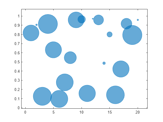
Define the bubble coordinates as the vectors x and y. Define sz as a vector that specifies the bubble sizes. Then create a bubble chart of x and y.
x = 1:20; y = rand(1,20); sz = rand(1,20); bubblechart(x,y,sz);
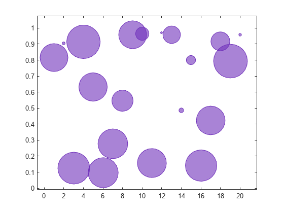
Define the bubble coordinates as the vectors x and y. Define sz as a vector that specifies the bubble sizes. Then create a bubble chart of x and y, and specify the color as red. By default, the bubbles are partially transparent.
x = 1:20; y = rand(1,20); sz = rand(1,20); bubblechart(x,y,sz,'red');

For a custom color, you can specify an RGB triplet or a hexadecimal color code. For example, the hexadecimal color code '#7031BB' specifies a shade of purple.
bubblechart(x,y,sz,'#7031BB');
You can also specify a different color for each bubble. For example, specify a vector to select colors from the figure's colormap.
c = 1:20; bubblechart(x,y,sz,c)

Define the bubble coordinates as the vectors x and y. Define sz as a vector that specifies the bubble sizes. Then create a bubble chart of x and y. By default, the bubbles are 60% opaque, and the edges are completely opaque with the same color.
x = 1:20; y = rand(1,20); sz = rand(1,20); bubblechart(x,y,sz);

You can customize the opacity and the outline color by setting the MarkerFaceAlpha and MarkerEdgeColor properties, respectively. One way to set a property is by specifying a name-value pair argument when you create the chart. For example, you can specify 20% opacity by setting the MarkerFaceAlpha value to 0.20.
bc = bubblechart(x,y,sz,'MarkerFaceAlpha',0.20);

If you create the chart by calling the bubblechart function with a return argument, you can use the return argument to set properties on the chart after creating it. For example, you can change the outline color to purple.
bc.MarkerEdgeColor = [0.5 0 0.5];

Define a data set that shows the contamination levels of a certain toxin across different towns in a metropolitan area. Define towns as the population of each town. Define nsites as the number of industrial sites in the corresponding towns. Define levels as the contamination levels in the towns. Then display the data in a bubble chart with axis labels. Call the bubblesize function to decrease the bubble sizes, and add a bubble legend that shows the relationship between the bubble size and population.
towns = randi([25000 500000],[1 30]); nsites = randi(10,1,30); levels = (3 * nsites) + (7 * randn(1,30) + 20);
% Display bubble chart with axis labels and legend bubblechart(nsites,levels,towns) xlabel('Number of Industrial Sites') ylabel('Contamination Level') bubblesize([5 30]) bubblelegend('Town Population','Location','eastoutside')

When you display multiple data sets in the same axes, you can include multiple legends. To manage the alignment of the legends, create your chart in a tiled chart layout.
Create two sets of data, and plot them together in the same axes object within a tiled chart layout.
x = 1:20; y1 = rand(1,20); y2 = rand(1,20); sz1 = randi([20 500],[1,20]); sz2 = randi([20 500],[1,20]);
% Plot data in a tiled chart layout t = tiledlayout(1,1); nexttile bubblechart(x,y1,sz1) hold on bubblechart(x,y2,sz1) hold off
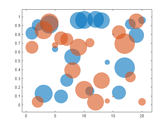
Add a bubble legend for illustrating the bubble sizes, and add another legend for illustrating the colors. Call the bubblelegend and legend functions with a return argument to store each legend object. Move the legends to the right outer tile of the tiled chart layout by setting the Layout.Tile property on each object to 'east'.
blgd = bubblelegend('Population'); lgd = legend('Springfield','Fairview'); blgd.Layout.Tile = 'east'; lgd.Layout.Tile = 'east';

A convenient way to plot data from a table is to pass the table to the bubblechart function and specify the variables you want to plot. For example, read patients.xls as a table tbl. Plot the Systolic, Diastolic, and Weight variables by passing tbl as the first argument to the bubblechart function followed by the variable names. By default, the axis labels match the variable names.
tbl = readtable('patients.xls'); bubblechart(tbl,'Systolic','Diastolic','Weight');

You can also plot multiple variables at the same time. For example, plot both blood pressure variables versus the Height variable by specifying the yvar argument as the cell array {'Systolic','Diastolic'}. Change the range of bubble sizes to be between 5 and 20 points. Then add a legend. The legend labels match the variable names.
bubblechart(tbl,'Height',{'Systolic','Diastolic'},'Weight'); bubblesize([5 20]) legend

You can plot data from a table and customize the colors by specifying the cvar argument when you call bubblechart.
For example, create a table with four variables of random numbers, and plot the X and Y variables. Vary the bubble sizes according to the Sz variable, and vary the colors according to the Colors variable.
tbl = table(randn(15,1)-10,randn(15,1)+10,rand(15,1),rand(15,1), ... 'VariableNames',{'X','Y','Sz','Colors'});
bubblechart(tbl,'X','Y','Sz','Colors');

Define two sets of data that show the contamination levels of a certain toxin across different towns on the east and west sides of a certain metropolitan area. Define towns1 and towns2 as the populations across the towns. Define nsites1 and nsites2 as the number of industrial sites in the corresponding towns. Then define levels1 and levels2 as the contamination levels in the towns.
towns1 = randi([25000 500000],[1 30]); towns2 = towns1/3; nsites1 = randi(10,1,30); nsites2 = randi(10,1,30); levels1 = (5 * nsites2) + (7 * randn(1,30) + 20); levels2 = (3 * nsites1) + (7 * randn(1,30) + 20);
Create a tiled chart layout so you can visualize the data side-by-side. Then create an axes object in the first tile and plot the data for the west side of the city. Add a title and axis labels. Then, repeat the process in the second tile to plot the east side data.
tiledlayout(1,2,'TileSpacing','compact')
% West side ax1 = nexttile; bubblechart(ax1,nsites1,levels1,towns1); title('West Side') xlabel('Number of Industrial Sites')
% East side ax2 = nexttile; bubblechart(ax2,nsites2,levels2,towns2); title('East Side') xlabel('Number of Industrial Sites') ylabel('Contamination Level')
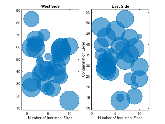
Reduce all the bubble sizes to make it easier to see all the bubbles. In this case, change the range of diameters to be between 5 and 30 points.
bubblesize(ax1,[5 30]) bubblesize(ax2,[5 30])

The west side towns are three times the size of the east side towns, but the bubble sizes do not reflect this information in the preceding charts. This is because the smallest and largest bubbles map to the smallest and largest data points in each of the axes. To display the bubbles on the same scale, define a vector called alltowns that includes the populations from both sides of the city. Use the bubblelim function to reset the scaling for both charts. Next, use the xlim and ylim functions to display the charts with the same _x_- and _y_-axis limits.
% Adjust scale of the bubbles alltowns = [towns1 towns2]; newlims = [min(alltowns) max(alltowns)]; bubblelim(ax1,newlims) bubblelim(ax2,newlims)
% Adjust x-axis limits allx = [xlim(ax1) xlim(ax2)]; xmin = min(allx); xmax = max(allx); xlim([ax1 ax2],[xmin xmax]);
% Adjust y-axis limits ally = [ylim(ax1) ylim(ax2)]; ymin = min(ally); ymax = max(ally); ylim([ax1 ax2],[ymin ymax]);

Input Arguments
_x_-coordinates, specified as a scalar, vector, or matrix. The size and shape of x depends on the shape of your data. This table describes the most common situations.
| Type of Bubble Chart | How to Specify Coordinates |
|---|---|
| Single bubble | Specify x, y, andsz as scalars. For example:bubblechart(1,2,10) |
| One set of bubbles | Specify x, y, andsz as any combination of row or column vectors of the same length. For example:x = [1 2 3 4]; y = [4; 5; 6; 7]; sz = [12 13 14 15]; bubblechart(x,y,sz) |
| Multiple sets of bubbles | If all the data sets share the same _x_- or_y_-coordinates, specify the shared coordinates as a vector and the other coordinates as a matrix. The length of the vector must match one of the dimensions of the matrix. For example, plot two data sets that share the same _x_-coordinates and size values.x = [1 2 3 4]; y = [4 5 6 7; 7 8 9 10]; sz = [1 2 3 4]; bubblechart(x,y,sz)If the matrices are square, bubblechart plots a separate set of bubbles for each column in the matrix.Alternatively, specify x, y, andsz as matrices of equal size. In this case,bubblechart plots the columns of the matrices. For example, plot two data sets.x = [1 1; 2 2; 3 3; 4 4]; y = [4 7; 5 8; 6 9; 7 10]; sz = [1 1; 2 2; 3 3; 4 4]; bubblechart(x,y,sz) |
Data Types: single | double | int8 | int16 | int32 | int64 | uint8 | uint16 | uint32 | uint64 | categorical | datetime | duration
_y_-coordinates, specified as a scalar, vector, or matrix. The size and shape of y depends on the shape of your data. This table describes the most common situations.
| Type of Bubble Chart | How to Specify Coordinates |
|---|---|
| Single bubble | Specify x, y, andsz as scalars. For example:bubblechart(1,2,10) |
| One set of bubbles | Specify x, y, andsz as any combination of row or column vectors of the same length. For example:x = [1 2 3 4]; y = [4; 5; 6; 7]; sz = [12 13 14 15]; bubblechart(x,y,sz) |
| Multiple sets of bubbles | If all the data sets share the same _x_- or_y_-coordinates, specify the shared coordinates as a vector and the other coordinates as a matrix. The length of the vector must match one of the dimensions of the matrix. For example, plot two data sets that share the same _x_-coordinates and size values.x = [1 2 3 4]; y = [4 5 6 7; 7 8 9 10]; sz = [1 2 3 4]; bubblechart(x,y,sz)If the matrices are square, bubblechart plots a separate set of bubbles for each column in the matrix.Alternatively, specify x, y, andsz as matrices of equal size. In this case,bubblechart plots the columns of the matrices. For example, plot two data sets.x = [1 1; 2 2; 3 3; 4 4]; y = [4 7; 5 8; 6 9; 7 10]; sz = [1 1; 2 2; 3 3; 4 4]; bubblechart(x,y,sz) |
Data Types: single | double | int8 | int16 | int32 | int64 | uint8 | uint16 | uint32 | uint64 | categorical | datetime | duration
Relative bubble sizes, specified as a numeric scalar, vector, or matrix.
The sz values control the relative distribution of the bubble sizes. By default, bubblechart linearly maps a range of bubble areas across the range of the sz values for all the bubble charts in the axes. For more control over the absolute bubble sizes, and how they map across the range of the sz values, see bubblesize and bubblelim.
Whether you specify sz as a scalar, vector, or matrix depends on how you specify x and y and how you want the chart to look. This table describes the most common situations.
| Type of Bubble Chart | x and y | sz | Example |
|---|---|---|---|
| One set of bubbles | Vectors of the same length | A vector with the same length as x andy | Specify x, y, andsz as vectors.x = [1 2 3 4]; y = [4 5 6 7]; sz = [80 150 700 50]; bubblechart(x,y,sz) |
| Multiple sets of bubbles that have varied coordinates and bubble sizes | At least one of x or y is a matrix for plotting multiple data sets | A matrix that has the same size as the x ory matrix | Specify x as a vector and y and sz as matrices.x = [1 2 3 4]; y = [1 6; 3 8; 2 7; 4 9]; sz = [80 30; 150 900; 50 2000; 200 350]; bubblechart(x,y,sz) |
| Multiple sets of bubbles, where all the coordinates are shared, but the sizes are different for each data set | Vectors of the same length | A matrix with at least one dimension that matches the lengths ofx and y | Specify x and y as vectors and sz as a matrix.x = [1 2 3 4]; y = [5 6 7 8]; sz = [80 30; 150 900; 50 500; 200 350]; bubblechart(x,y,sz) |
| Multiple sets of bubbles, where the coordinates vary in at least one dimension, but the sizes are shared between data sets | At least one of x or y is a matrix for plotting multiple data sets | A vector with the same number of elements as there are bubbles in each data set | Specify x as a vector, y as a matrix, and sz as vector.x = [1 2 3 4]; y = [1 6; 3 8; 2 7; 4 9]; sz = [80 150 200 350]; bubblechart(x,y,sz) |
Data Types: single | double | int8 | int16 | int32 | int64 | uint8 | uint16 | uint32 | uint64
Bubble color, specified as a color name, RGB triplet, matrix of RGB triplets, or a vector of colormap indices.
- Color name — A color name such as
"red", or a short name such as"r". - RGB triplet — A three-element row vector whose elements specify the intensities of the red, green, and blue components of the color. The intensities must be in the range
[0,1]; for example,[0.4 0.6 0.7]. RGB triplets are useful for creating custom colors. - Matrix of RGB triplets — A three-column matrix in which each row is an RGB triplet.
- Vector of colormap indices — A vector of numeric values that is the same length as the
xandyvectors.
The way you specify the color depends on your preferred color scheme and whether you are plotting one set of bubbles or multiple sets of bubbles. This table describes the most common situations.
| Color Scheme | How to Specify the Color | Example |
|---|---|---|
| Use one color for all the bubbles. | Specify a color name or a short name from the table below, or specify one RGB triplet. | Display one set of bubbles, and specify the color as"red".x = [1 2 3 4]; y = [2 5 3 6]; sz = [1 2 3 4]; bubblechart(x,y,sz,"red")Display two sets of bubbles, and specify the color as red using the RGB triplet[1 0 0].x = [1 2 3 4]; y = [2 5; 1 2; 8 4; 7 9]; sz = [1 2; 3 4; 5 6; 7 8]; bubblechart(x,y,sz,[1 0 0]) |
| Assign different colors to each bubble using a colormap. | Specify a row or column vector of numbers. The numbers map into the current colormap array. The smallest value maps to the first row in the colormap, and the largest value maps to the last row. The intermediate values map linearly to the intermediate rows.If your chart has three bubbles, specify a column vector to ensure the values are interpreted as colormap indices.You can use this method only whenx, y, and sz are all vectors. | Create a vector c that specifies four colormap indices. Display four bubbles using the colors from the current colormap. Then, change the colormap towinter.c = [1 2 3 4]; x = [1 2 3 4]; y = [5 6 7 8]; sz = [1 2 3 4]; bubblechart(x,y,sz,c) colormap(gca,"winter") |
| Create a custom color for each bubble. | Specify an m-by-3 matrix of RGB triplets, where m is the number of bubbles. You can use this method only whenx, y, and sz are all vectors. | Create a matrix c that specifies RGB triplets for green, red, gray, and purple. Then display four bubbles using those colors.c = [0 1 0; 1 0 0; 0.5 0.5 0.5; 0.6 0 1]; x = [1 2 3 4]; y = [5 6 7 8]; sz = [1 2 3 4]; bubblechart(x,y,sz,c) |
| Create a different color for each data set. | Specify an n-by-3 matrix of RGB triplets, where n is the number of data sets.You can use this method only when at least one ofx, y, or sz is a matrix. | Create a matrix c that contains two RGB triplets. Then display two sets of bubbles using those colors.c = [1 0 0; 0.6 0 1]; x = [1 2 3 4]; y = [2 5; 1 2; 8 4; 11 9]; sz = [1 1; 2 2; 3 3; 4 4]; bubblechart(x,y,sz,c) |
Color Names and RGB Triplets for Common Colors
| Color Name | Short Name | RGB Triplet | Hexadecimal Color Code | Appearance |
|---|---|---|---|---|
| "red" | "r" | [1 0 0] | "#FF0000" |  |
| "green" | "g" | [0 1 0] | "#00FF00" |  |
| "blue" | "b" | [0 0 1] | "#0000FF" |  |
| "cyan" | "c" | [0 1 1] | "#00FFFF" |  |
| "magenta" | "m" | [1 0 1] | "#FF00FF" |  |
| "yellow" | "y" | [1 1 0] | "#FFFF00" |  |
| "black" | "k" | [0 0 0] | "#000000" |  |
| "white" | "w" | [1 1 1] | "#FFFFFF" |  |
This table lists the default color palettes for plots in the light and dark themes.
| Palette | Palette Colors |
|---|---|
| "gem" — Light theme default_Before R2025a: Most plots use these colors by default._ |  |
| "glow" — Dark theme default |  |
You can get the RGB triplets and hexadecimal color codes for these palettes using the orderedcolors and rgb2hex functions. For example, get the RGB triplets for the "gem" palette and convert them to hexadecimal color codes.
RGB = orderedcolors("gem"); H = rgb2hex(RGB);
Before R2023b: Get the RGB triplets using RGB = get(groot,"FactoryAxesColorOrder").
Before R2024a: Get the hexadecimal color codes using H = compose("#%02X%02X%02X",round(RGB*255)).
Source table containing the data to plot, specified as a table or a timetable.
Table variables containing the _x_-coordinates, specified as one or more table variable indices.
Specifying Table Indices
Use any of the following indexing schemes to specify the desired variable or variables.
| Indexing Scheme | Examples |
|---|---|
| Variable names: A string, character vector, or cell array.A pattern object. | "A" or 'A' — A variable named A["A","B"] or {'A','B'} — Two variables named A andB"Var"+digitsPattern(1) — Variables named"Var" followed by a single digit |
| Variable index: An index number that refers to the location of a variable in the table.A vector of numbers.A logical vector. Typically, this vector is the same length as the number of variables, but you can omit trailing0 or false values. | 3 — The third variable from the table[2 3] — The second and third variables from the table[false false true] — The third variable |
| Variable type: A vartype subscript that selects variables of a specified type. | vartype("categorical") — All the variables containing categorical values |
Plotting Your Data
The table variables you specify can contain numeric, categorical, datetime, or duration values.
To plot one data set, specify one variable each for xvar,yvar, sizevar, and optionallycvar. For example, read Patients.xls into the table tbl. Plot the Height andWeight variables, and vary the bubble sizes according to theAge variable.
tbl = readtable('Patients.xls'); bubblechart(tbl,'Height','Weight','Age')
To plot multiple data sets together, specify multiple variables for at least one of xvar, yvar, sizevar, or optionally cvar. If you specify multiple variables for more than one argument, the number of variables must be the same for each of those arguments.
For example, plot the Weight variable on the _x_-axis, and the Systolic and Diastolic variables on the_y_-axis. Specify the Age variable for the bubble sizes.
bubblechart(tbl,'Weight',{'Systolic','Diastolic'},'Age')
You can also use different indexing schemes for the table variables. For example, specify xvar as a variable name, yvar as an index number, and sizevar as a logical vector.
bubblechart(tbl,'Height',6,[false false true])
Table variables containing the _y_-coordinates, specified as one or more table variable indices.
Specifying Table Indices
Use any of the following indexing schemes to specify the desired variable or variables.
| Indexing Scheme | Examples |
|---|---|
| Variable names: A string, character vector, or cell array.A pattern object. | "A" or 'A' — A variable named A["A","B"] or {'A','B'} — Two variables named A andB"Var"+digitsPattern(1) — Variables named"Var" followed by a single digit |
| Variable index: An index number that refers to the location of a variable in the table.A vector of numbers.A logical vector. Typically, this vector is the same length as the number of variables, but you can omit trailing0 or false values. | 3 — The third variable from the table[2 3] — The second and third variables from the table[false false true] — The third variable |
| Variable type: A vartype subscript that selects variables of a specified type. | vartype("categorical") — All the variables containing categorical values |
Plotting Your Data
The table variables you specify can contain numeric, categorical, datetime, or duration values.
To plot one data set, specify one variable each for xvar,yvar, sizevar, and optionallycvar. For example, read Patients.xls into the table tbl. Plot the Height andWeight variables, and vary the bubble sizes according to theAge variable.
tbl = readtable('Patients.xls'); bubblechart(tbl,'Height','Weight','Age')
To plot multiple data sets together, specify multiple variables for at least one of xvar, yvar, sizevar, or optionally cvar. If you specify multiple variables for more than one argument, the number of variables must be the same for each of those arguments.
For example, plot the Weight variable on the _x_-axis, and the Systolic and Diastolic variables on the_y_-axis. Specify the Age variable for the bubble sizes.
bubblechart(tbl,'Weight',{'Systolic','Diastolic'},'Age')
You can also use different indexing schemes for the table variables. For example, specify xvar as a variable name, yvar as an index number, and sizevar as a logical vector.
bubblechart(tbl,'Height',6,[false false true])
Table variables containing the bubble size data, specified as one or more table variable indices.
Specifying Table Indices
Use any of the following indexing schemes to specify the desired variable or variables.
| Indexing Scheme | Examples |
|---|---|
| Variable names: A string, character vector, or cell array.A pattern object. | "A" or 'A' — A variable named A["A","B"] or {'A','B'} — Two variables named A andB"Var"+digitsPattern(1) — Variables named"Var" followed by a single digit |
| Variable index: An index number that refers to the location of a variable in the table.A vector of numbers.A logical vector. Typically, this vector is the same length as the number of variables, but you can omit trailing0 or false values. | 3 — The third variable from the table[2 3] — The second and third variables from the table[false false true] — The third variable |
| Variable type: A vartype subscript that selects variables of a specified type. | vartype("categorical") — All the variables containing categorical values |
Plotting Your Data
The table variables you specify can contain any type of numeric values.
If you are plotting one data set, specify one variable forsizevar. For example, read Patients.xls into the table tbl. Plot the Height andWeight variables, and vary the bubble sizes according to theAge variable.
tbl = readtable('Patients.xls'); bubblechart(tbl,'Height','Weight','Age')
If you are plotting multiple data sets, you can specify multiple variables for at least one of xvar, yvar,sizevar, or optionally cvar. If you specify multiple variables for more than one argument, the number of variables must be the same for each of those arguments.
For example, plot the Weight variable on the_x_-axis and the Height variable on the_y_-axis. Specify the Systolic andDiastolic variables for the bubble sizes. The resulting plot shows two sets of bubbles with the same coordinates, but different bubble sizes.
bubblechart(tbl,'Weight','Height',{'Systolic','Diastolic'})
Table variables containing the bubble color data, specified as one or more table variable indices.
Specifying Table Indices
Use any of the following indexing schemes to specify the desired variable or variables.
| Indexing Scheme | Examples |
|---|---|
| Variable names: A string, character vector, or cell array.A pattern object. | "A" or 'A' — A variable named A["A","B"] or {'A','B'} — Two variables named A andB"Var"+digitsPattern(1) — Variables named"Var" followed by a single digit |
| Variable index: An index number that refers to the location of a variable in the table.A vector of numbers.A logical vector. Typically, this vector is the same length as the number of variables, but you can omit trailing0 or false values. | 3 — The third variable from the table[2 3] — The second and third variables from the table[false false true] — The third variable |
| Variable type: A vartype subscript that selects variables of a specified type. | vartype("categorical") — All the variables containing categorical values |
Plotting Your Data
The table variables you specify can contain values of any numeric type. Each variable can be:
- A column of numbers that linearly map into the current colormap.
- A three-column array of RGB triplets. RGB triplets are three-element vectors whose values specify the intensities of the red, green, and blue components of specific colors. The intensities must be in the range
[0,1]. For example,[0.5 0.7 1]specifies a shade of light blue.
If you are plotting one data set, specify one variable forcvar. For example, create a table with six variables of random numbers. Plot the X1 and Y variables. Vary the bubble sizes according to the SZ variable, and vary the colors according to the Color1 variable.
tbl = table(randn(50,1)-5,randn(50,1)+5,rand(50,1), ... rand(50,1),rand(50,1),rand(50,1),... 'VariableNames',{'X1','X2','Y','SZ','Color1','Color2'});
bubblechart(tbl,'X1','Y','SZ','Color1')
If you are plotting multiple data sets, you can specify multiple variables for at least one of xvar, yvar,sizevar, or cvar. If you specify multiple variables for more than one argument, the number of variables must be the same for each of those arguments.
For example, plot the X1 and X2 variables on the _x_-axis and the Y variable on the_y_-axis. Vary the bubble sizes according to theSZ variable. Specify the Color1 andColor2 variables for the colors. The resulting plot shows two sets of bubbles with the same _y_-coordinates and bubble sizes, but different _x_-coordinates and colors.
bubblechart(tbl,{'X1','X2'},'Y','SZ',{'Color1','Color2'})
Target axes, specified as an Axes, PolarAxes, or GeographicAxes object. If you do not specify the axes, MATLAB® plots into the current axes, or it creates an Axes object if one does not exist.
Name-Value Arguments
Specify optional pairs of arguments asName1=Value1,...,NameN=ValueN, where Name is the argument name and Value is the corresponding value. Name-value arguments must appear after other arguments, but the order of the pairs does not matter.
Before R2021a, use commas to separate each name and value, and enclose Name in quotes.
Example: bubblechart([1 2 3],[4 10 9],[1 2 3],'MarkerFaceColor','red') creates red bubbles.
Marker fill color, specified as 'flat', 'auto', an RGB triplet, a hexadecimal color code, a color name, or a short name. The 'flat' option uses the CData values. The 'auto' option uses the same color as the Color property for the axes.
For a custom color, specify an RGB triplet or a hexadecimal color code.
- An RGB triplet is a three-element row vector whose elements specify the intensities of the red, green, and blue components of the color. The intensities must be in the range
[0,1], for example,[0.4 0.6 0.7]. - A hexadecimal color code is a string scalar or character vector that starts with a hash symbol (
#) followed by three or six hexadecimal digits, which can range from0toF. The values are not case sensitive. Therefore, the color codes"#FF8800","#ff8800","#F80", and"#f80"are equivalent.
Alternatively, you can specify some common colors by name. This table lists the named color options, the equivalent RGB triplets, and the hexadecimal color codes.
| Color Name | Short Name | RGB Triplet | Hexadecimal Color Code | Appearance |
|---|---|---|---|---|
| "red" | "r" | [1 0 0] | "#FF0000" | |
| "green" | "g" | [0 1 0] | "#00FF00" | |
| "blue" | "b" | [0 0 1] | "#0000FF" | |
| "cyan" | "c" | [0 1 1] | "#00FFFF" | |
| "magenta" | "m" | [1 0 1] | "#FF00FF" | |
| "yellow" | "y" | [1 1 0] | "#FFFF00" | |
| "black" | "k" | [0 0 0] | "#000000" | |
| "white" | "w" | [1 1 1] | "#FFFFFF" | |
| "none" | Not applicable | Not applicable | Not applicable | No color |
This table lists the default color palettes for plots in the light and dark themes.
| Palette | Palette Colors |
|---|---|
| "gem" — Light theme default_Before R2025a: Most plots use these colors by default._ | |
| "glow" — Dark theme default | |
You can get the RGB triplets and hexadecimal color codes for these palettes using the orderedcolors and rgb2hex functions. For example, get the RGB triplets for the "gem" palette and convert them to hexadecimal color codes.
RGB = orderedcolors("gem"); H = rgb2hex(RGB);
Before R2023b: Get the RGB triplets using RGB = get(groot,"FactoryAxesColorOrder").
Before R2024a: Get the hexadecimal color codes using H = compose("#%02X%02X%02X",round(RGB*255)).
Example: [0.3 0.2 0.1]
Example: 'green'
Example: '#D2F9A7'
Marker edge transparency, specified as a scalar in the range [0,1] or 'flat'. A value of 1 is opaque and 0 is completely transparent. Values between 0 and 1 are semitransparent.
To set the edge transparency to a different value for each point in the plot, set theAlphaData property to a vector the same size as theXData property, and set theMarkerEdgeAlpha property to 'flat'.
Marker face transparency, specified as a scalar in the range [0,1] or 'flat'. A value of 1 is opaque and 0 is completely transparent. Values between 0 and 1 are partially transparent.
To set the marker face transparency to a different value for each point, set the AlphaData property to a vector the same size as the XData property, and set the MarkerFaceAlpha property to 'flat'.
Version History
Introduced in R2020b
When you pass a table and one or more variable names to the bubblechart function, the axis and legend labels now display any special characters that are included in the table variable names, such as underscores. Previously, special characters were interpreted as TeX or LaTeX characters.
For example, if you pass a table containing a variable named Sample_Number to the bubblechart function, the underscore appears in the axis and legend labels. In R2022a and earlier releases, the underscores are interpreted as subscripts.
| Release | Label for Table Variable "Sample_Number" |
|---|---|
| R2022b |  |
| R2022a |  |
To display axis and legend labels with TeX or LaTeX formatting, specify the labels manually. For example, after plotting, call the xlabel orlegend function with the desired label strings.
xlabel("Sample_Number") legend(["Sample_Number" "Another_Legend_Label"])
The bubblechart function now accepts combinations of vectors and matrices for the coordinates and size data. As a result, you can visualize multiple data sets at once rather than using the hold function between plotting commands.
Create plots by passing a table to the bubblechart function followed by the variables you want to plot. When you specify your data as a table, the axis labels and the legend (if present) are automatically labeled using the table variable names.