Rainfall Prediction using Machine Learning Python (original) (raw)
Last Updated : 6 Aug, 2025
Today there are no certain methods by using which we can predict whether there will be rainfall today or not. Even the meteorological department's prediction fails sometimes. In this article, we will learn how to build a machine-learning model which can predict whether there will be rainfall today or not based on some atmospheric factors. This problem is related to _Rainfall Prediction using Machine Learning because machine learning models tend to perform better on the previously known task which needed highly skilled individuals to do so.
Importing Libraries and Dataset
**Python libraries make it easy for us to handle the data and perform typical and complex tasks with a single line of code.
- **Pandas - This library helps to load the data frame in a 2D array format and has multiple functions to perform analysis tasks in one go.
- **Numpy - Numpy arrays are very fast and can perform large computations in a very short time.
- **Matplotlib/**Seaborn - This library is used to draw visualizations.
- Sklearn - This module contains multiple libraries are having pre-implemented functions to perform tasks from data preprocessing to model development and evaluation.
- **XGBoost - This contains the eXtreme Gradient Boosting machine learning algorithm which is one of the algorithms which helps us to achieve high accuracy on predictions.
- **Imblearn- This module contains a function that can be used for handling problems related to data imbalance. Python `
import numpy as np import pandas as pd import matplotlib.pyplot as plt import seaborn as sb
from sklearn.model_selection import train_test_split from sklearn.preprocessing import StandardScaler from sklearn import metrics from sklearn.svm import SVC from xgboost import XGBClassifier from sklearn.linear_model import LogisticRegression from imblearn.over_sampling import RandomOverSampler
import warnings warnings.filterwarnings('ignore')
`
Now let's load the dataset into the panda's data frame and print its first five rows.
Python `
df = pd.read_csv('Rainfall.csv') df.head()
`
**Output:
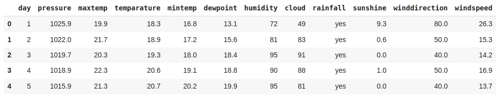
First Five rows of the dataset
Now let's check the size of the dataset.
Python `
df.shape
`
**Output:
(366, 12)
Let's check which column of the dataset contains which type of data.
Python `
df.info()
`
**Output:

Information regarding data in the columns
As per the above information regarding the data in each column, we can observe that there are no null values.
Python `
df.describe().T
`
**Output:

Descriptive statistical measures of the dataset
Data Cleaning
The data which is obtained from the primary sources is termed the raw data and required a lot of preprocessing before we can derive any conclusions from it or do some modeling on it. Those preprocessing steps are known as **data cleaning and it includes, outliers removal, null value imputation, and removing discrepancies of any sort in the data inputs.
Python `
df.isnull().sum()
`
**Output:

Sum of null values present in each column
So there is one null value in the ****'winddirection'** as well as the ****'windspeed'** column. But what's up with the column name wind direction?
Python `
df.columns
`
**Output:
Index(['day', 'pressure ', 'maxtemp', 'temperature', 'mintemp', 'dewpoint', 'humidity ', 'cloud ', 'rainfall', 'sunshine', ' winddirection', 'windspeed'], dtype='object')
Here we can observe that there are unnecessary spaces in the names of the columns let's remove that.
Python `
df.rename(str.strip, axis='columns', inplace=True)
df.columns
`
**Output:
Index(['day', 'pressure', 'maxtemp', 'temperature', 'mintemp', 'dewpoint', 'humidity', 'cloud', 'rainfall', 'sunshine', 'winddirection', 'windspeed'], dtype='object')
Now it's time for null value imputation.
Python `
for col in df.columns:
Checking if the column contains
any null values
if df[col].isnull().sum() > 0: val = df[col].mean() df[col] = df[col].fillna(val)
df.isnull().sum().sum()
`
**Output:
0
Exploratory Data Analysis
**EDA is an approach to analyzing the data using visual techniques. It is used to discover trends, and patterns, or to check assumptions with the help of statistical summaries and graphical representations. Here we will see how to check the data imbalance and skewness of the data.
Python `
plt.pie(df['rainfall'].value_counts().values, labels = df['rainfall'].value_counts().index, autopct='%1.1f%%') plt.show()
`
**Output:
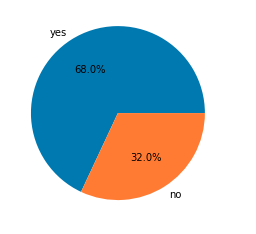
Pie chart for the number of data for each target
Python `
df.groupby('rainfall').mean()
`
**Output:
Here we can clearly draw some observations:
- **maxtemp is relatively lower on days of rainfall.
- **dewpoint value is higher on days of rainfall.
- **humidity is high on the days when rainfall is expected.
- Obviously, clouds must be there for rainfall.
- **sunshine is also less on days of rainfall.
- **windspeed is higher on days of rainfall.
The observations we have drawn from the above dataset are very much similar to what is observed in real life as well.
Python `
features = list(df.select_dtypes(include = np.number).columns) features.remove('day') print(features)
`
**Output:
['pressure', 'maxtemp', 'temperature', 'mintemp', 'dewpoint', 'humidity', 'cloud', 'sunshine', 'winddirection', 'windspeed']
Let's check the distribution of the continuous features given in the dataset.
Python `
plt.subplots(figsize=(15,8))
for i, col in enumerate(features): plt.subplot(3,4, i + 1) sb.distplot(df[col]) plt.tight_layout() plt.show()
`
**Output:

Distribution plot for the columns with continuous data
Let's draw boxplots for the continuous variable to detect the outliers present in the data.
Python `
plt.subplots(figsize=(15,8))
for i, col in enumerate(features): plt.subplot(3,4, i + 1) sb.boxplot(df[col]) plt.tight_layout() plt.show()
`
**Output:
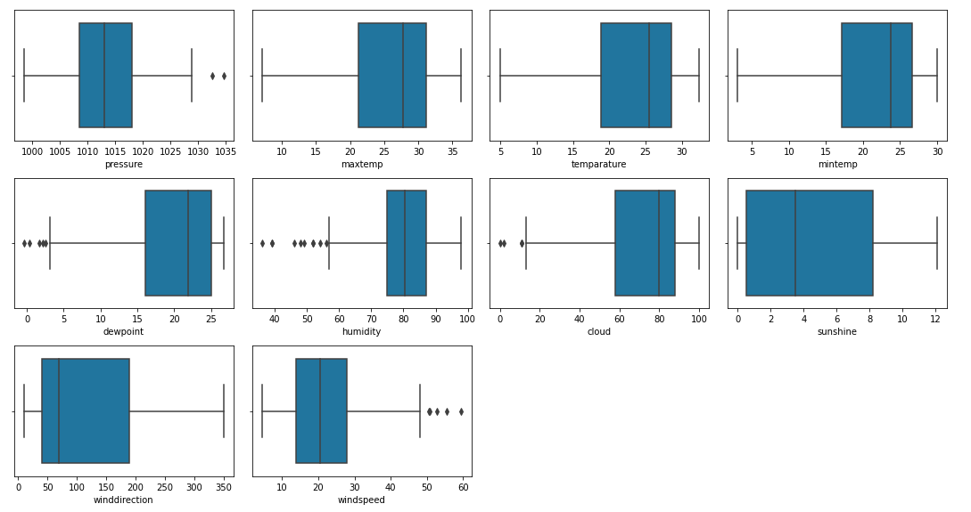
Box plots for the columns with continuous data
There are outliers in the data but sadly we do not have much data so, we cannot remove this.
Python `
df.replace({'yes':1, 'no':0}, inplace=True)
`
Sometimes there are highly correlated features that just increase the dimensionality of the feature space and do not good for the model's performance. So we must check whether there are highly correlated features in this dataset or not.
Python `
plt.figure(figsize=(10,10)) sb.heatmap(df.corr() > 0.8, annot=True, cbar=False) plt.show()
`
**Output:

Heat map to detect highly correlated features
Now we will remove the highly correlated features 'maxtemp' and 'mintemp'. But why not temp or dewpoint? This is because temp and dewpoint provide distinct information regarding the weather and atmospheric conditions.
Python `
df.drop(['maxtemp', 'mintemp'], axis=1, inplace=True)
`
Model Training
Now we will separate the features and target variables and split them into training and testing data by using which we will select the model which is performing best on the validation data.
Python `
features = df.drop(['day', 'rainfall'], axis=1) target = df.rainfall
`
As we found earlier that the dataset we were using was imbalanced so, we will have to balance the training data before feeding it to the model.
Python `
X_train, X_val,
Y_train, Y_val = train_test_split(features,
target,
test_size=0.2,
stratify=target,
random_state=2)
As the data was highly imbalanced we will
balance it by adding repetitive rows of minority class.
ros = RandomOverSampler(sampling_strategy='minority', random_state=22) X, Y = ros.fit_resample(X_train, Y_train)
`
The features of the dataset were at different scales so, normalizing it before training will help us to obtain optimum results faster along with stable training.
Python `
Normalizing the features for stable and fast training.
scaler = StandardScaler() X = scaler.fit_transform(X) X_val = scaler.transform(X_val)
`
Now let's train some state-of-the-art models for classification and train them on our training data.
- LogisticRegression
- XGBClassifier
- SVC Python `
models = [LogisticRegression(), XGBClassifier(), SVC(kernel='rbf', probability=True)]
for i in range(3): models[i].fit(X, Y)
print(f'{models[i]} : ')
train_preds = models[i].predict_proba(X) print('Training Accuracy : ', metrics.roc_auc_score(Y, train_preds[:,1]))
val_preds = models[i].predict_proba(X_val) print('Validation Accuracy : ', metrics.roc_auc_score(Y_val, val_preds[:,1])) print()
`
**Output:
LogisticRegression() : Training Accuracy : 0.8893967324057472 Validation Accuracy : 0.8966666666666667
XGBClassifier() : Training Accuracy : 0.9903285270573975 Validation Accuracy : 0.8408333333333333
SVC(probability=True) : Training Accuracy : 0.9026413474407211 Validation Accuracy : 0.8858333333333333
Model Evaluation
From the above accuracies, we can say that Logistic Regression and support vector classifier are satisfactory as the gap between the training and the validation accuracy is low. Let's plot the confusion matrix as well for the validation data using the SVC model.
Python `
import matplotlib.pyplot as plt from sklearn.metrics import ConfusionMatrixDisplay from sklearn import metrics
ConfusionMatrixDisplay.from_estimator(models[2], X_val, Y_val) plt.show()
This code is modified by Susobhan Akhuli
`
**Output:

Confusion matrix for the validation data
Let's plot the classification report as well for the validation data using the SVC model.
Python `
print(metrics.classification_report(Y_val, models[2].predict(X_val)))
`
**Output:
          precision    recall  f1-score   support

       0       0.84      0.67      0.74        24
       1       0.85      0.94      0.90        50

accuracy                           0.85        74
macro avg 0.85 0.80 0.82 74 weighted avg 0.85 0.85 0.85 74
**Get the complete notebook and dataset link here:
**1. Notebook Link: **click here.
2. Dataset Link: **click here.