Python Data visualization tutorial (original) (raw)
Last Updated : 3 Oct, 2025
Data visualization is the process of converting complex data into graphical formats such as charts, graphs, and maps. It allows users to understand patterns, trends, and outliers in large datasets quickly and clearly. By transforming data into visual elements, data visualization helps in making data more accessible and easier to interpret, allowing for more informed decisions and insights.
Features of Data Visualization:
- **Simplifies Complex Data: Transforms complex datasets into easy-to-understand visuals.
- **Identifies Patterns: Helps spot trends and patterns that might not be obvious in raw data.
- **Improves Decision-Making: Provides visual clarity, helping decision-makers make informed choices faster.
- **Highlights Key Insights: Allows for the emphasis of important trends, outliers, and relationships.
- **Interactive: Many visualizations allow for user interaction, enabling deeper exploration of data.
Example: Plotting with Matplotlib
Python `
import matplotlib.pyplot as plt import numpy as np
days = np.arange(1, 31) prices = 100 + np.cumsum(np.random.randn(30))
plt.plot(days, prices, marker='o', linestyle='-', color='green') plt.title("Simulated Stock Price") plt.xlabel("Day") plt.ylabel("Price ($)") plt.grid(True) plt.show()
`
**Output
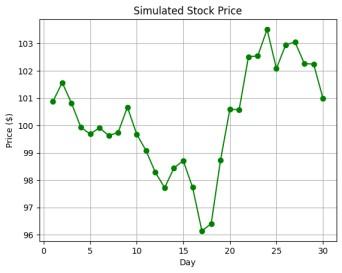
Stock Price Chart
**Explanation:
- **np.arange(1, 31) creates an array of days from 1 to 30.
- **np.cumsum(np.random.randn(30)) generates random daily changes and sums them to simulate stock prices.
- **plt.plot() draws the stock price line with green circle markers.
- **plt.title(), plt.xlabel(), plt.ylabel(), and plt.grid() add labels, title and grid for clarity.
Table of Content
- Data Visualization Basics
- Data Visualization with Matplotlib
- Effective Data Visualization With Seaborn
- Data Visualization with Pandas
- Data Visualization with Plotly
- Data Visualization with Plotnine
- Data Visualizations with Altair
- Interactive Data Visualization with Bokeh
- Advanced Data Visualization with Pygal
- Choosing the Right Data Visualization Library
Data Visualization Basics
After analyzing data, it is important to visualize the data to uncover patterns, trends, outliers, and insights that may not be apparent in raw data using visual elements like charts, graphs, and maps. **Choosing the right type of chart is crucial for effectively communicating your data. Different charts serve different purposes and can highlight various aspects of your data. For a deeper dive into selecting the best chart for your data, check out this comprehensive guide on:
- What is Data Visualization and Why is It Important?
- Types of Data Visualization Charts
- Choosing the Right Chart Type
Equally important is selecting the right colors for your visualizations. Proper color choices highlight key information, improve readability, and make visuals more engaging. For expert advice on choosing the best colors for your charts, visit How to select Colors for Data Visualizations?
Data Visualization with Matplotlib
Matplotlib is one of the most widely used libraries for data visualization in Python. It is highly flexible and allows users to create a wide range of static, animated, and interactive plots. It helps us create basic visualizations, and we can easily integrate it with other libraries like Seaborn for more advanced statistical graphics.
- Introduction to Matplotlib
- Setting up Python Environment for installation
- Pyplot in Matplotlib
- Matplotlib – Axes Class
- Data Visualization With Matplotlib
Effective Data Visualization With Seaborn
Seaborn is built on top of Matplotlib and provides a high-level interface for creating attractive and informative statistical plots. It integrates seamlessly with Pandas and makes it easier to create complex visualizations with minimal code.
- Data Visualization with Python Seaborn
- Data visualization with Seaborn Pairplot
- Data Visualization with FacetGrid in Seaborn
- Time Series Visualization with Seaborn : Line Plot
Data Visualization with Pandas
Pandas is a powerful library primarily used for data manipulation, but it also offers basic plotting capabilities. While it may not be as feature-rich as dedicated visualization libraries like Matplotlib or Seaborn, Pandas' built-in plotting is convenient for quick and simple visualizations.
- Data Visualization With Pandas
- Visualizing Time Series Data with pandas
- Plotting Geospatial Data using GeoPandas
For more information, see Pandas and check Box Plots for details on specific charts.
Data Visualization with Plotly
Plotly is an interactive visualization library that allows users to create a wide range of plots, including line plots, bar charts, and scatter plots. Plotly is known for its beautiful visuals and high interactivity, making it a popular choice for web-based dashboards.
Data Visualization with Plotnine
Plotnine is a Python library that implements the Grammar of Graphics, inspired by R's ggplot2. It provides a powerful and consistent way to create complex plots with minimal code.
Data Visualizations with Altair
Altair is a Python library for creating clear, interactive charts with minimal code. Based on Vega and Vega-Lite, it uses a declarative approach (meaning you specify what the chart should show, not how to draw it), making complex visualizations easy to build and understand.
- Data Visualization with Altair
- Aggregating Data for Large Datasets
- Sharing and Publishing Visualizations with Altair
Interactive Data Visualization with Bokeh
Bokeh is a powerful Python library for creating interactive data visualization and highly customizable visualizations. It is **designed for modern web browsers and allows for the creation of complex visualizations with ease. Bokeh supports a wide range of plot types and interactivity features, making it a popular choice for interactive data visualization.
- Introduction to Bokeh in Python
- Interactive Data Visualization with Bokeh
- Practical Examples for Mastering Data Visualization with Bokeh
Advanced Data Visualization with Pygal
Pygal is known for its ease of use and ability to create beautiful, interactive charts that can be embedded in web applications. We can also create a wide range of charts including line charts, bar charts, pie charts and more, all with interactive capabilities.
To learn about it in detail, refer to Data Visualization with Pygal
Choosing the Right Data Visualization Library
| Library | Best For | Strengths | Limitations |
|---|---|---|---|
| Matplotlib | Static plots | Highly customizable | Steep learning curve |
| Seaborn | Statistical visualizations | Easy to use, visually appealing | Limited interactivity |
| Plotly | Interactive visualizations | Web integration, modern designs | Requires browser rendering |
| Bokeh | Web-based dashboards | Real-time interactivity | More complex setup |
| Altair | Declarative statistical plots | Concise syntax | Limited customization |
| Pygal | Scalable SVG charts | High-quality graphics | Less suited for complex datasets |
To create impactful and engaging data visualizations. Start by selecting the appropriate chart type-bar charts for comparisons, line charts for trends, and pie charts for proportions.
- Simplify your visualizations to focus on key insights.
- Use annotations to guide the viewer’s attention.
- Strategically use color to differentiate categories or highlight important data, but avoid overuse to prevent confusion.
For a more detailed exploration of these techniques consider below resources: