Exploratory Data Analysis (EDA) with NumPy, Pandas, Matplotlib and Seaborn (original) (raw)
Last Updated : 29 Jan, 2026
Exploratory Data Analysis (EDA) is the foundation of every data science project. It is the process of examining datasets to understand their structure, identify patterns, detect anomalies and extract meaningful insights. Before applying any machine learning or statistical models, data must be cleaned, transformed and explored this is where EDA plays an important role.
EDA helps answer important questions such as:
- What type of data is present (numerical, categorical, text, dates)
- Are there missing or inconsistent values
- Are there outliers that could affect analysis
- What patterns or relationships exist between variables
Exploratory Data Analysis (EDA) with NumPy, Pandas, Matplotlib and Seaborn
For example, in a student performance dataset, some records may have missing scores or inconsistent subject names (such as _“Math” and _“Mathematics”). EDA helps identify and fix such issues, ensuring the dataset is ready for analysis and modeling.
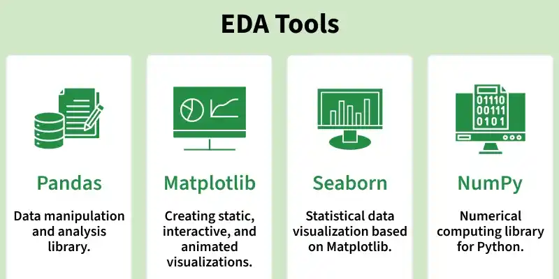
The most commonly used Python libraries for EDA are NumPy, Pandas, Matplotlib and Seaborn. Each library serves a specific purpose in the EDA workflow.
1. NumPy for Numerical Operations
NumPy is the core library for numerical computing in Python. It is designed to handle large, multi-dimensional arrays efficiently and provides fast mathematical and statistical operations.
- **Handles Large Datasets Efficiently: NumPy allows to work with large, multi-dimensional arrays and matrices of numerical data. Provides functions for performing mathematical operations such as linear algebra, statistical analysis.
- **Facilitates Data Transformation: Helps in sorting, reshaping and aggregating data. Python `
import numpy as np
Dataset: Exam scores
scores = np.array([45, 50, 55, 60, 65, 70, 75, 80, 200])
Calculate basic statistics
mean_score = np.mean(scores) median_score = np.median(scores) std_dev_score = np.std(scores)
print(f"Mean: {mean_score}, Median: {median_score}, Standard Deviation: {std_dev_score}")
`
Output
Mean: 77.77777777777777, Median: 65.0, Standard Deviation: 44.541560561838764
This example shows how NumPy quickly computes descriptive statistics and highlights the impact of outliers (the value 200) on the mean.
Topics to Explore
- Introduction
- Basics of NumPy Arrays
- Data types and type casting
- Accessing and Modifying Data
- Indexing
- Slicing
- Arithmetic operations
- Broadcasting
- Mathematical Function
- Linear algebra operations
- Data Cleaning: Handling missing values & Replacing and removing missing data
- Sorting, Searching and Counting
- Reshaping Data
- Random Module for EDA
- Saving and loading NumPy arrays
2. Pandas for Data Manipulation
Pandas is built on top of NumPy and is designed for working with structured, tabular data. It introduces two main data structures:
- Series (1D)
- DataFrame (2D)
Pandas makes data cleaning, transformation and analysis simple and intuitive.
- Reading and writing data (CSV, Excel, JSON, SQL)
- Handling missing values
- Filtering and slicing data
- Grouping and aggregation
- Working with date and time data Python `
import pandas as pd
data={ "Name":["A","B","C","D"], "Marks":[78,85,None,90] }
df=pd.DataFrame(data)
print(df) print(df.isnull()) print(df["Marks"].mean())
`
Output
Name Marks 0 A 78.0 1 B 85.0 2 C NaN 3 D 90.0 Name Marks 0 False False 1 False False 2 False True 3 False False 84.33333333333333
This example demonstrates how Pandas identifies missing values and computes summary statistics.
Topics to Explore
- Introduction
- DataFrame creation
- Importing & Exporting Data: Read Dataset with Pandas, Save DataFrame as CSV file, Reading from JSON files into Pandas DataFrame, Working with Excel files
- Indexing and Selecting
- Data Processing with Pandas
- Filtering
- Handling Missing Data
- Removing Duplicates
- Data Transformation
- Sorting
- Grouping & Aggregation
- Datetime conversion
- Merging, Joining & Concatenate
- Outlier Detection
- Data Visualization
3. Matplotlib for Data Visualization
Matplotlib is a powerful and flexible plotting library used to visualize data in various formats. It helps convert numerical data into meaningful visual representations.
- Supports line, bar, scatter, histogram and 3D plots
- Highly customizable
- Essential for visual EDA Python `
import matplotlib.pyplot as plt
scores=[45,50,55,60,65,70,75,80,200]
plt.hist(scores) plt.xlabel("Scores") plt.ylabel("Frequency") plt.title("Distribution of Exam Scores") plt.show()
`
**Output:
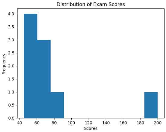
Visualizing Data with Matplotlib
This histogram helps visually identify the presence of outliers in the dataset.
Topics to Explore
- Introduction
- Axes Class
- Line Plots in Matplotlib
- Bar Charts with Matplotlib
- Scatter Plots in Matplotlib
- Histograms in Matplotlib
- Pie Charts with Matplotlib
- Customization for EDA: Adding Labels, Markers, Configuring Grid, Styling Plots
- 3D plot in Matplotlib
- Heatmaps and Contour Plots
- Animating Plots
- Saving Plots as PNG, JPG and SVG
- Saving Multiple Figures
4. Seaborn for Statistical Data Visualization
Seaborn is built on top of Matplotlib and focuses on statistical visualizations. It provides a high-level interface for creating attractive and informative plots with minimal code.
- Better default aesthetics
- Built-in support for statistical plots
- Easy visualization of relationships Python `
import seaborn as sns import pandas as pd
data=sns.load_dataset("tips")
sns.boxplot(x="day",y="total_bill",data=data)
`
**Output:
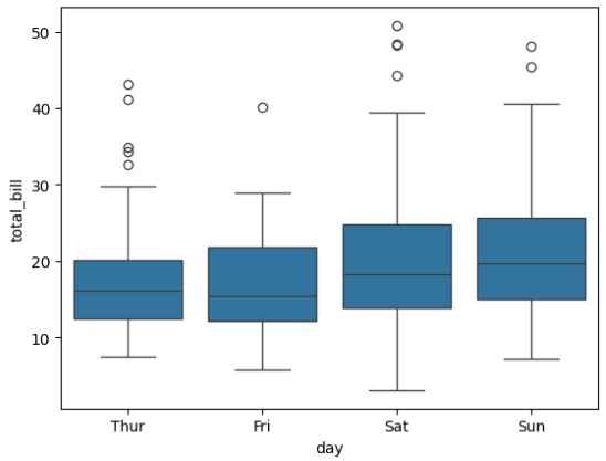
Statistical Visualization Using Seaborn
This boxplot helps analyze data distribution and detect outliers across different categories.
- Introduction to Seaborn
- Types Of Seaborn Plots
- Distribution Plots: Histograms, Jointplot, Pairplot, KDE Plot
- Categorical Plots: Barplot, Countplot, Boxplot
- Relationship Plots: Scatterplot, Line Plot, Regression plot
- Matrix & Correlation Plots: Heatmap, Correlation Heatmap
- Comparative Analysis: Violin plot, Strip plot, Swarm plot
- Pairplot function
- Facet & Grid Plot
- Customization for EDA: Style and Color, Color Palette
**Complete EDA Workflow Using NumPy, Pandas and Seaborn
Let's implement complete workflow for performing EDA: starting with numerical analysis using NumPy and Pandas, followed by insightful visualizations using Seaborn to make data-driven decisions effectively.
- Numerical analysis using NumPy and Pandas
- Data Preprocessing
- Visualizing with seaborn
- Data Visualization using Matplotlib
- Advanced EDA
- Time Series Analysis & Visualization
Hands-On EDA Projects
To strengthen your understanding, explore these real-world projects:
- Titanic Data EDA
- Uber Rides Analysis
- Zomato Data Analysis
- Covid-19 Data Analysis and Visualizations
- iPhone Sales Analysis
- Google Search Analysis
Web Scraping For EDA
Web scraping is the automated process of extracting data from websites for analysis. It is useful when datasets are not readily available.